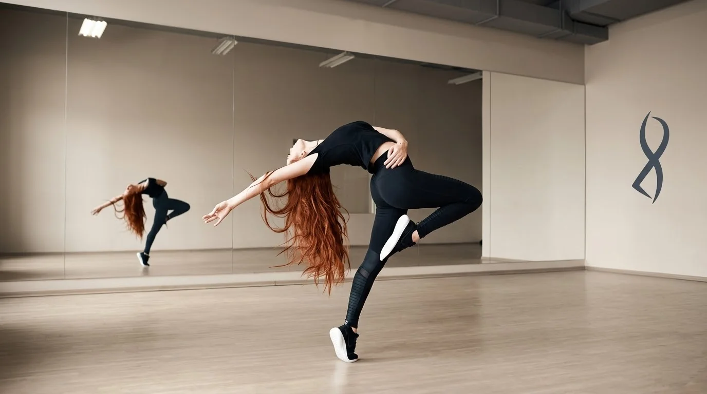
A contemporary dance studio asked us to replace a logo that felt like a fitness brand. We built an identity with the warmth of a second home and the discipline of the barre — one ribbon, drawn in a single breath.
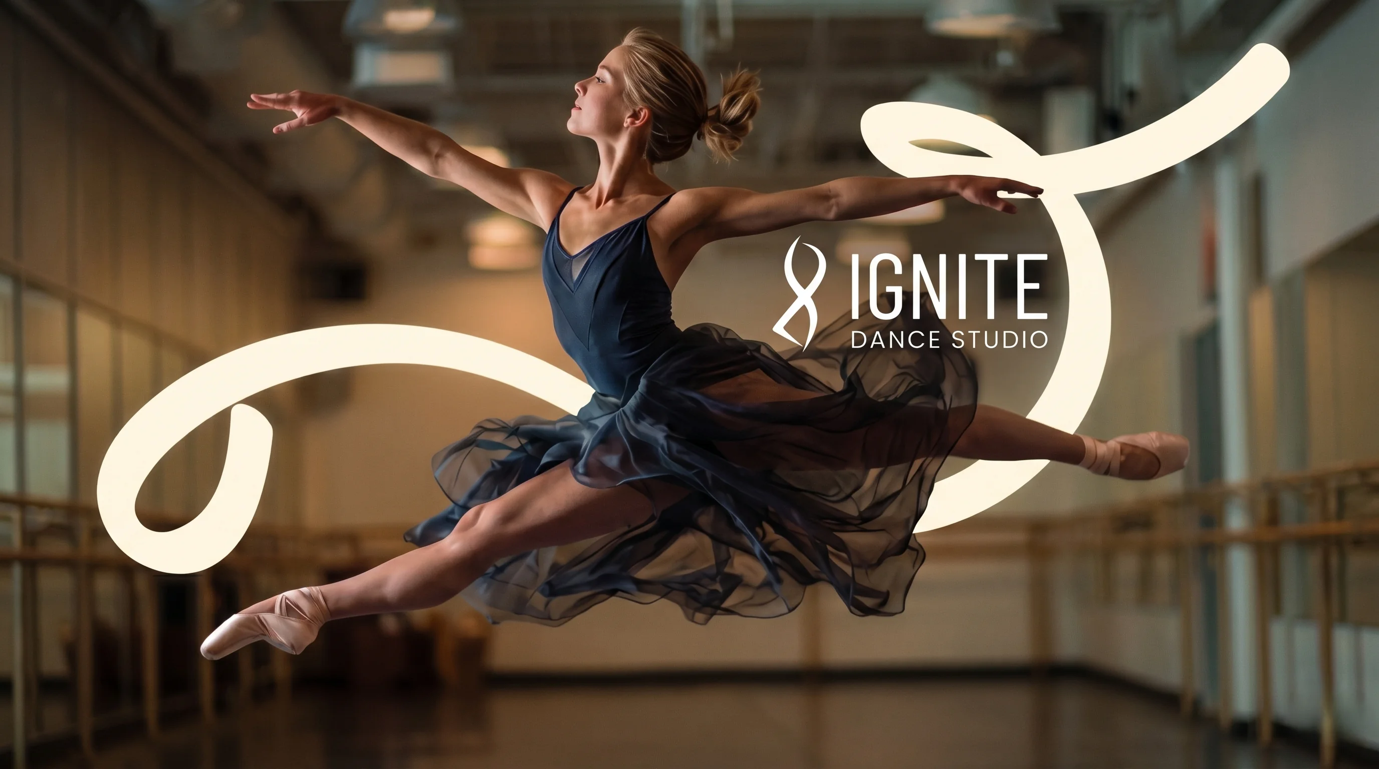
The mark is a continuous figure-eight — an infinity made from the motion of a ribbon. It references the loop a dancer's arm carves in the air, the continuity of practice, and the lemniscate rhythm of a phrase. No hard corners. Nothing pointing anywhere but back into itself.
Ink and Slate ground the system — the walls, the barre, the low light before class. Ember is the single accent, used sparingly where the brand wants the eye. Sand and White carry the breathing room.
Poppins, top to bottom. Bold for headlines that need to land. Regular for body that needs to breathe. One typeface keeps the system honest and the files small.
How we actually ran this, one sentence per step.
Sat in on three classes, interviewed eight students, and catalogued every touchpoint the studio owned. Found the wordmark no one was proud of.
Three territories — Archive, Ember, Ritual. Ember won on the first review. Sketched the ribbon mark by hand, then refined it in vector.
Locked the mark, palette, and type. Pressure-tested against signage, poster, merch, and Instagram before writing a single guideline.
Guide, asset pack, print files, and a 45-minute handover with the studio's front-desk lead. Two weeks of free edits after.
Signage at dusk, a poster on a concrete wall, a cotton tee folded on linen. A brand only earns its keep once it leaves the PDF.
 Studio signage
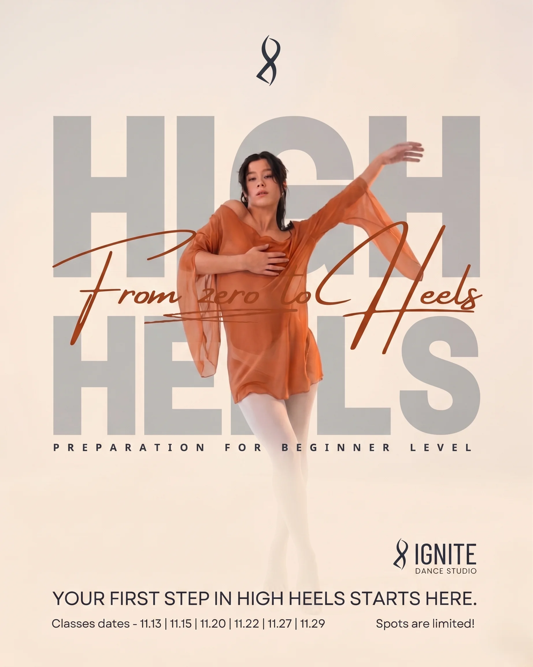 Class poster
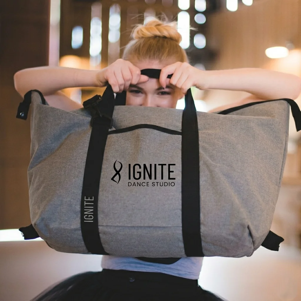 Apparel & tote
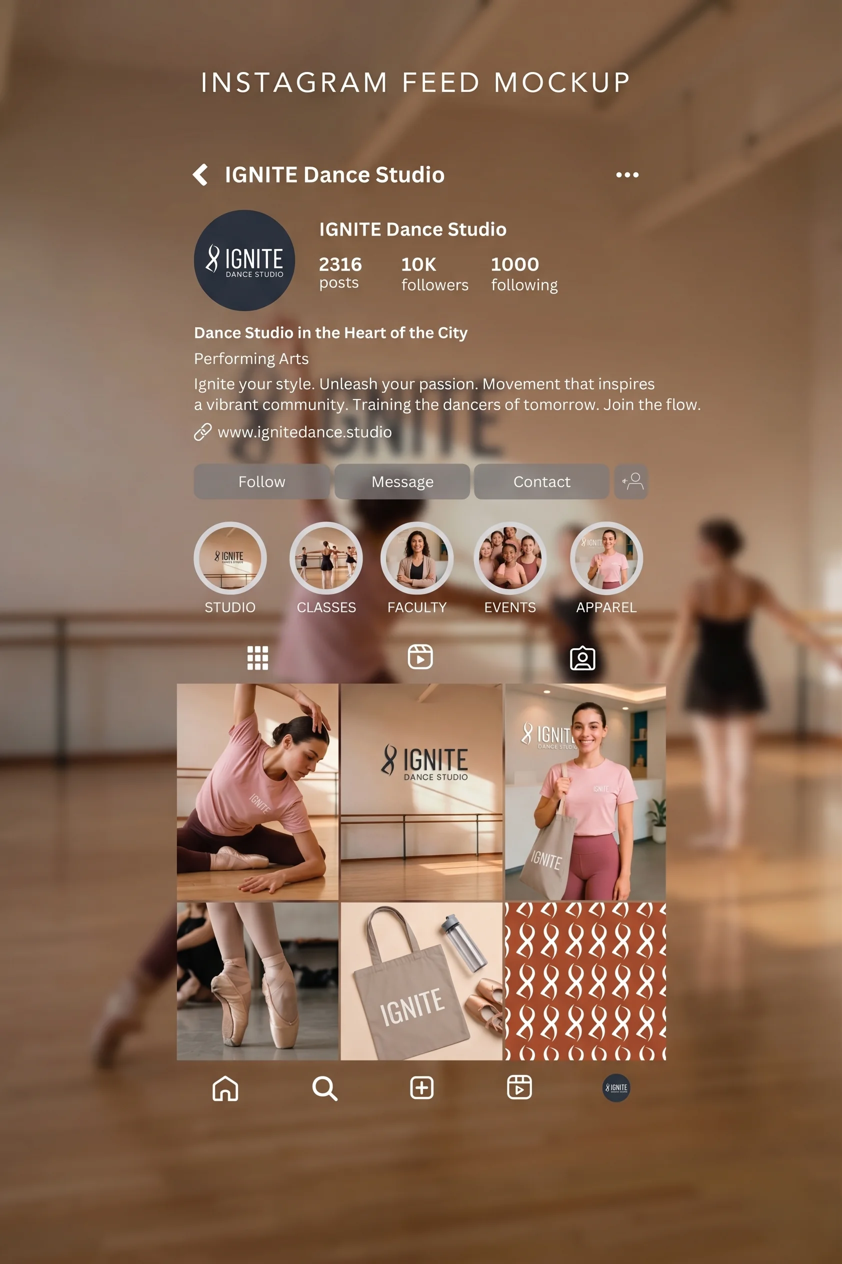 Social & app icon
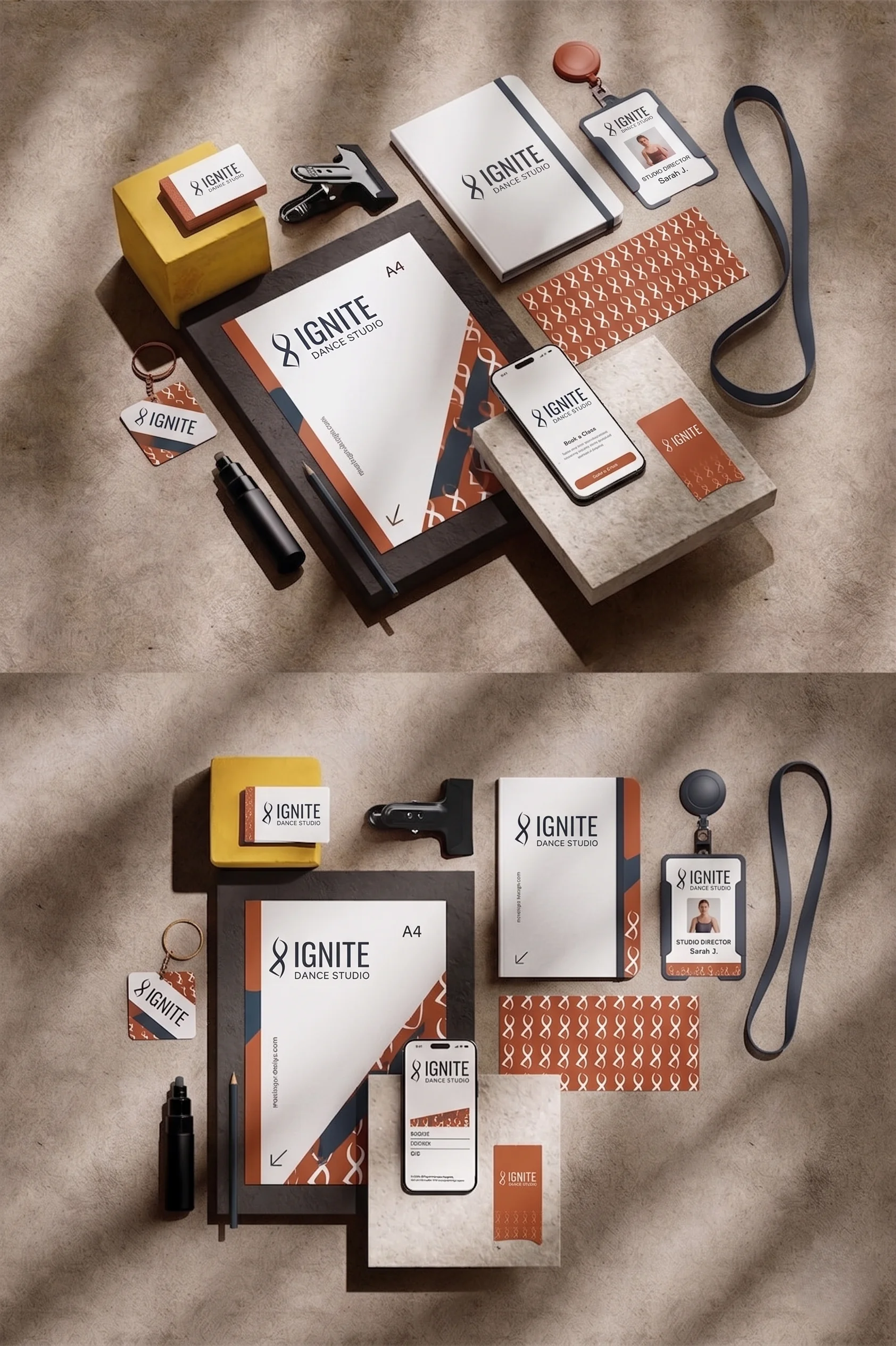 Stationery
Send a sentence about what you're building. Scope and timeline back in 48 hours.
Running classes on spreadsheets and DMs? We build booking & registration systems too — see the SNAP build →