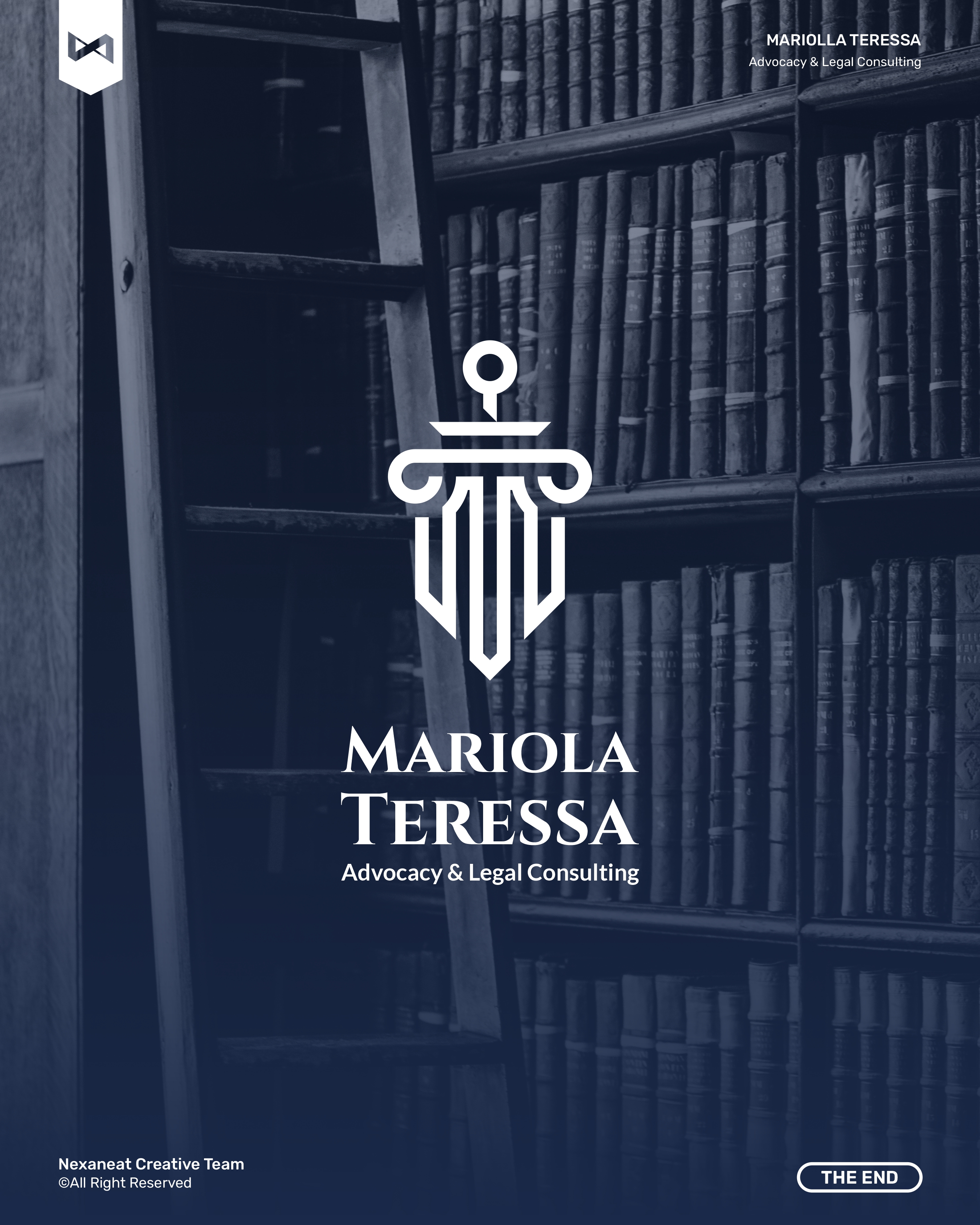
A São Paulo legal practice wanted an identity that earned trust in the first two seconds — before a client ever read a word. We built a mark that borrows the posture of classical justice (column, shield, sword) and paired it with Trajan-lineage capitals so the brand reads as institution, not freelancer.
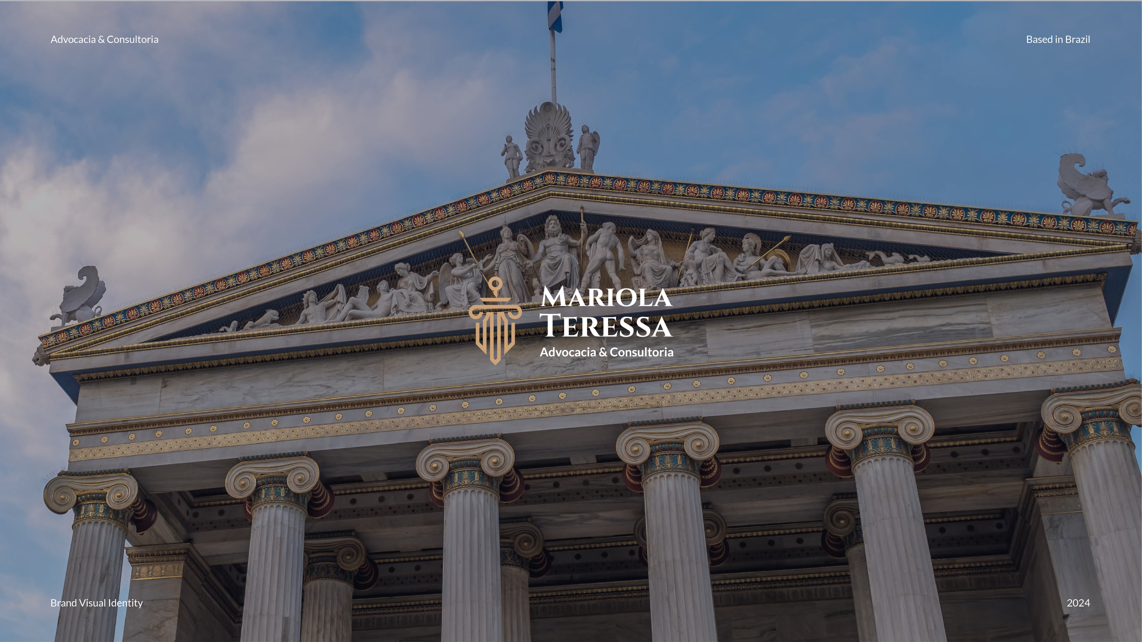
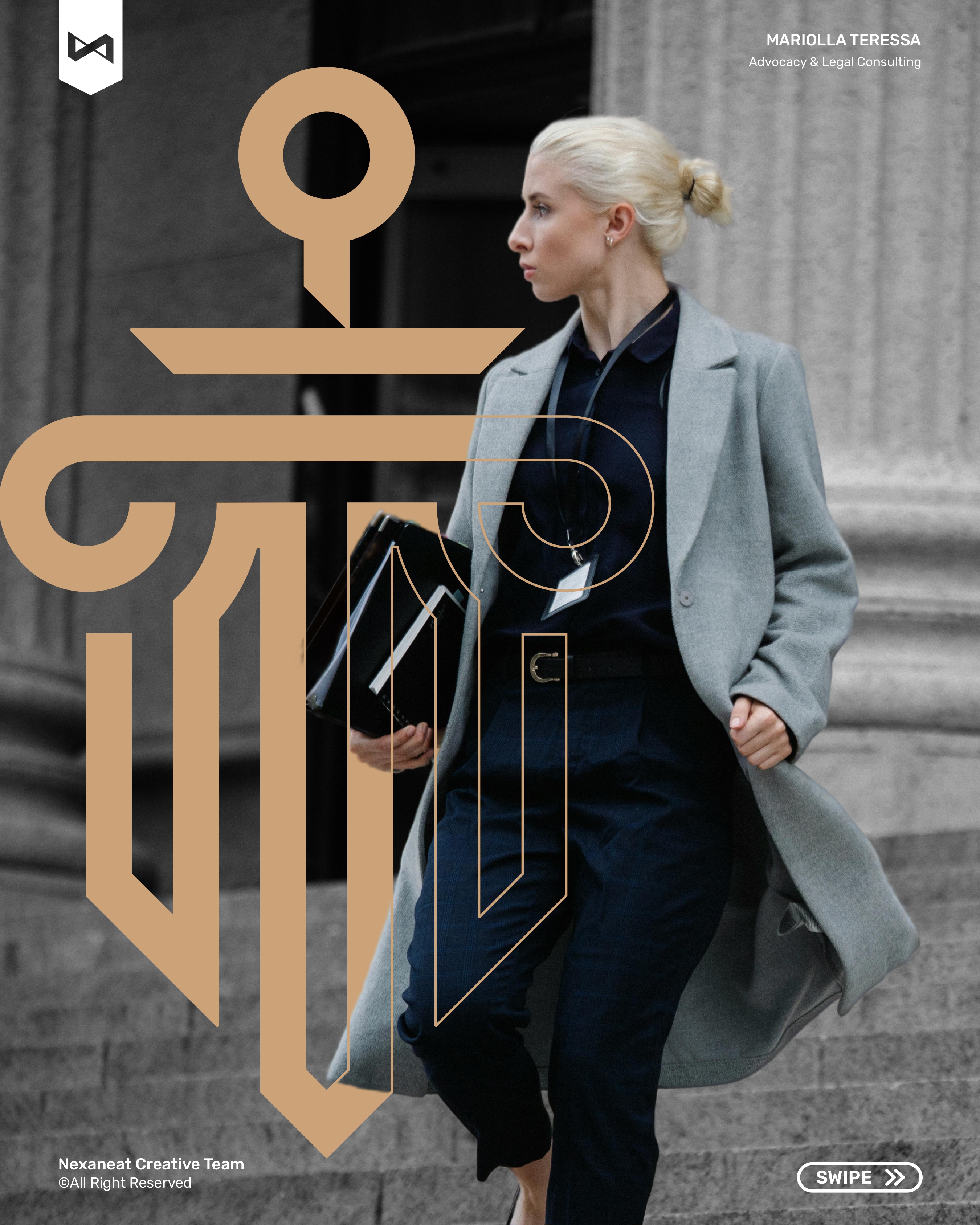
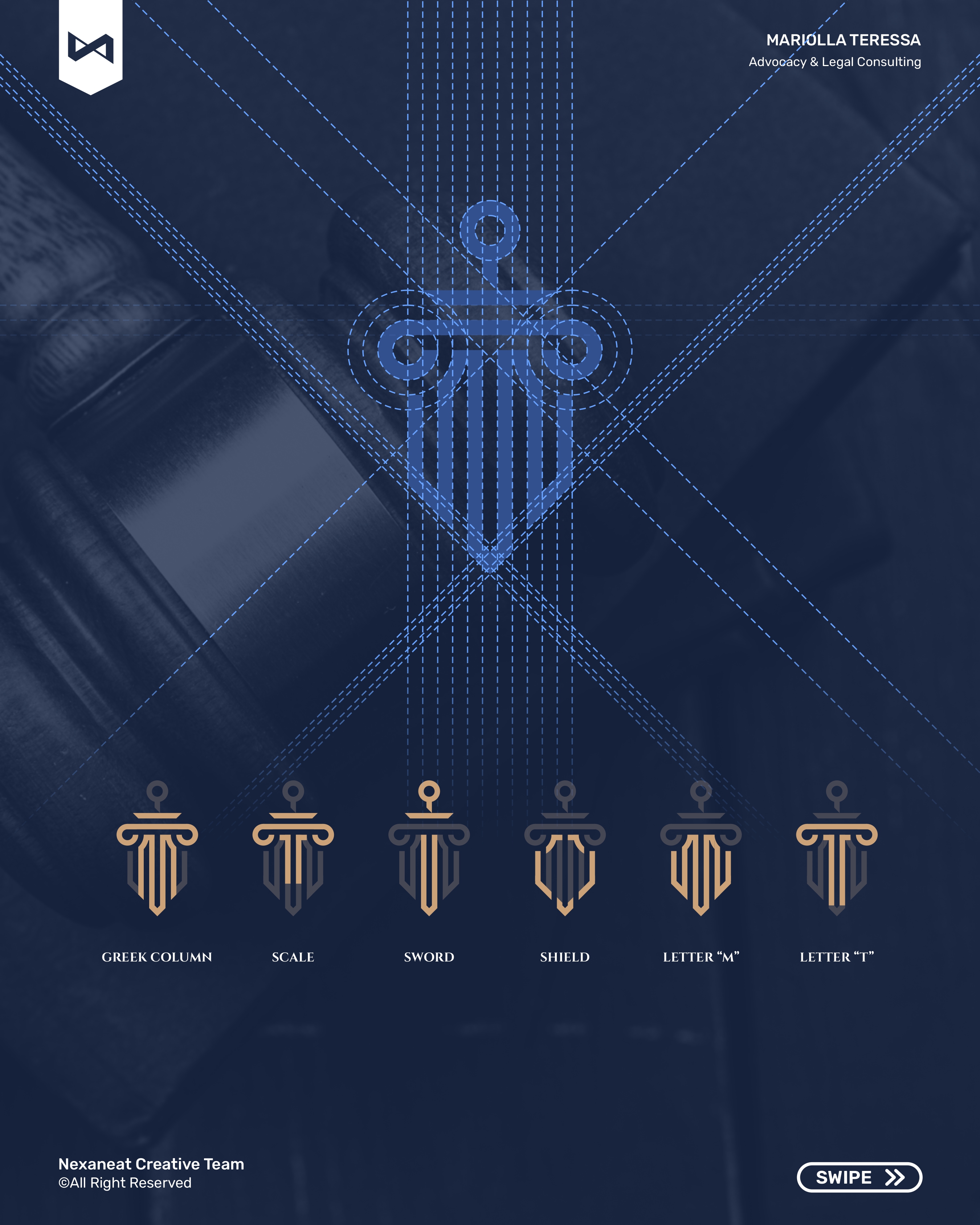
We fused three signifiers of civil law into a single glyph: an Ionic column capital (the Roman origin of modern jurisprudence), a downward sword (judgement held, not brandished — the justice-at-rest pose), and a shield (the advocate's role, standing between client and risk). Gestalt continuity does the work — the eye reads one vertical object, not three stacked icons. Stroke weight is engineered to survive an embossed business card at 12 mm and a court-building façade at six metres without losing any of the three readings.
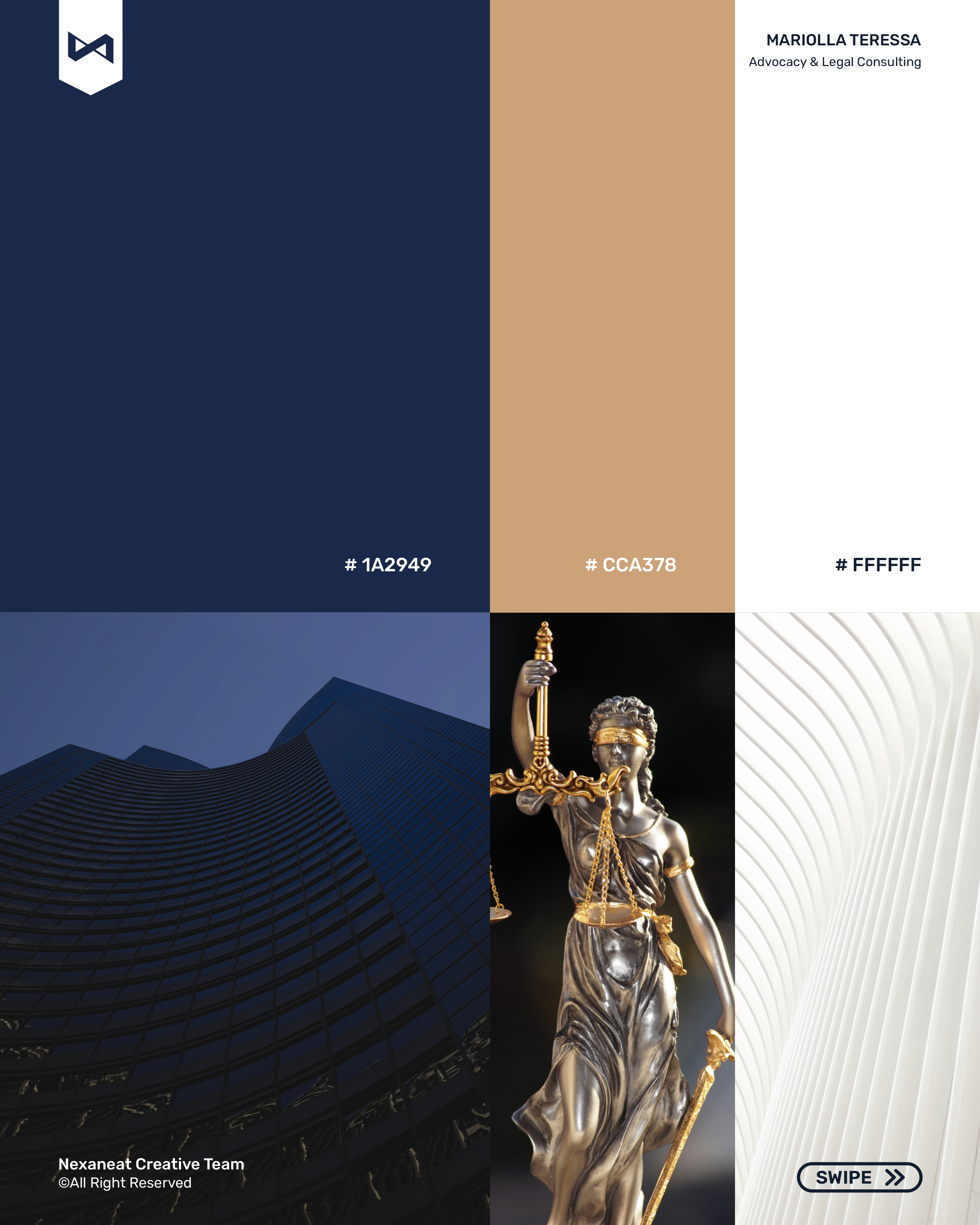
Colour psychology is doing a specific job here: saturated navy registers as competence and authority — it is the colour every serious judicial institution, from Brazil's STF to The Hague, defaults to. The gold isn't luxury signalling; warm ochre against navy is the universal shorthand for official seal, court stamp, raised emblem. A single parchment tone softens the pairing so the identity reads as a trusted counsel, not a cold tribunal. The whole system is two-plus-one: dominance, contrast, breath.
The wordmark is set in Cinzel — a digital descendant of the inscriptional capitals carved into Trajan's Column in 113 AD. That lineage is the point: the reader's eye has been trained for two millennia to read these proportions as legal, civic, permanent. Underneath, Instrument Sans carries the secondary tag in wide-tracked uppercase so the lockup compresses into one silhouette. Hierarchy is enforced by register (serif over sans) more than by size — the two faces read as a senior partner and a junior counsel standing together.
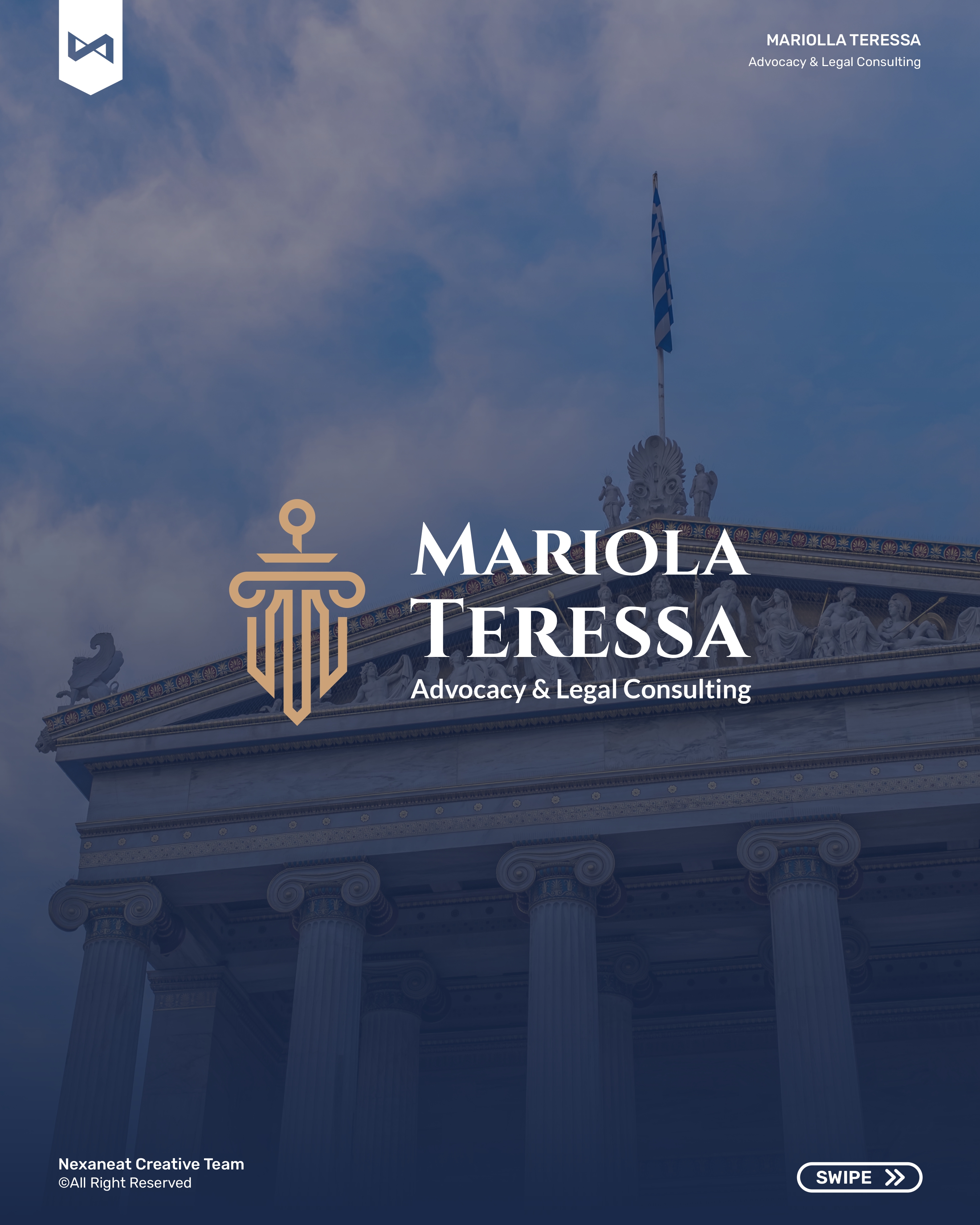
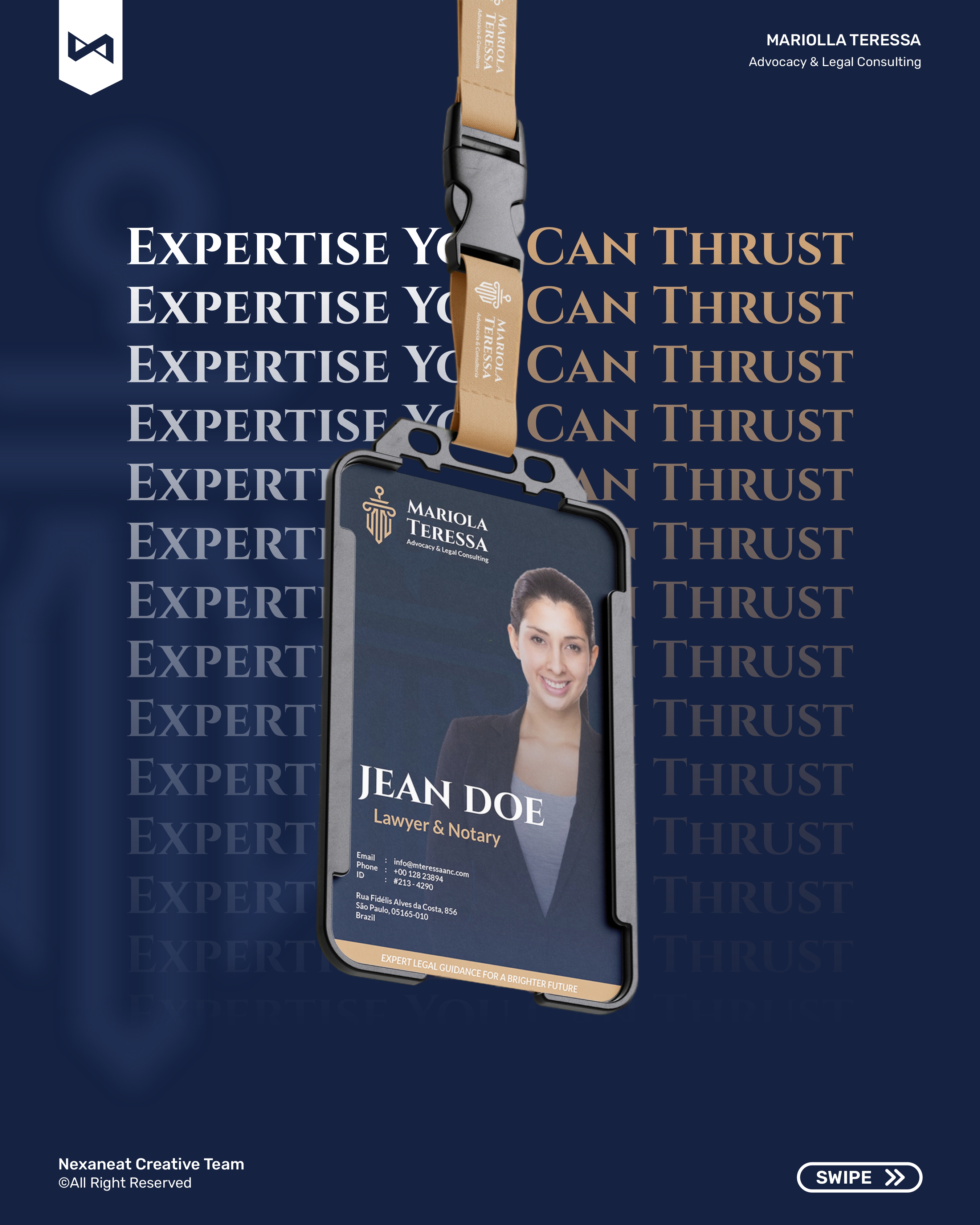
The lockup holds from a pocket-sized business card to a courthouse façade. Serif carries authority, sans carries clarity, and the wide-tracked all-caps tag compresses the whole identity into one silhouette — the same shape, whether printed, embossed, or hung outside a fifth-floor office in Vila Olímpia.
A small firm doesn't need months of discovery — it needs a weekly lock, so the identity ships before the next case hearing.
Audited the top twenty advocacia brands in São Paulo. Finding: 90% use initial-based monograms on cold white. The negative space was warmth — a firm that felt human without giving up authority.
Three routes tested with five target clients: neoclassical-editorial, minimal-monogram, and crest-heritage. Neoclassical-editorial won on trust and memorability in under two seconds.
Mark construction on a vertical symmetry axis, palette lock, type pairing, and first stationery dielines. The glyph was built to resolve at three scales: lapel pin, card, and façade.
Brand guidelines, full stationery mechanicals, a ten-frame launch carousel, story templates, a homepage design, and an OOH key visual. Hand-off inside one working day.
The launch piece is an Instagram carousel — cover, proposition, mark, palette, stationery, uniform, ID, stories, OOH, sign-off. Each frame carries the corner bug and a swipe cue so the ten slides read as one sustained argument, the same way a closing statement does.
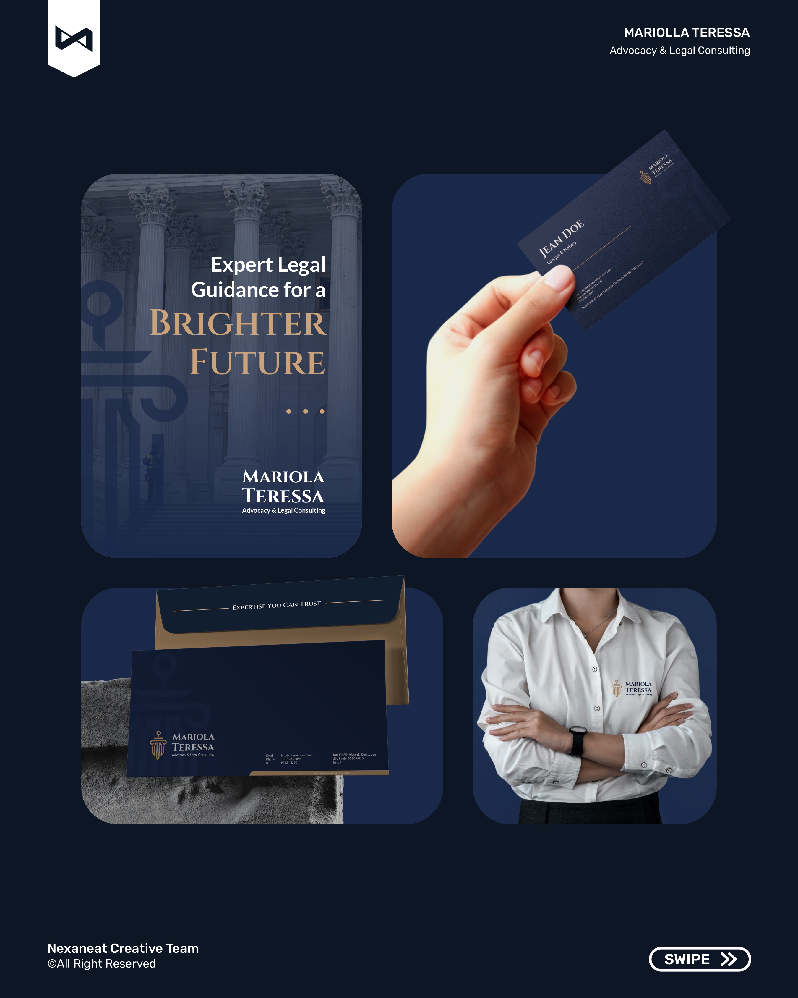
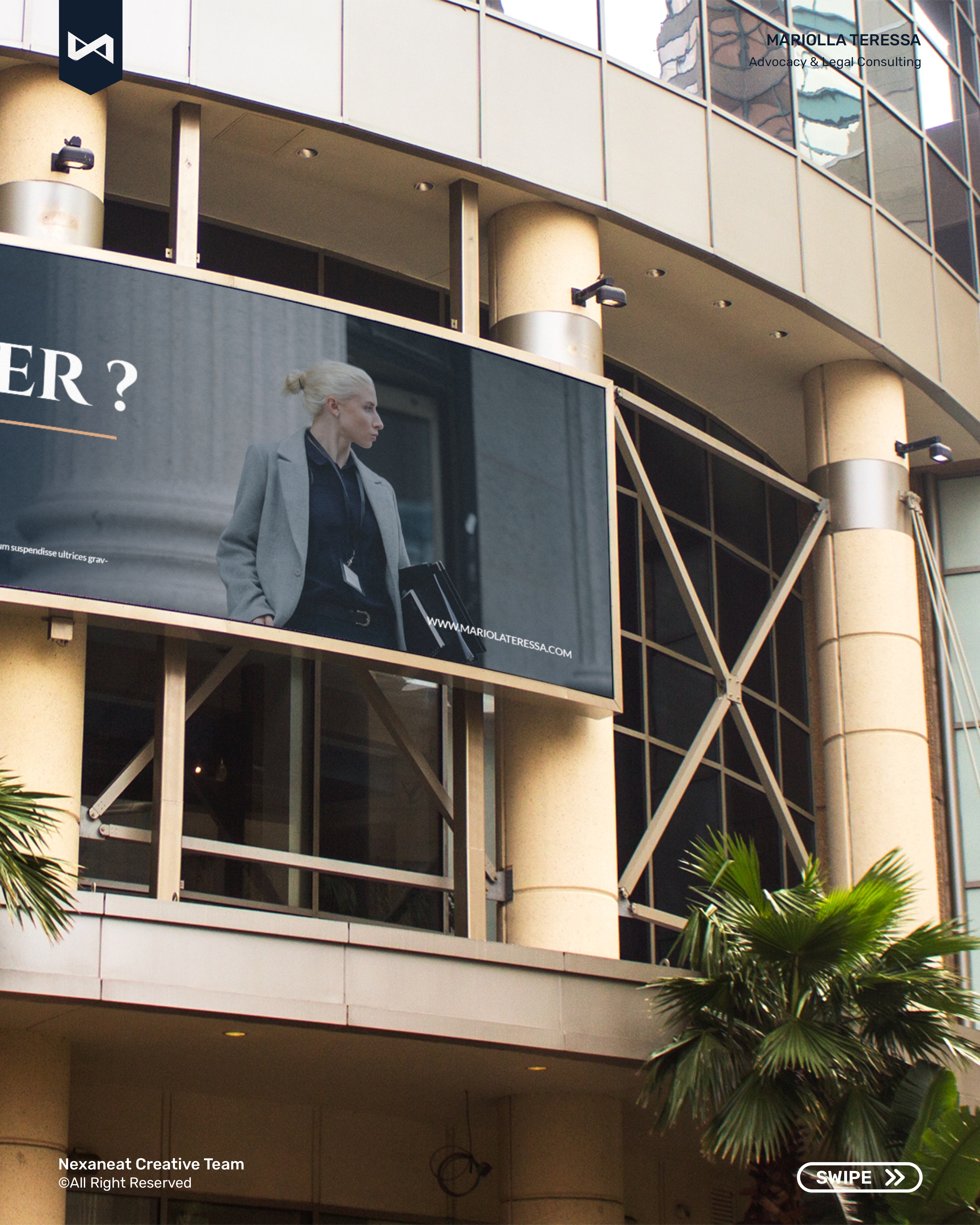
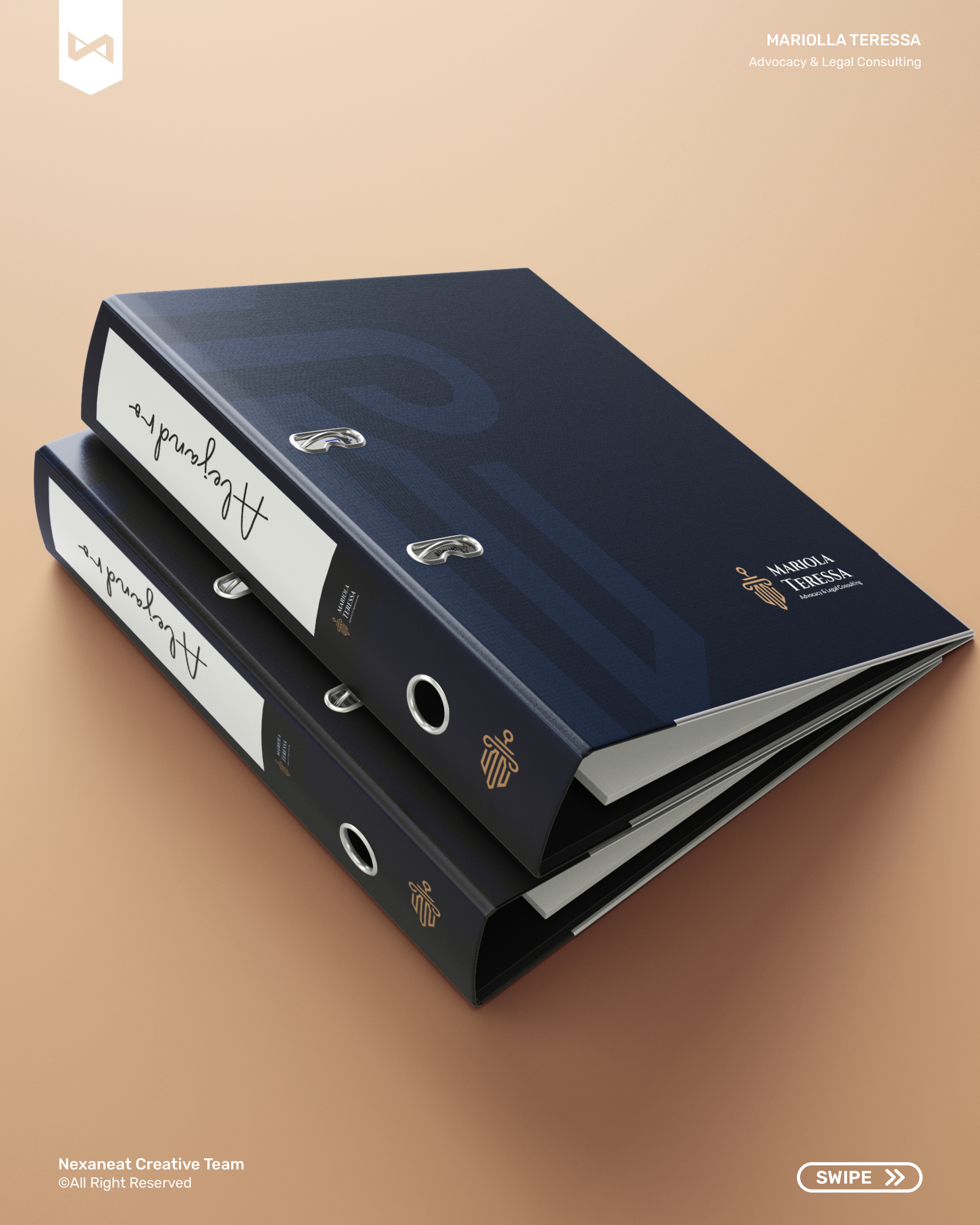
The same navy-and-gold system walks from a client's wallet to a façade across the city. Every touchpoint below leans on the same two-plus-one palette, the same Trajan wordmark, the same column-sword-shield glyph — so the firm reads as one office no matter where the client meets it.
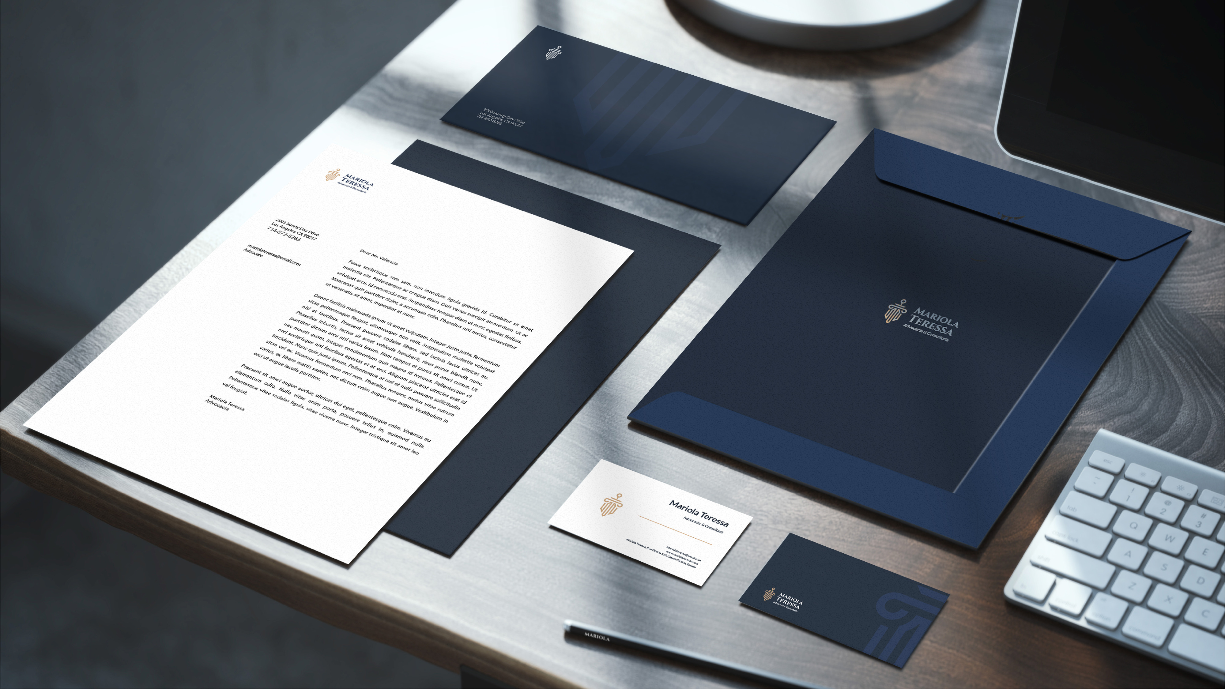 Stationery suite
 Counsel, on the steps
 Website — guiding you
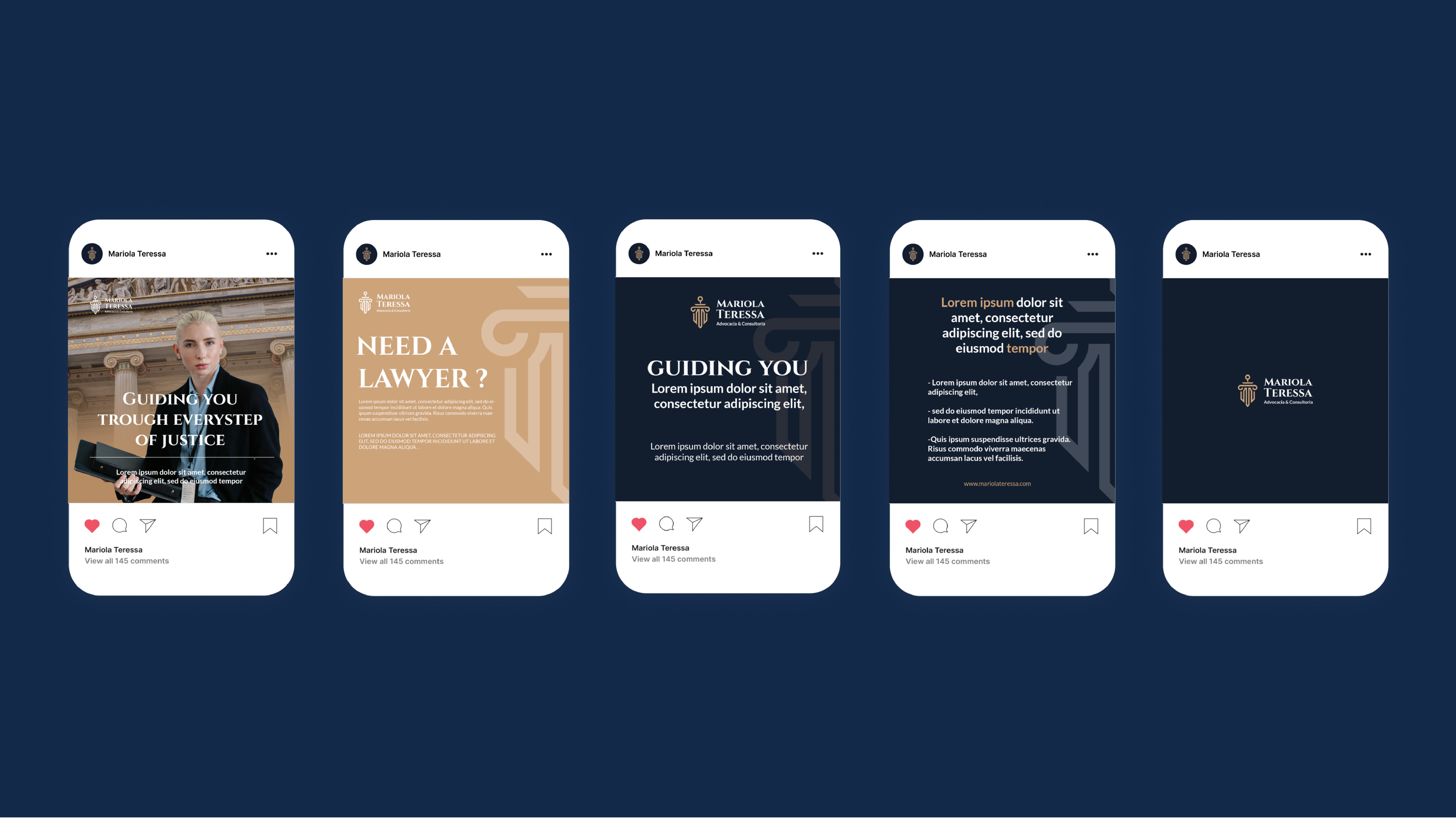 Social — feed grid
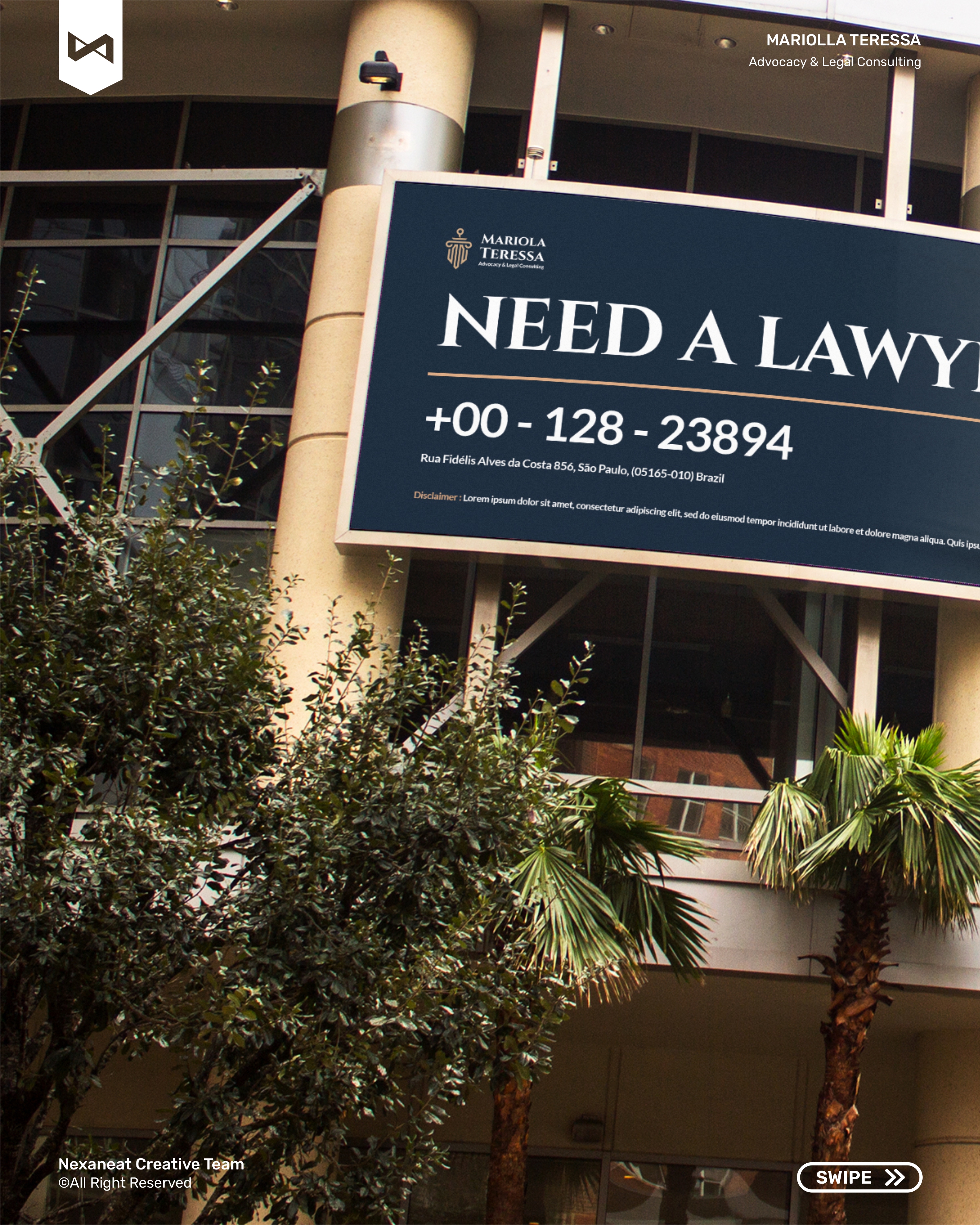
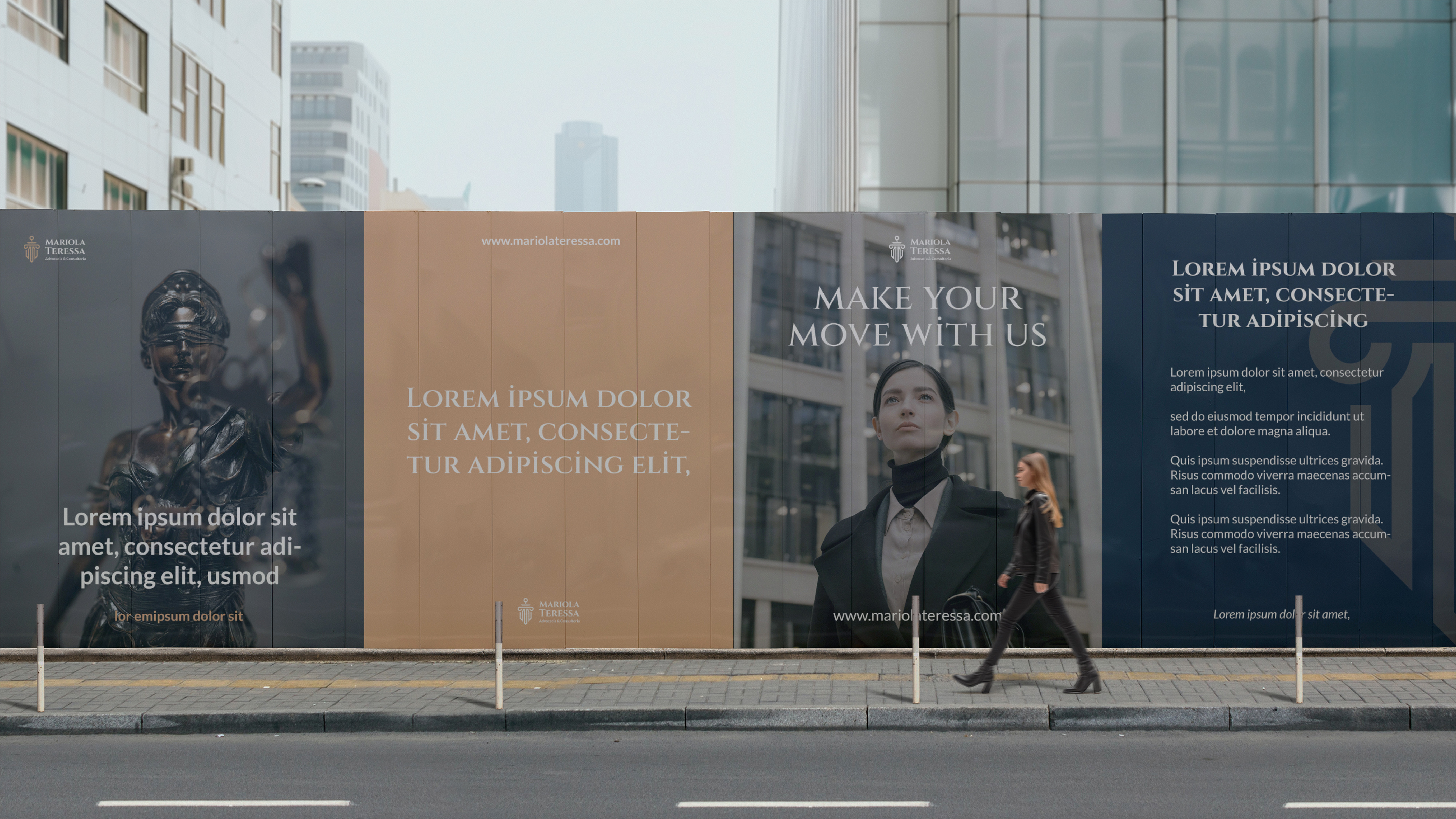 OOH — launch billboard
Send a sentence about what you're building. Scope and timeline back in 48 hours.