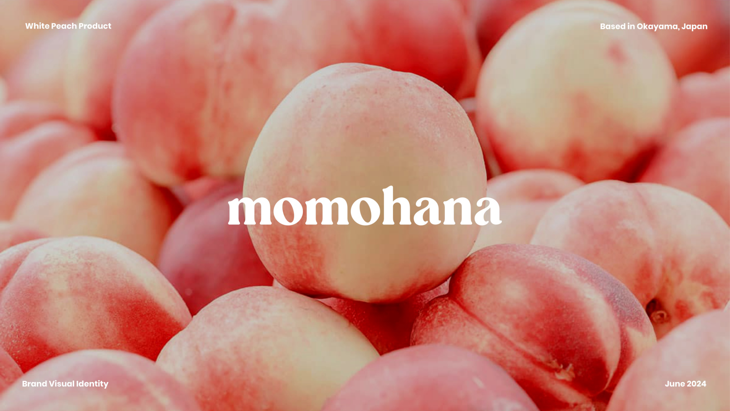
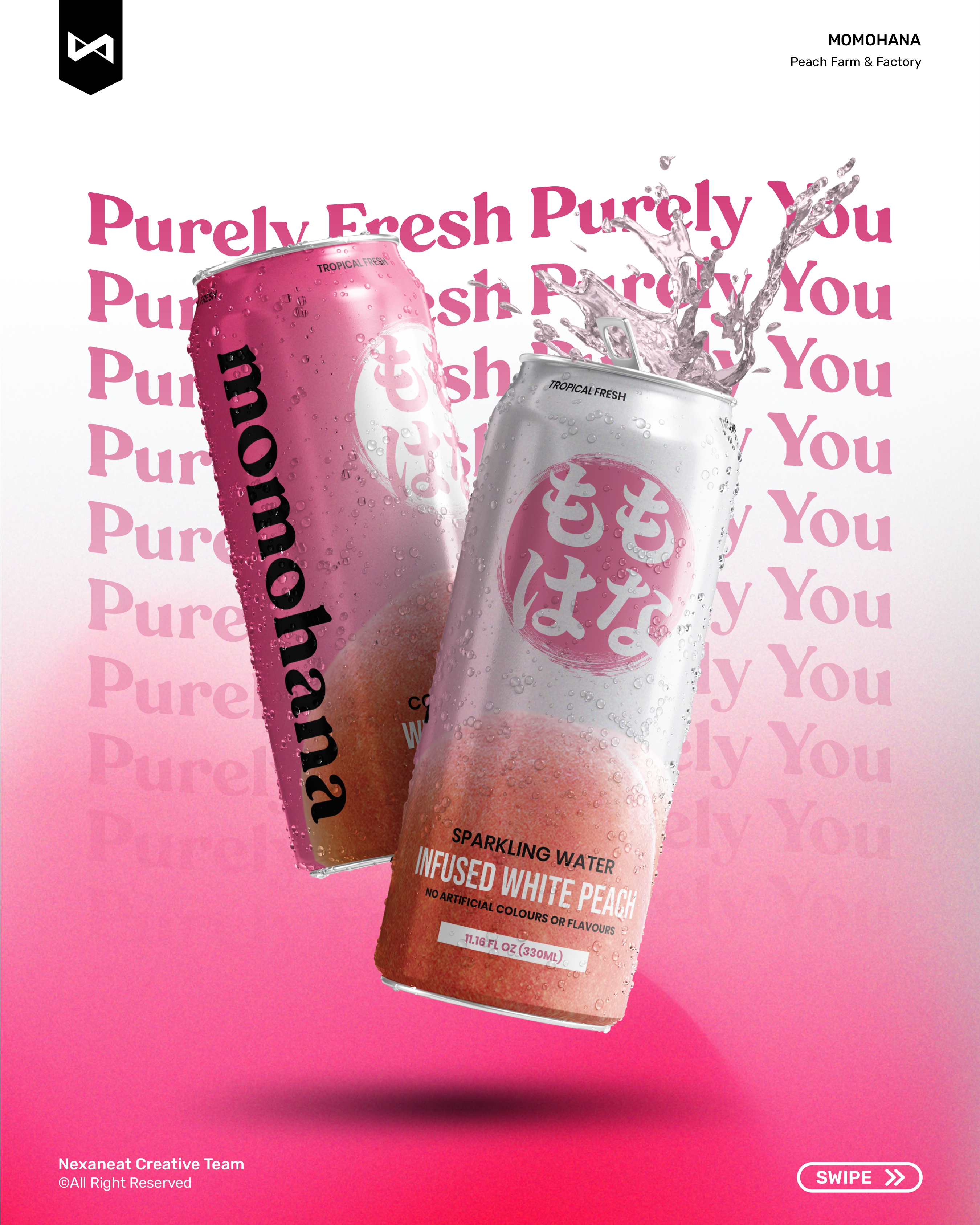
An Okayama-based beverage startup wanted a shelf identity that read as Japanese, juicy, and unmistakable from three metres away — not another pastel wellness can. We built a bilingual lockup around a brushed pink disc that borrows the geometry of the Hinomaru (rising-sun flag) and the ink-weight of traditional izakaya signage, then pushed the system into the loudest pink on the shelf so the product wins the second-and-a-half battle at the cooler door.
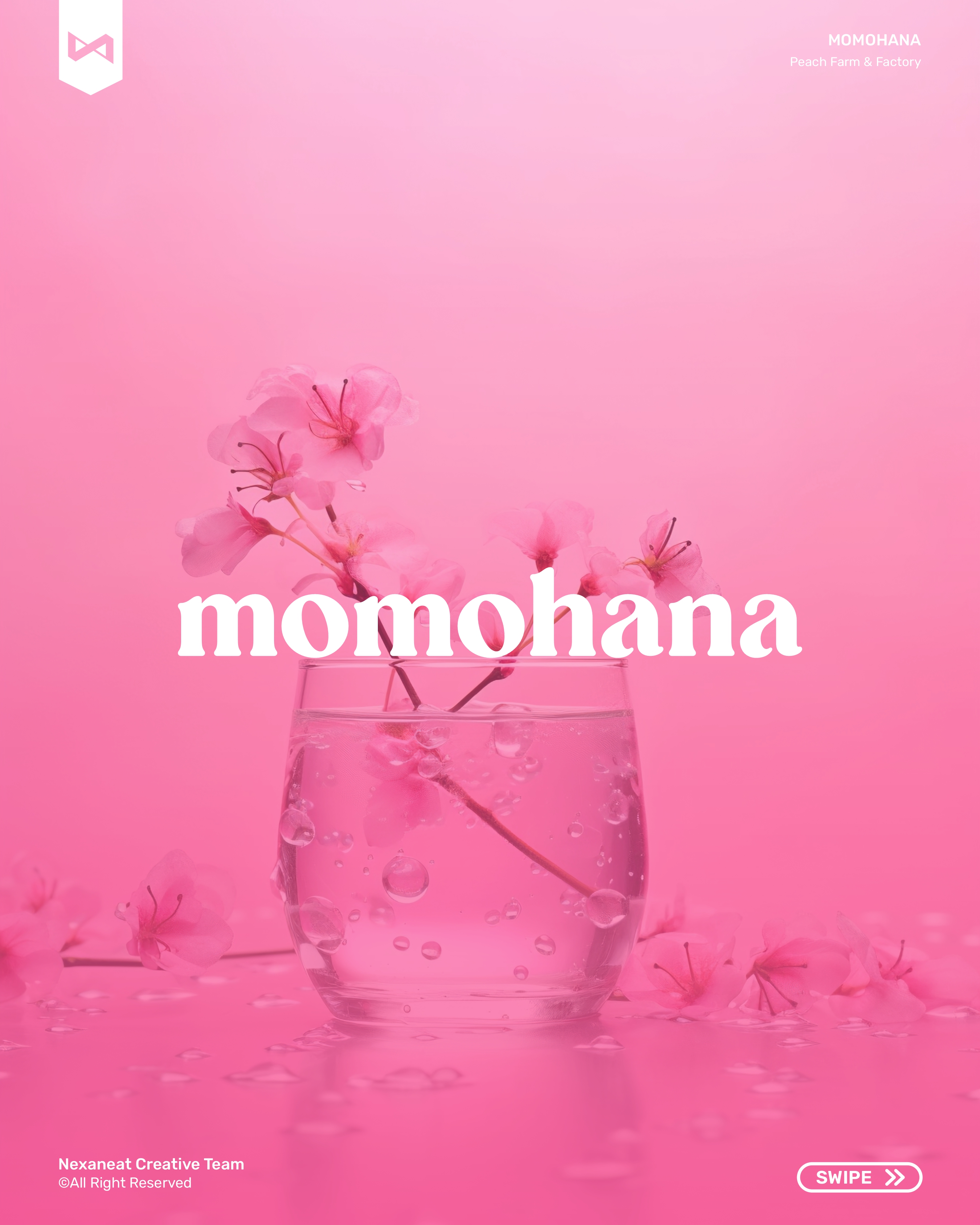
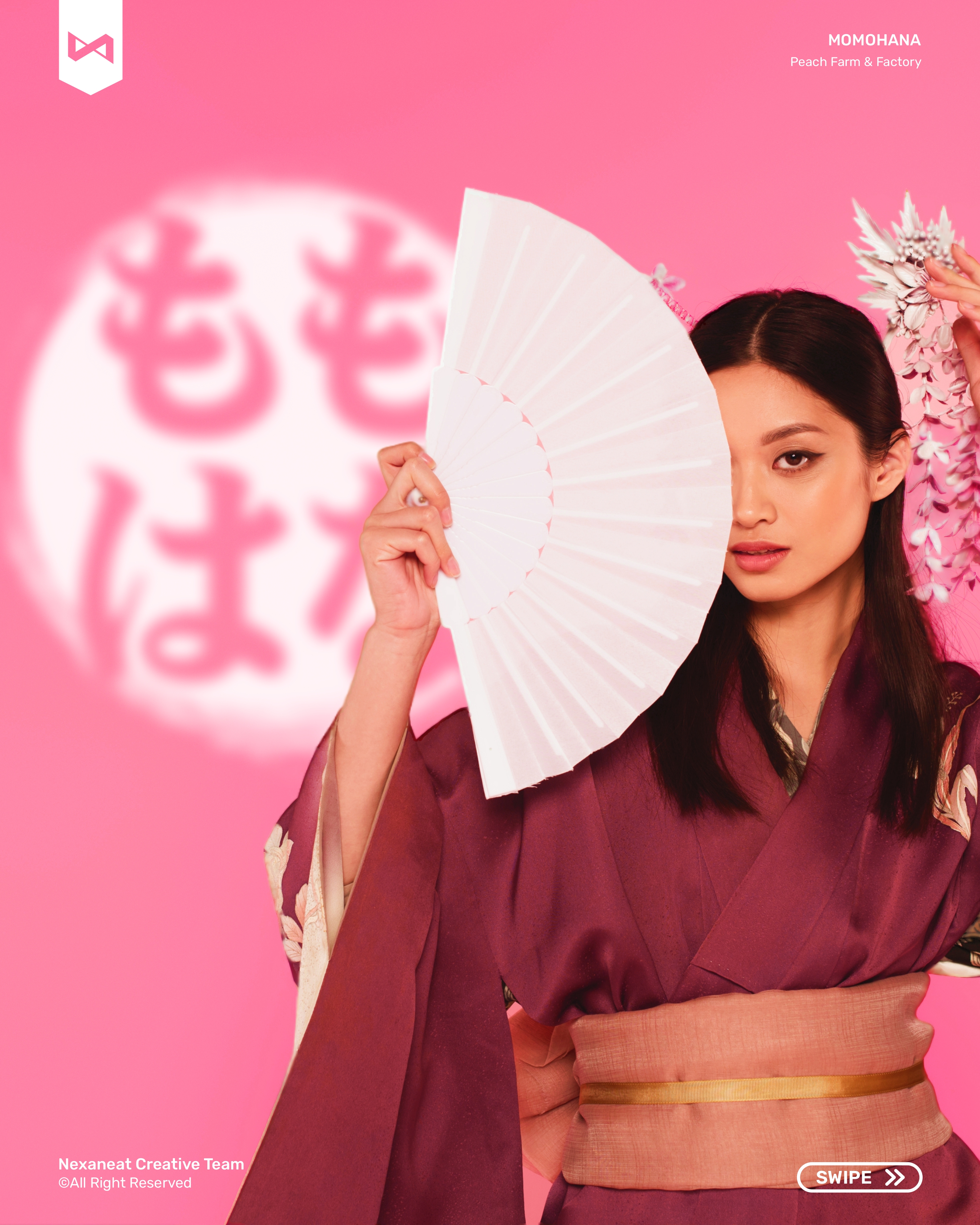
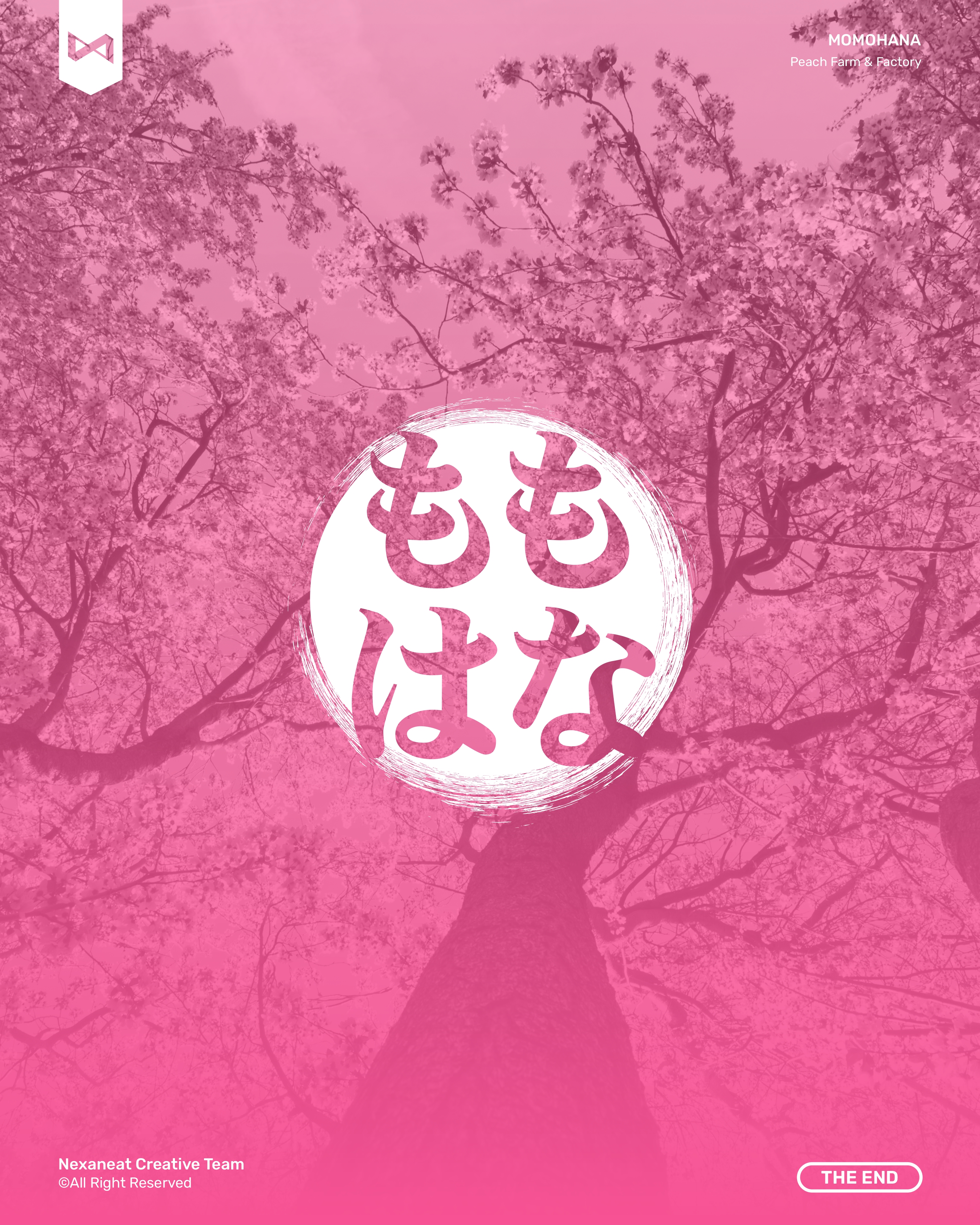
The logomark is a Hinomaru disc drawn with a rough enso brush edge — the same gesture a calligrapher finishes with a single breath. Inside, the product name is set in hiragana (もも・はな — peach·flower) stacked into a perfect square; the rounded kana mirror the roundness of the fruit and fill the circle edge-to-edge using figure-ground tension. At shelf distance the whole thing reads as one pink dot — at close range the bilingual secondary wordmark "momohana" locks below, so the eye resolves the brand in two beats instead of four. Stroke weight is tuned to survive a 28 mm canister print and a 4 m subway poster without losing either reading.
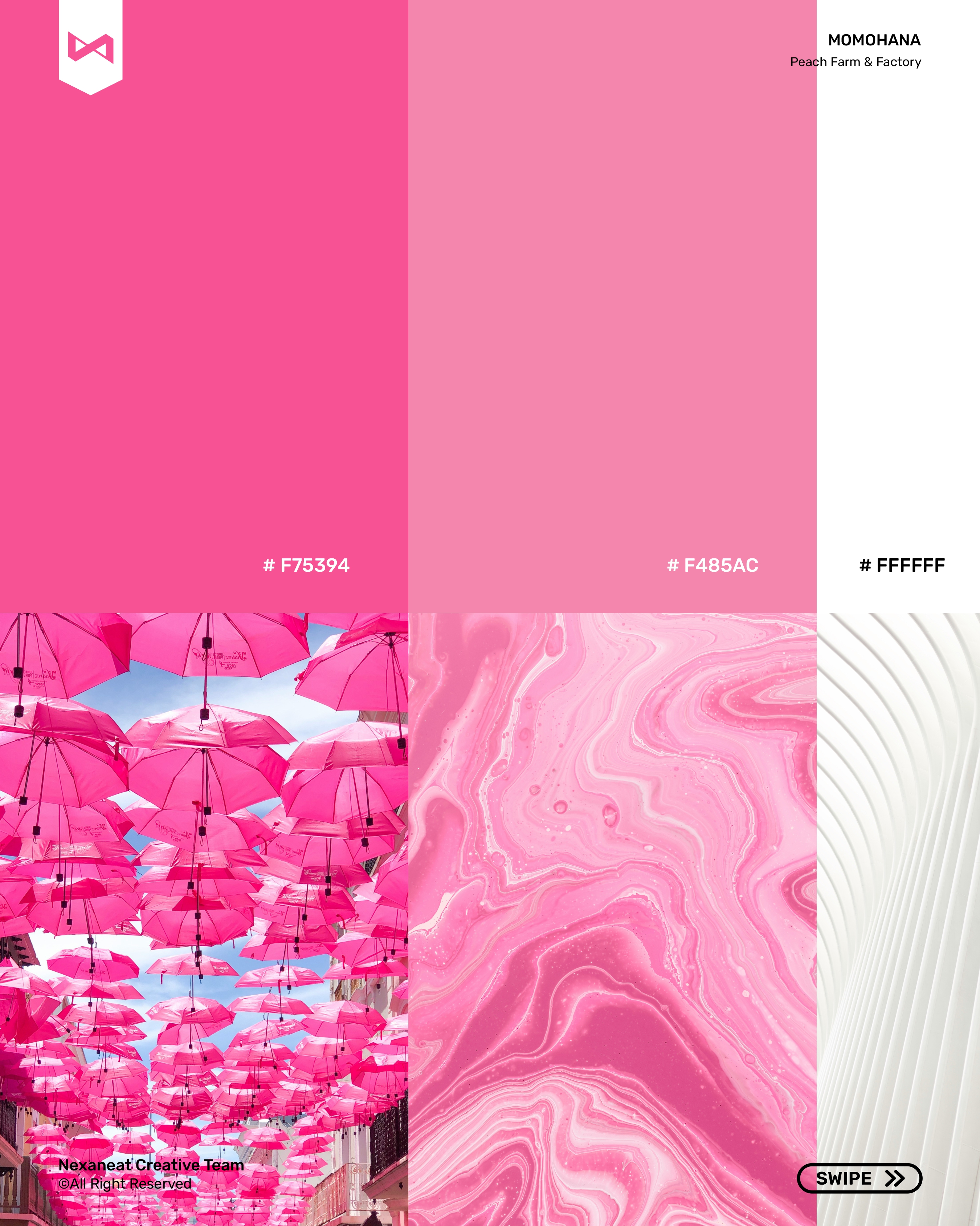
Colour here is the whole business case. White-peach drinks are a crowded category that defaults to dusty pastels and minimalist beige — so the first move was to refuse pastel. Pansy #F75394 is aggressive, saturated, and sits exactly on the hue of ripe peach flesh-and-skin, triggering what food psychologists call the appetite cue within 200 ms of eye contact. A softer Brown Knapweed sits under it as the blossom-petal tone, so the system can downshift for editorial moments without losing equity. Black-and-white do all the structural work — caption, seal, legal copy — which keeps the pink doing only one job: be the loudest thing on the shelf.
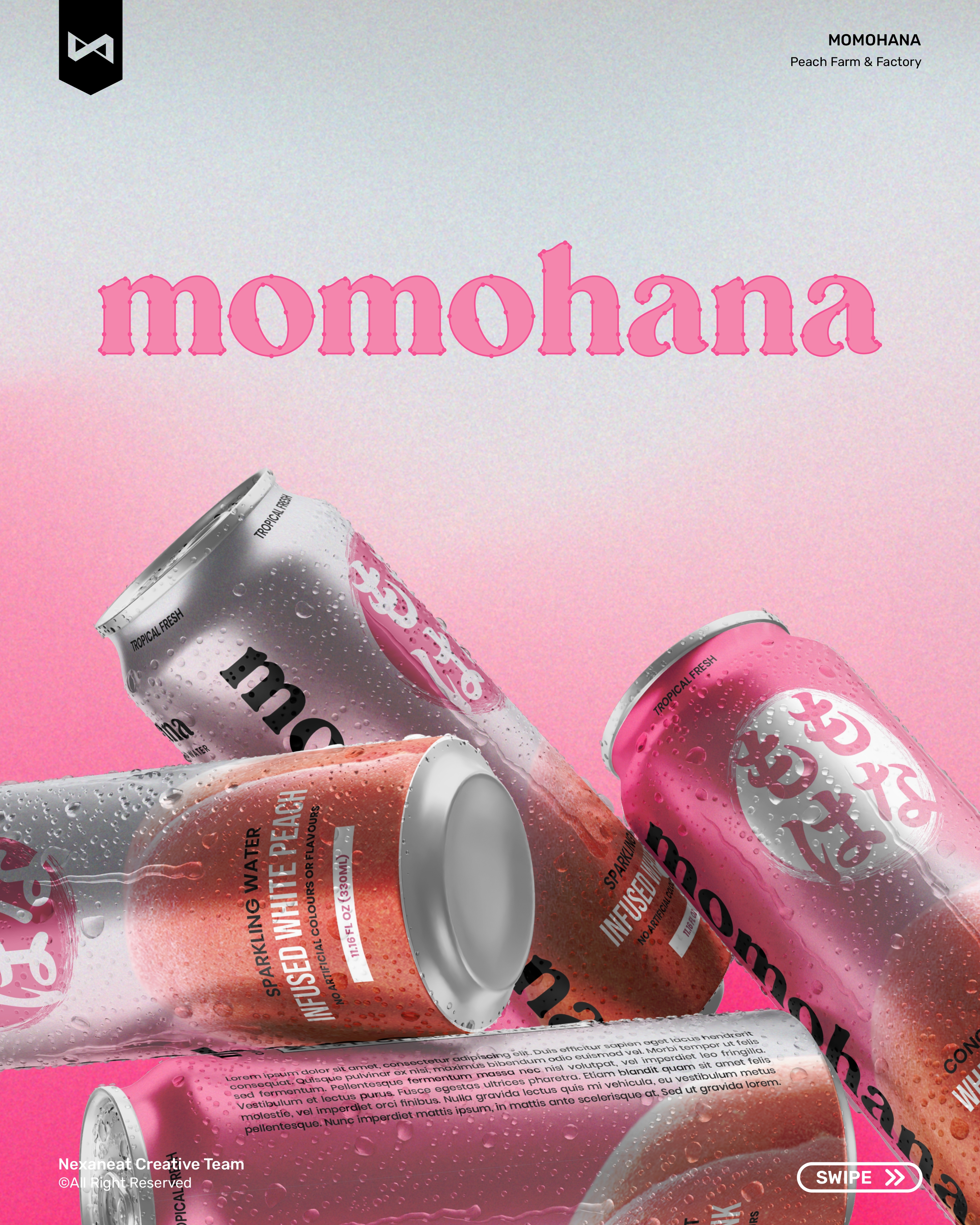
The primary face is Poppins — a geometric sans whose perfect-circle o's echo the Hinomaru disc, so the word "momohana" and the glyph carry the same primitive shape. That visual rhyme is doing gestalt-grouping work: the reader's eye ties word and mark together without conscious effort. For editorial moments — the tagline, the hero headline, pack tags — we pair it with an italic serif display face, which reads as the juice: soft, ripe, a little indulgent. On Japanese touchpoints, Noto Serif JP handles the kana with a stroke weight matched to Poppins Bold, so Latin and Japanese sit on the same visual tier.
The lockup holds from a 28 mm pack foot to a 4 m subway poster. Pansy pink does the shelf grab, hiragana seals the origin, and the geometric sans keeps the copy legible even under the cooler's blue LED. The brand tastes like the juice: ripe, floral, and unmistakably Japanese.
FMCG doesn't need a ten-week immersion — it needs a shelf-ready pack before the next distributor meeting. We ran the project on weekly locks, ending with a physical cooler mock-up.
Pulled the top 24 peach and white-peach SKUs in the Japanese and Indonesian convenience-store channel. Finding: 83% defaulted to pastel peach, soft cream, or orange-gradient. The open lane was saturated, confident pink.
Tested three directions: minimal-hana (flower glyph only), enso-kana (brushed disc + hiragana), and peach-silhouette. Enso-kana won on origin legibility and translated cleanly between JP and Latin markets.
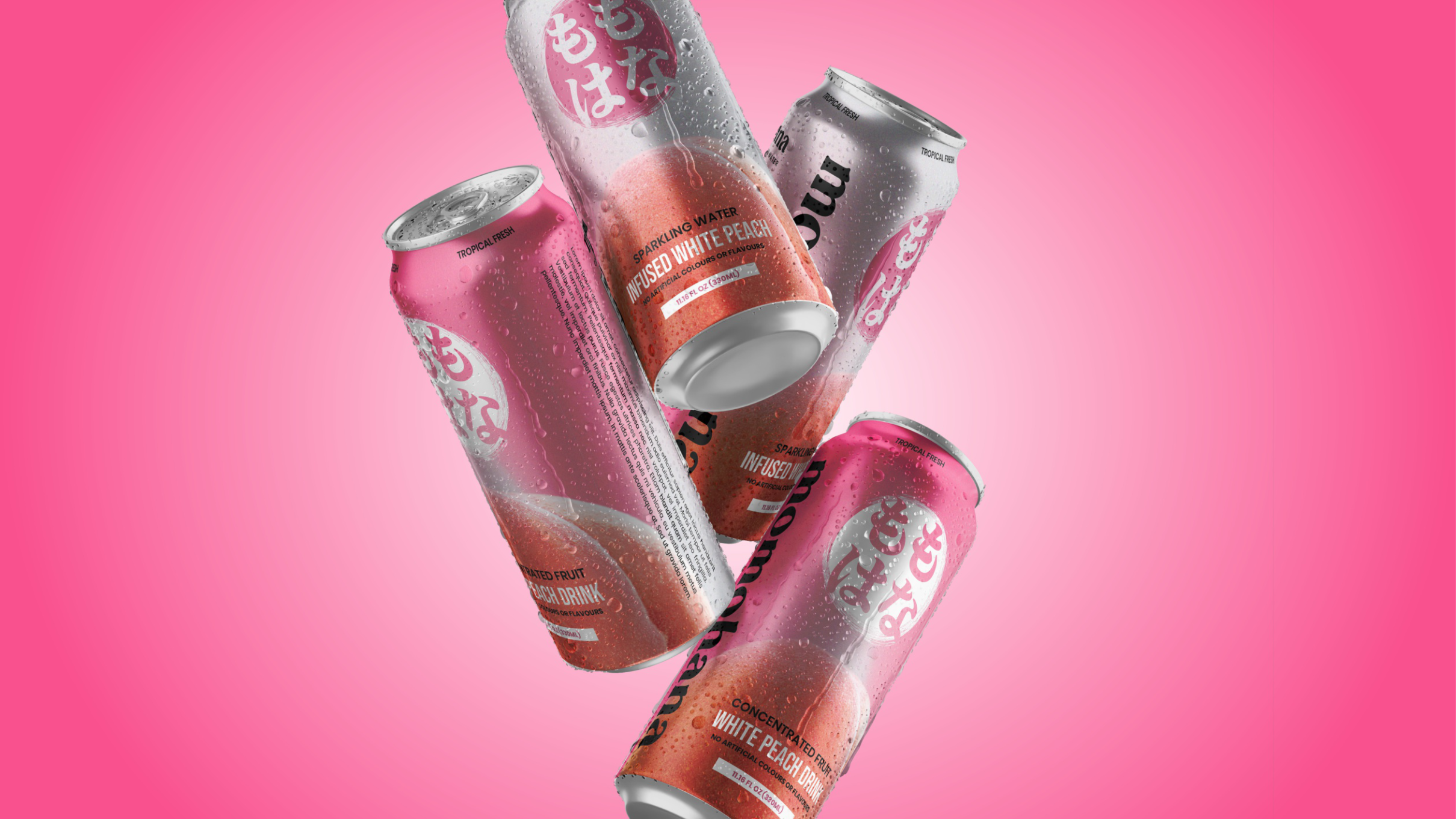
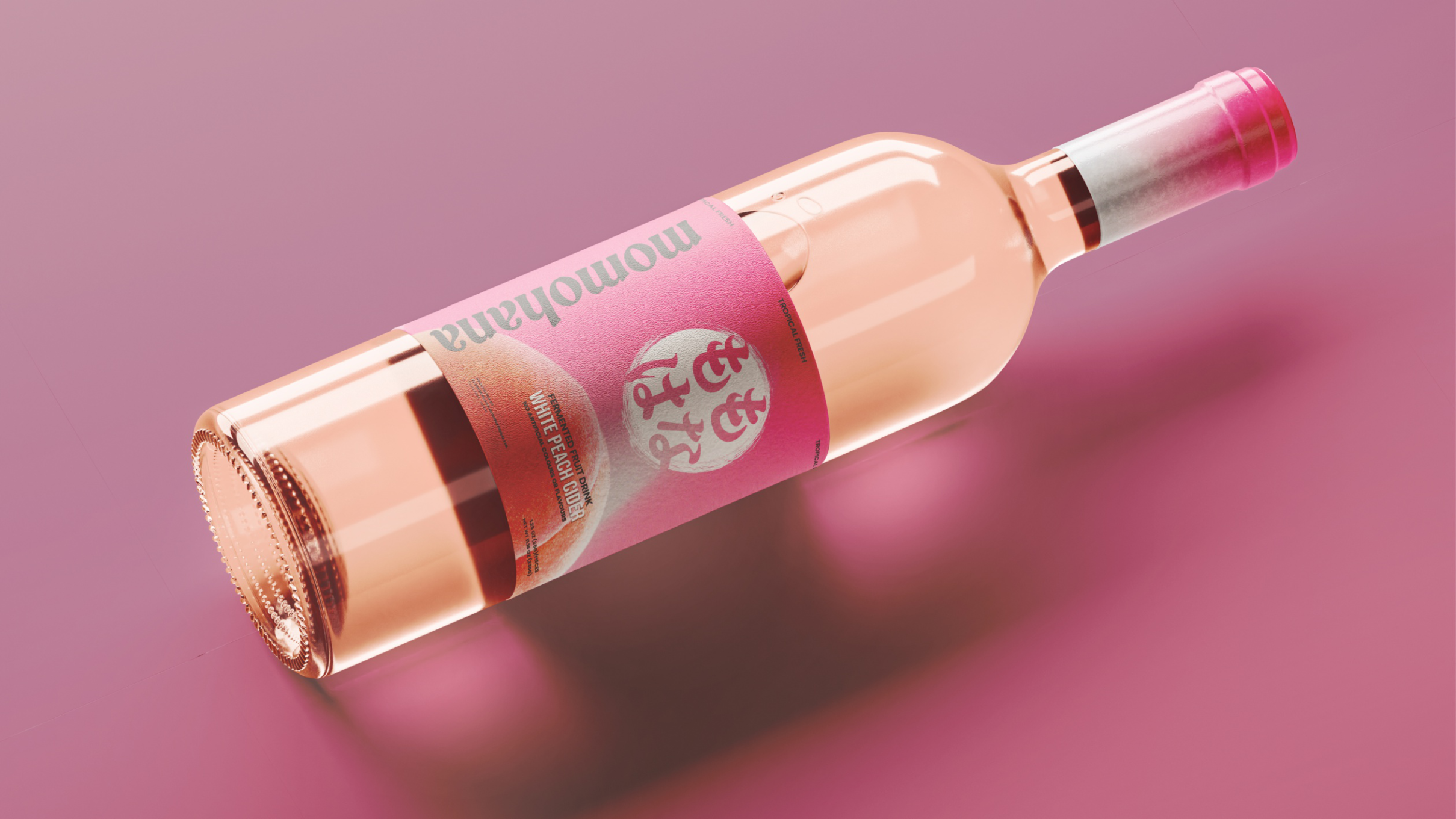
Can, pouch, cup and bottle — four pack formats on one grid. Water-splash photography, gradient back panel, full-height hiragana as primary shelf signal.
Guidelines, four pack mechanicals, a ten-frame launch carousel, story templates, an OOH triptych, and merch. Full handoff inside the third Friday.
The launch piece is a ten-slide Instagram carousel built as a single seduction: peach close-up, flower, mark reveal, palette, pack drop, splash, lifestyle, merch, OOH, sign-off. Each frame shares the brushed disc as a corner bug so the ten posts read as one argument — the product, resolved in a thumb-length scroll.
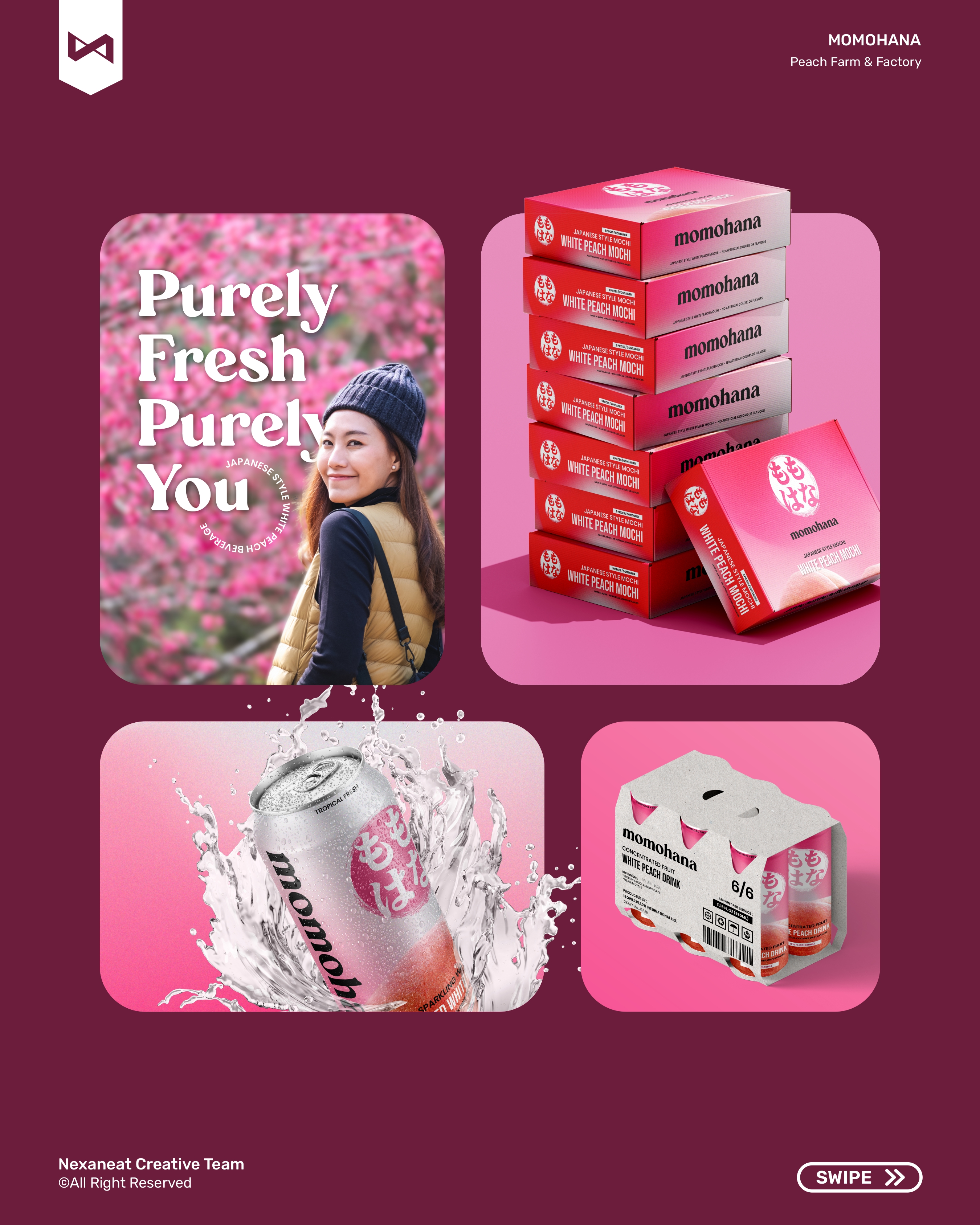
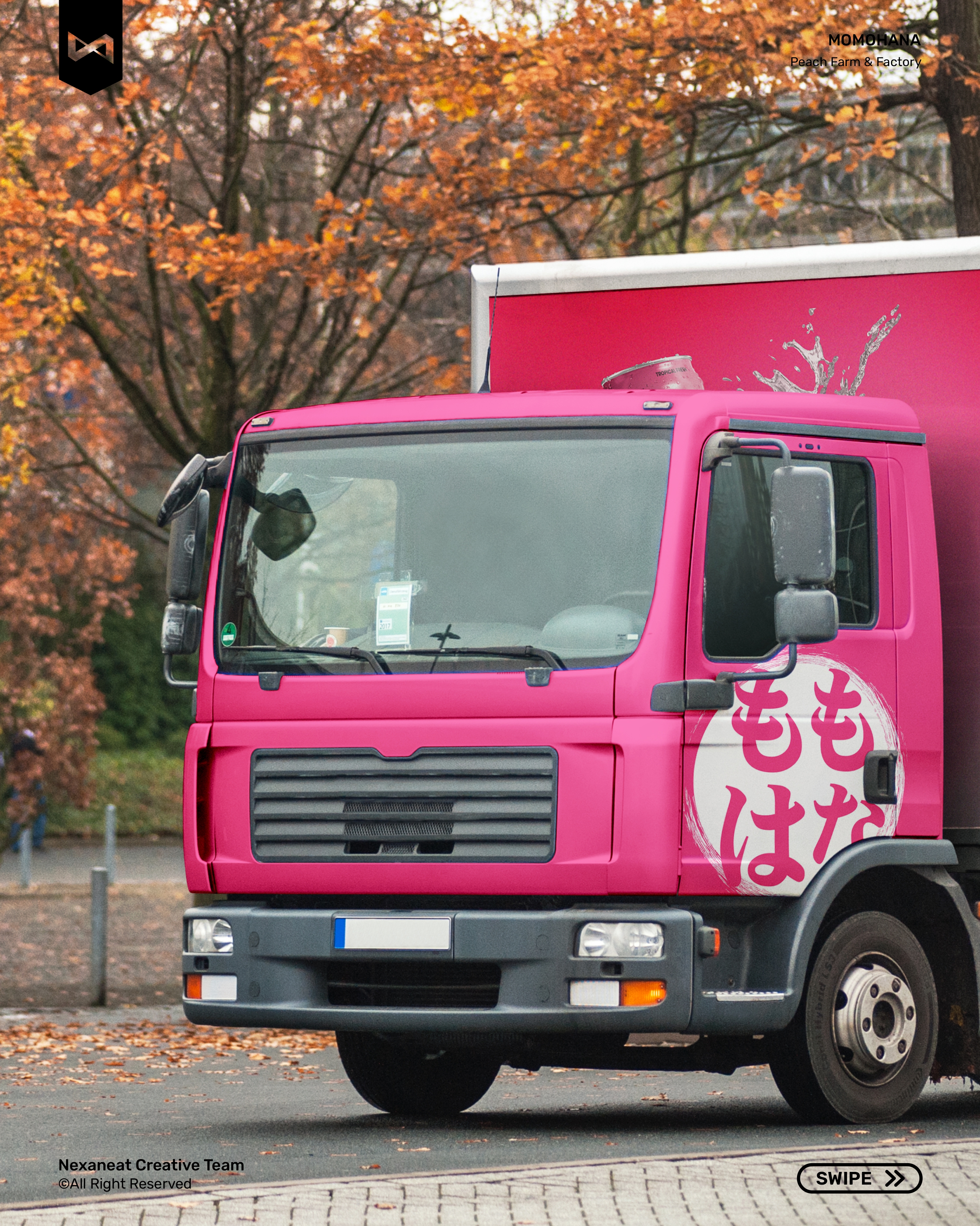
The same pansy-and-hiragana system walks from an aluminium can to a cotton tote without losing equity. Every touchpoint below leans on the same brushed disc, the same saturated pink, the same Poppins lockup — so the brand reads as one product whether you meet it in a 7-Eleven cooler, a night-market tote, or a bus-stop triptych.
 Can — Sparkling
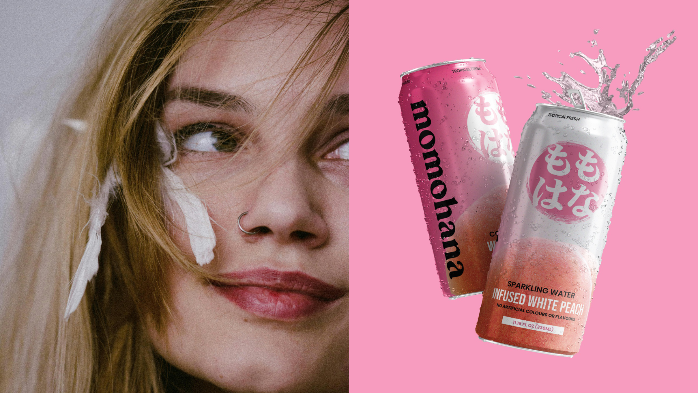 Lifestyle — the first bite
 Splash — water & fruit
 Pouch — 200 ml
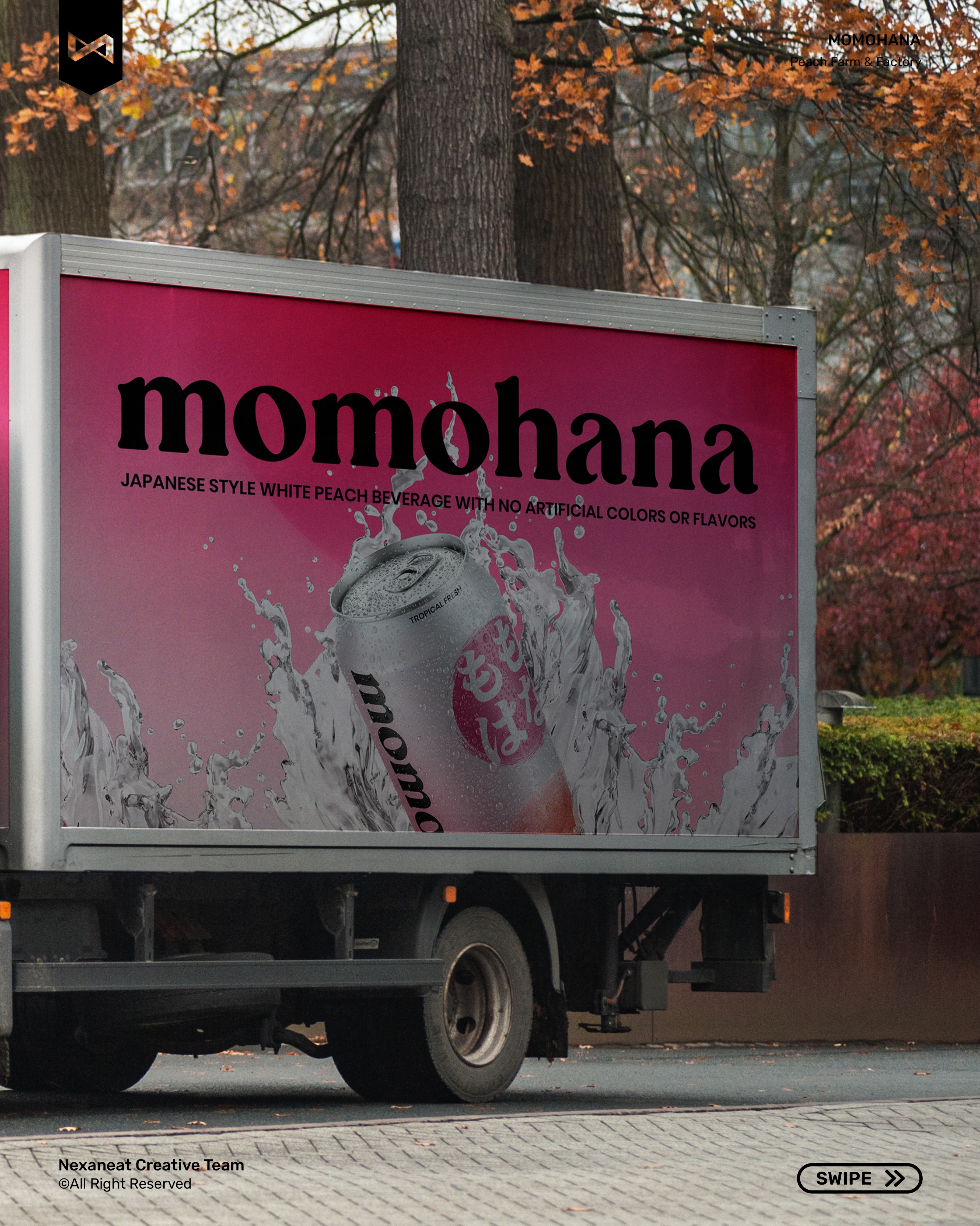
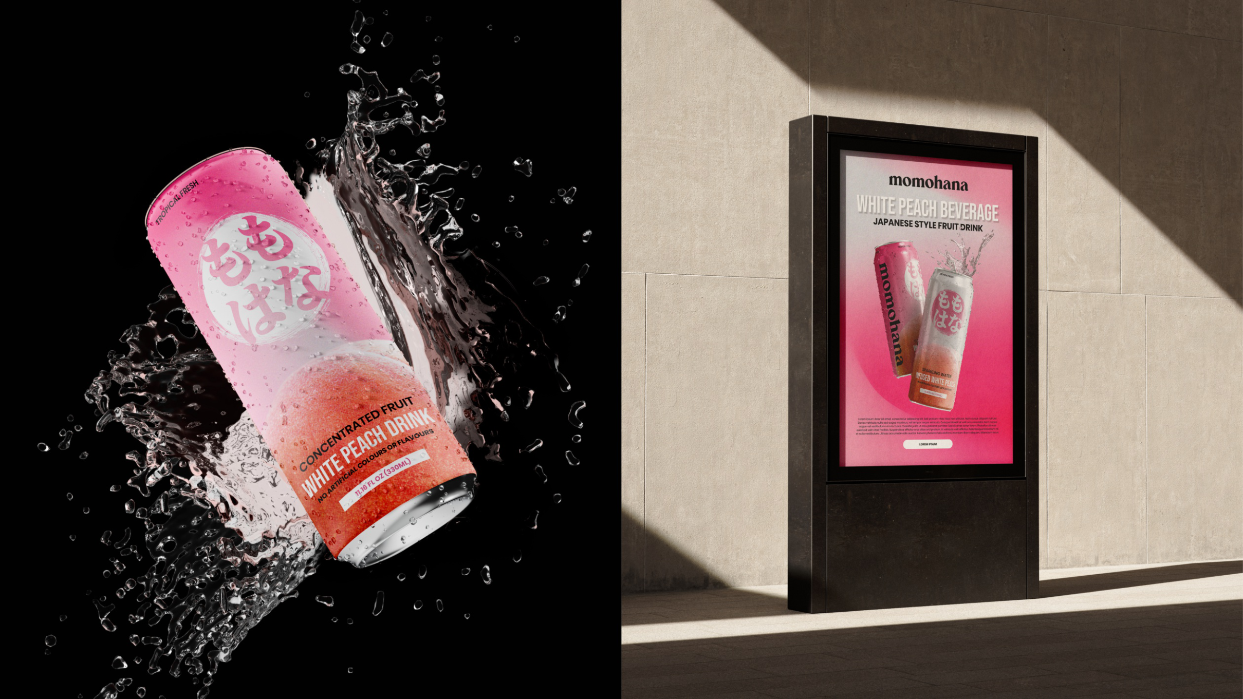
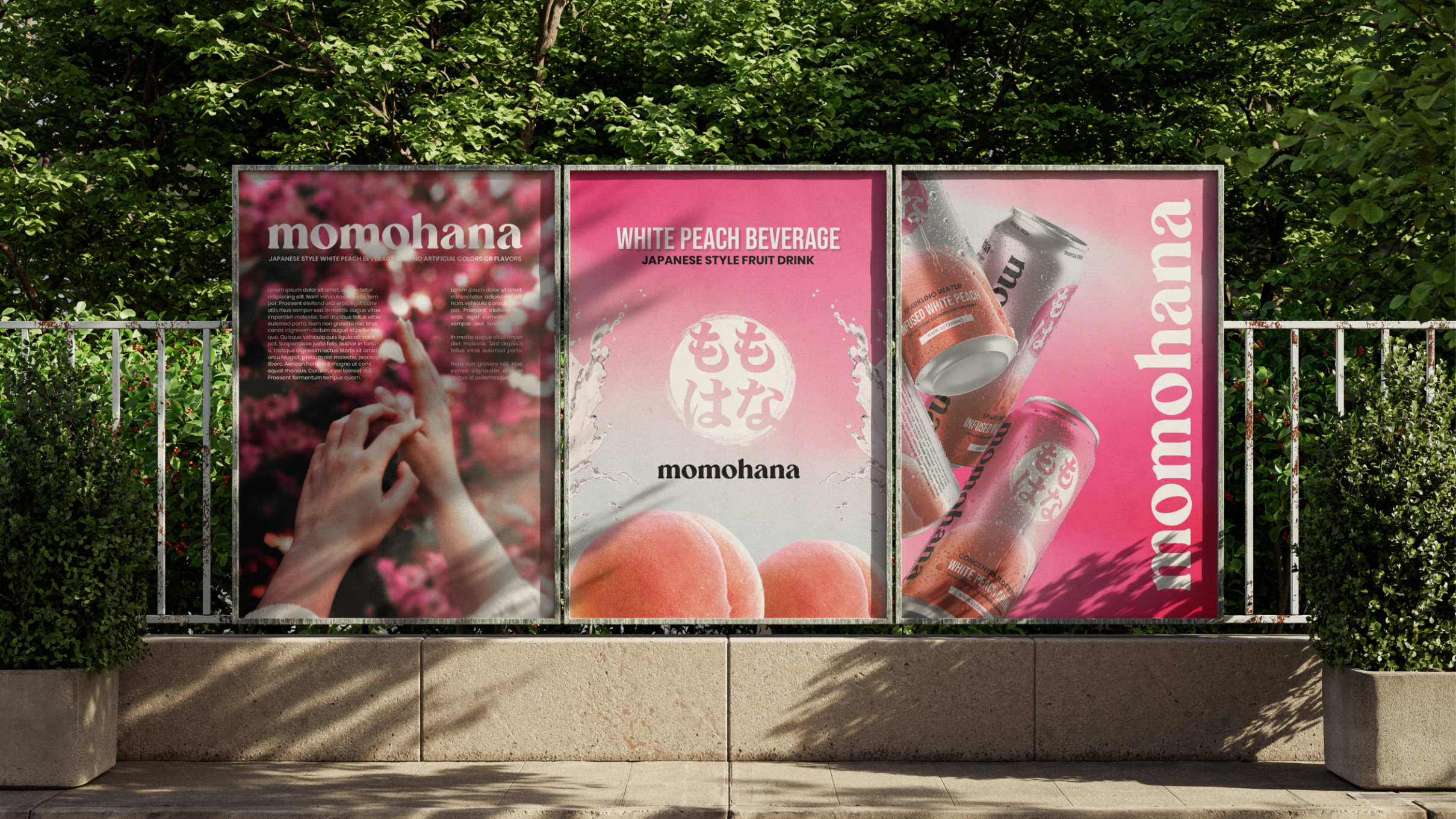 OOH — three-poster triptych
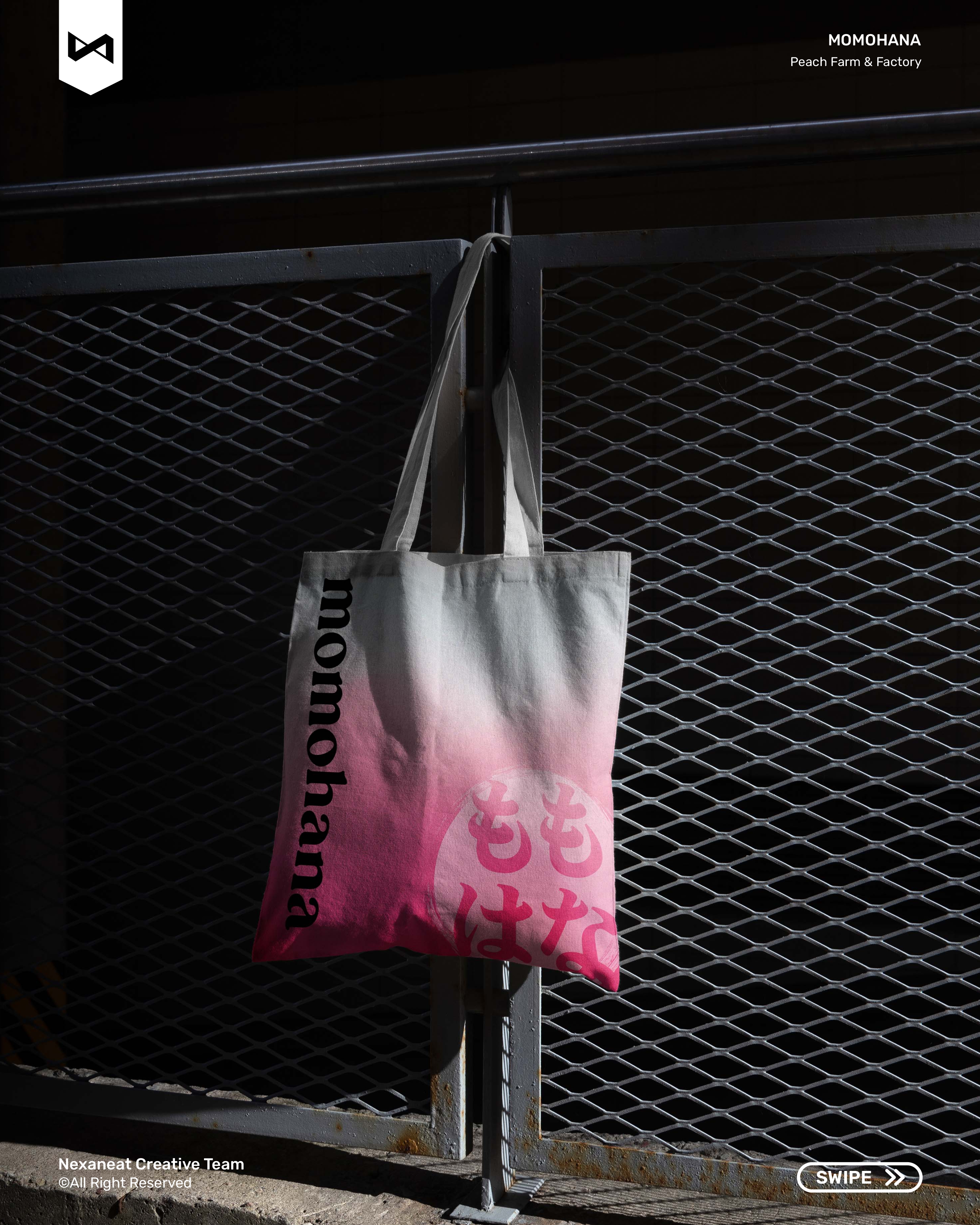
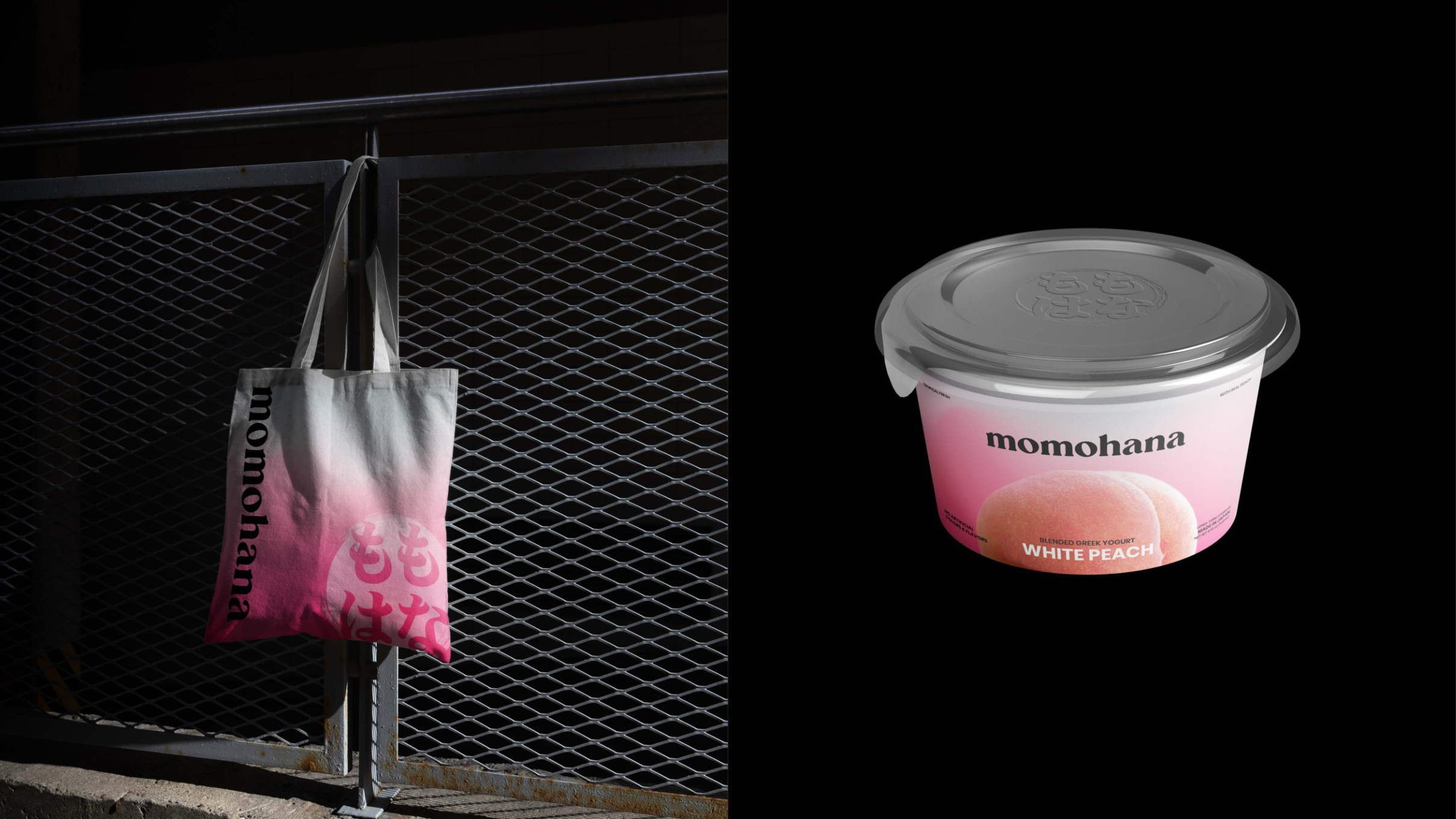
 Merch — tote & cup
Send a sentence about what you're building. Scope and timeline back in 48 hours.