A young Italian sauce brand asked us for a logo. We handed back six — each one pitched as a different business. The real job wasn't drawing a mark; it was forcing a decision about where Salvelli wanted to live: the supermarket shelf, the dinner table, or the gift shop.
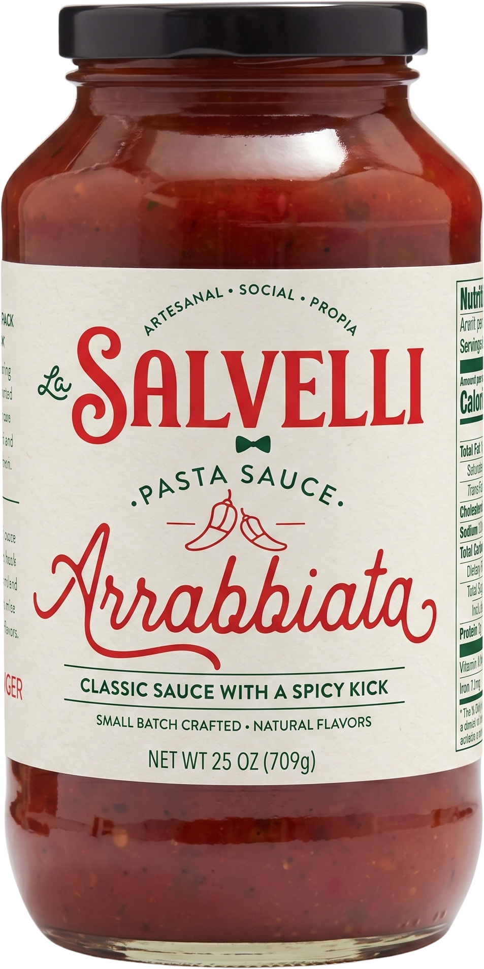
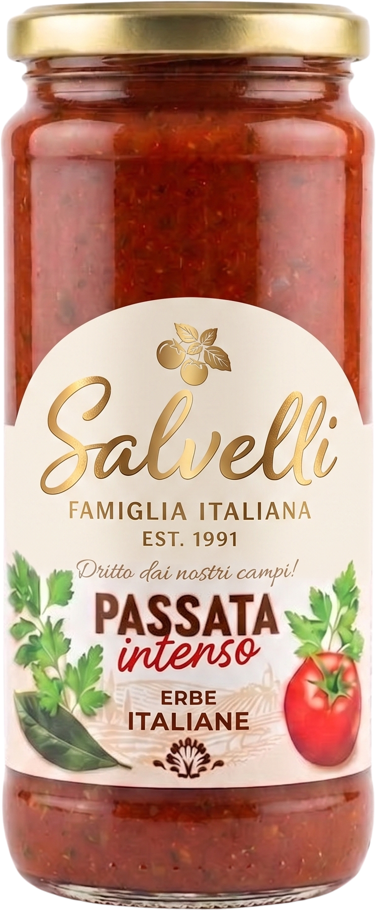
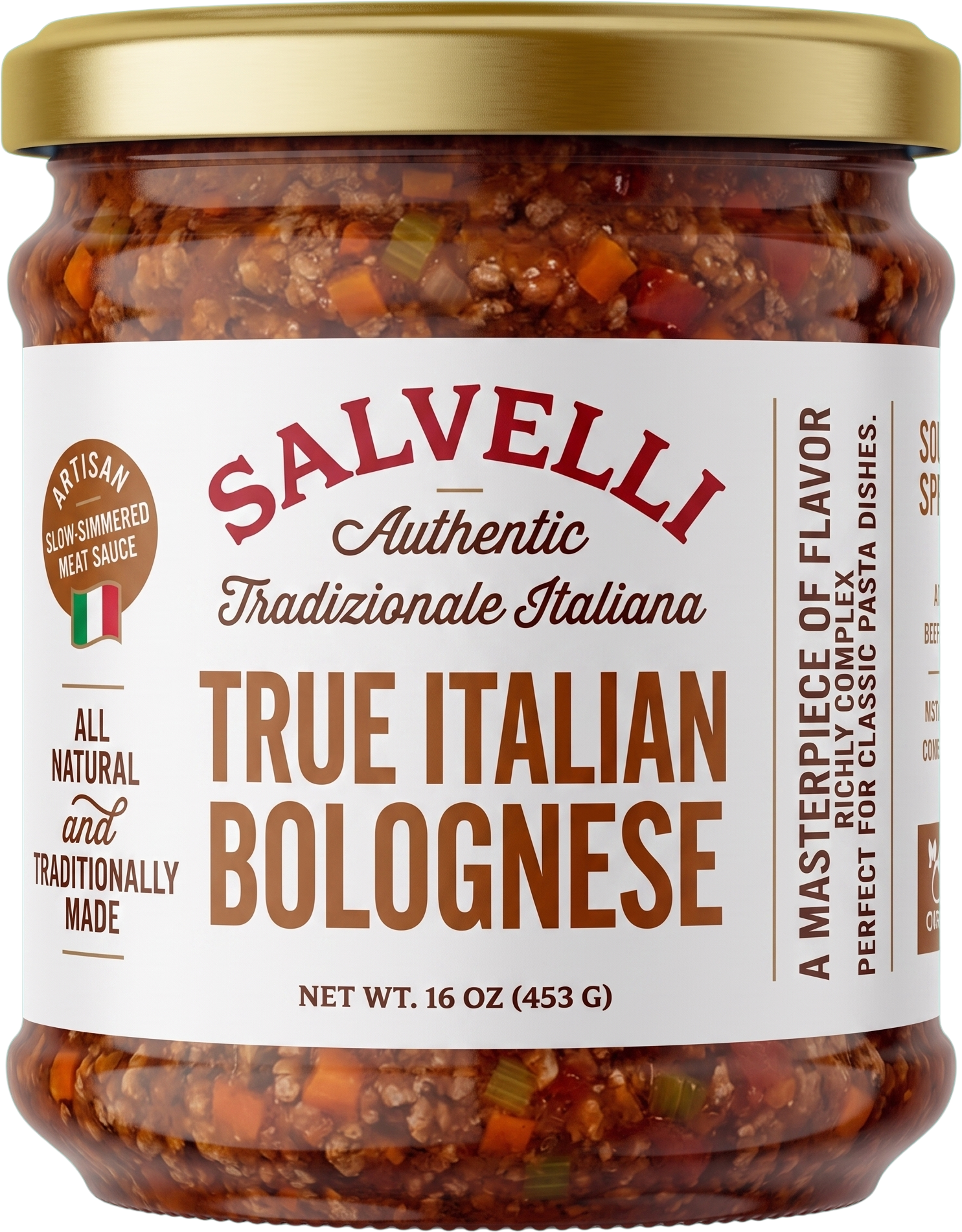
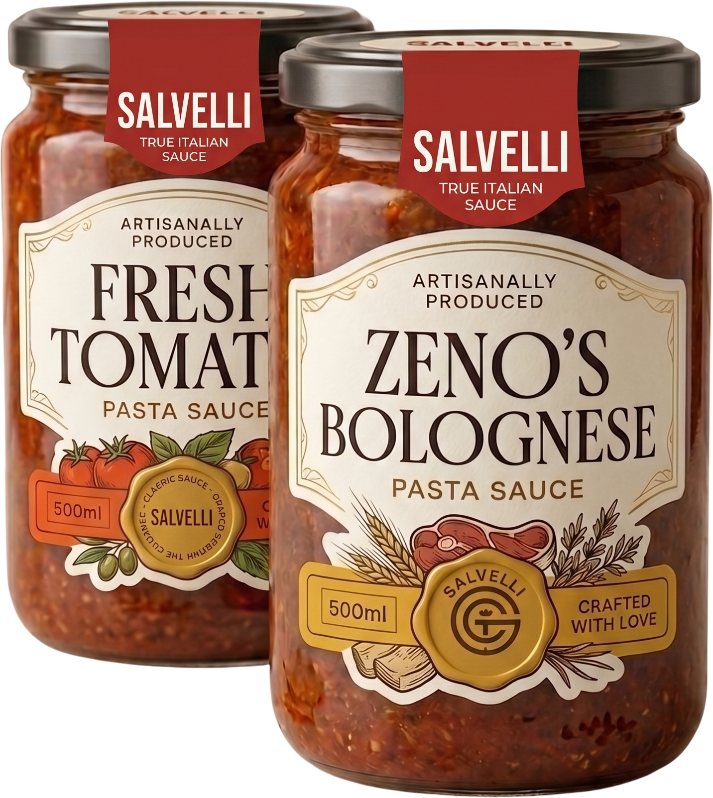
Most branding jobs end with one logo. Salvelli's started with a strategic question instead: a jar of Italian sauce can live in very different rooms. A tasting-menu restaurant. A Sunday kitchen. A supermarket shelf at 1.2 metres. A gift set in a specialty store. Each room rewards a different mark. So we drew six — an editorial wordmark, a maestro's signature, a trattoria script, a retail shield, a minimal system, and a premium "no-logo" route — and pitched each one as if it were the only answer.
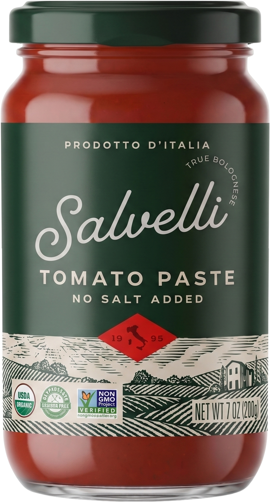
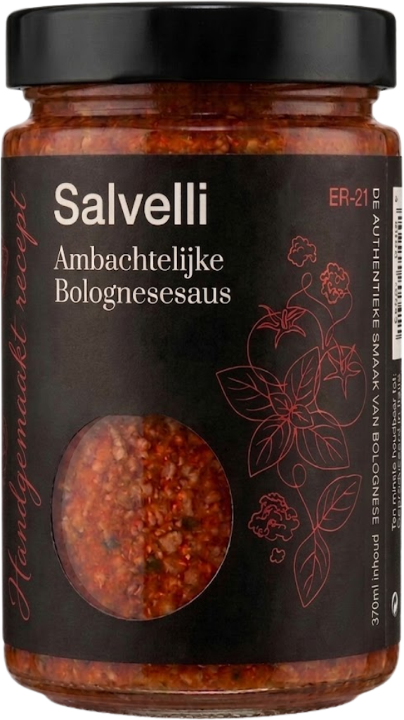
Every sauce brand sprints at the tricolore — green stripe, white stripe, red stripe, done. We pulled from ingredients instead. Pomodoro, basilico, terracotta, panna. It reads Italian at a glance (red and green still do the work) but it gives the system range: earth tones for the rustic direction, deep green for editorial, cream for premium. Colour psychology over colour cliché.
Typographic hierarchy does the positioning work. DM Serif Text carries the voice the brand wants in its headlines — editorial, plated, spoken slowly. Outfit handles everything the serif shouldn't: price tags, nutrition panels, the tiny app UI nobody wants to squint at. One voice for the menu card, one voice for the receipt.
A strategic exploration, not a logo draft followed by revisions. Each direction had to stand on its own.
Walked three supermarkets, photographed the sauce aisle, interviewed the founder. Identified the gap: every Italian sauce brand runs at the same cliché — flag stripes, red gingham, nonna silhouette.
Six territories, each deliberately in a different quadrant: editorial, signature, rustic, shield, modern, premium. Pitched each as a stand-alone business, not a variant of the same mark.
Rendered each direction on the pack it would sell on — pasta jar, passata carton, gift tin, tomato puree. Pressure-tested each at shelf distance, in a thumbnail, on a pantry shelf.
Presented a navigable scroll-deck alongside a print PDF, so the founder could compare at scale. Six live moodboards, one 45-minute call to decide which door Salvelli opens first.
A PDF attached to an email is a graveyard for logo directions. We built the pitch as a navigable microsite instead — one full-bleed screen per direction, each dressed in its own world (colour, type, mood) so the founder walked through six rooms before choosing one. Scroll-snapped, arrow-nav on the right, printable as a 16:9 deck for the meeting.
Send a sentence about what you're building. Scope and timeline back in 48 hours.