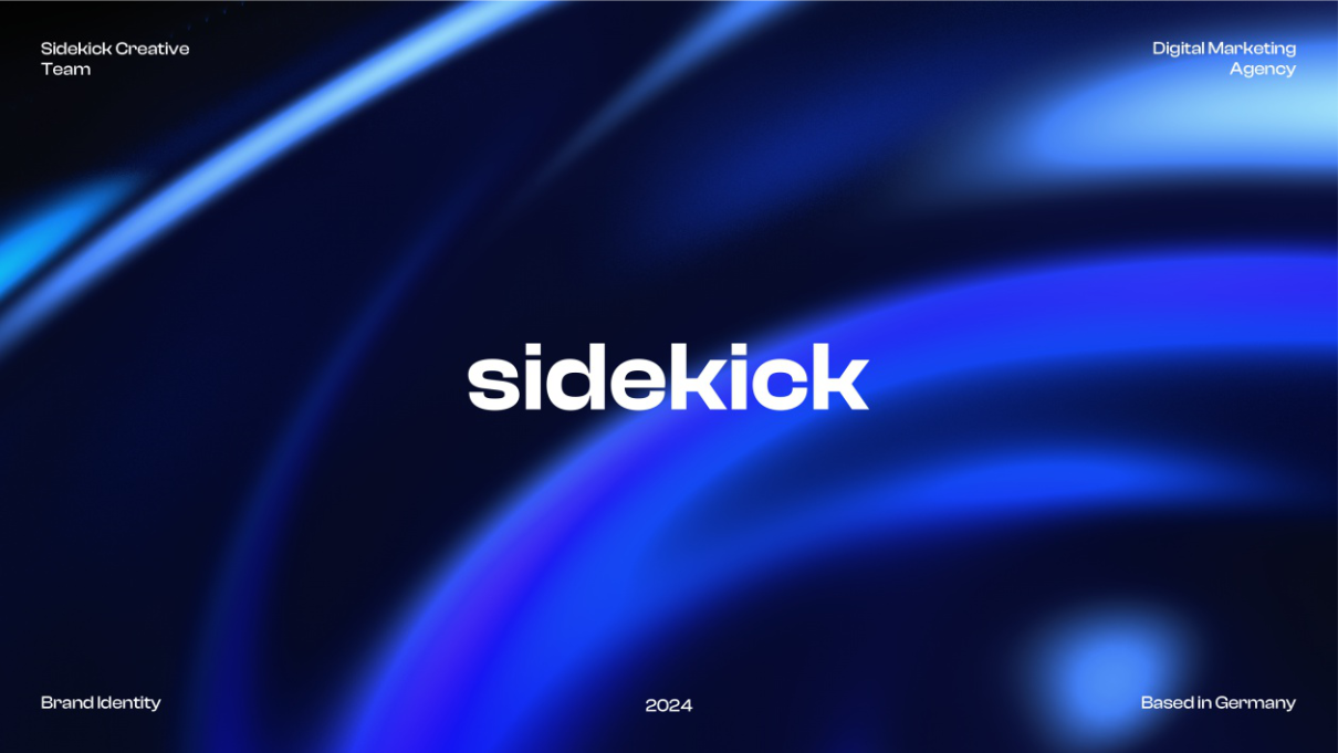
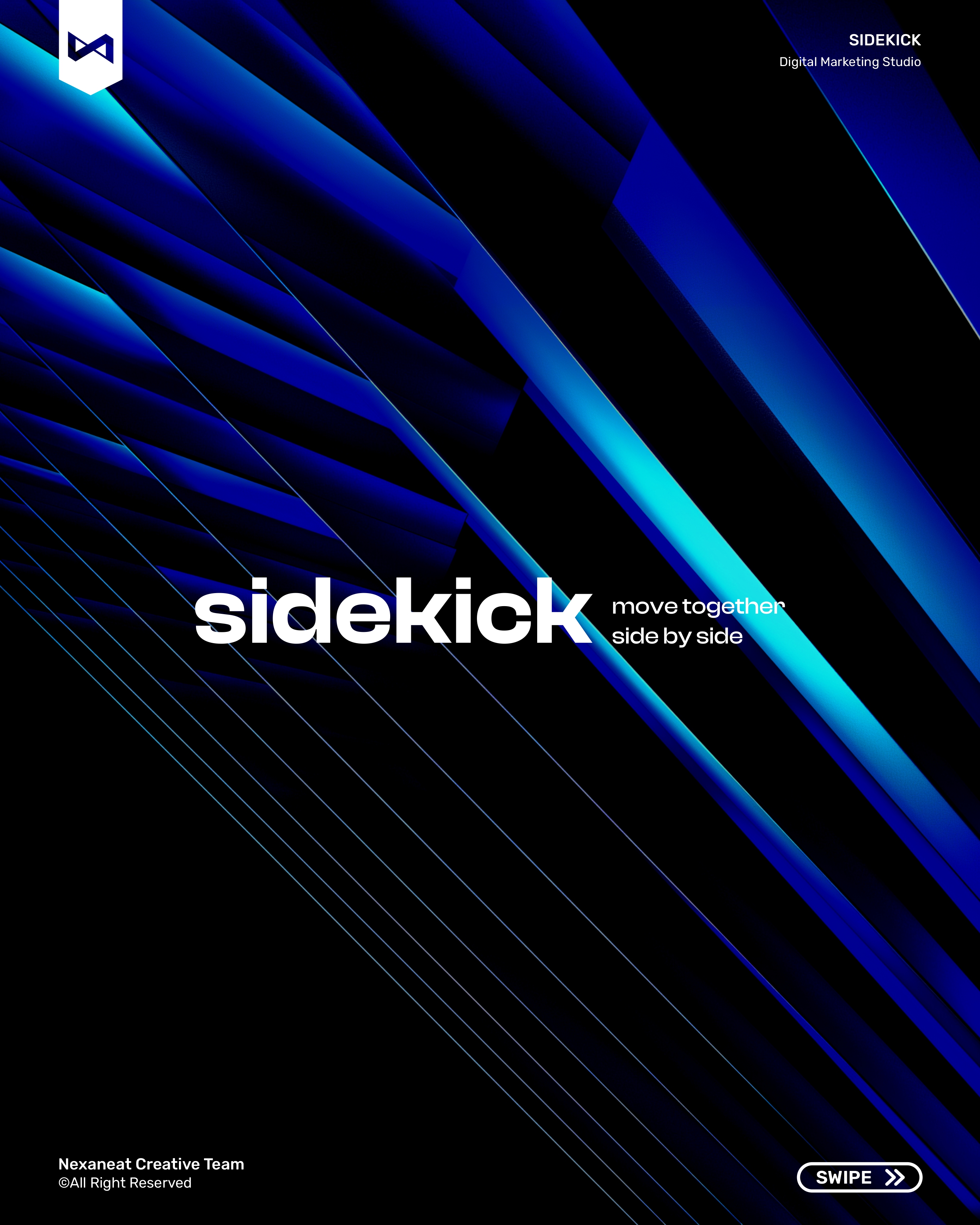
A Berlin-based digital marketing agency wanted an identity that felt like the operator in the headset next to you — not another pastel-gradient growth consultancy. We built the system around a goggles-and-grid monogram, an electric-blue night palette, and a voice that reads like a co-pilot briefing: short, directional, confident. The result is a brand that looks like software, sounds like a teammate, and scales from a 24-pixel app icon to a four-metre trade-show banner without softening.
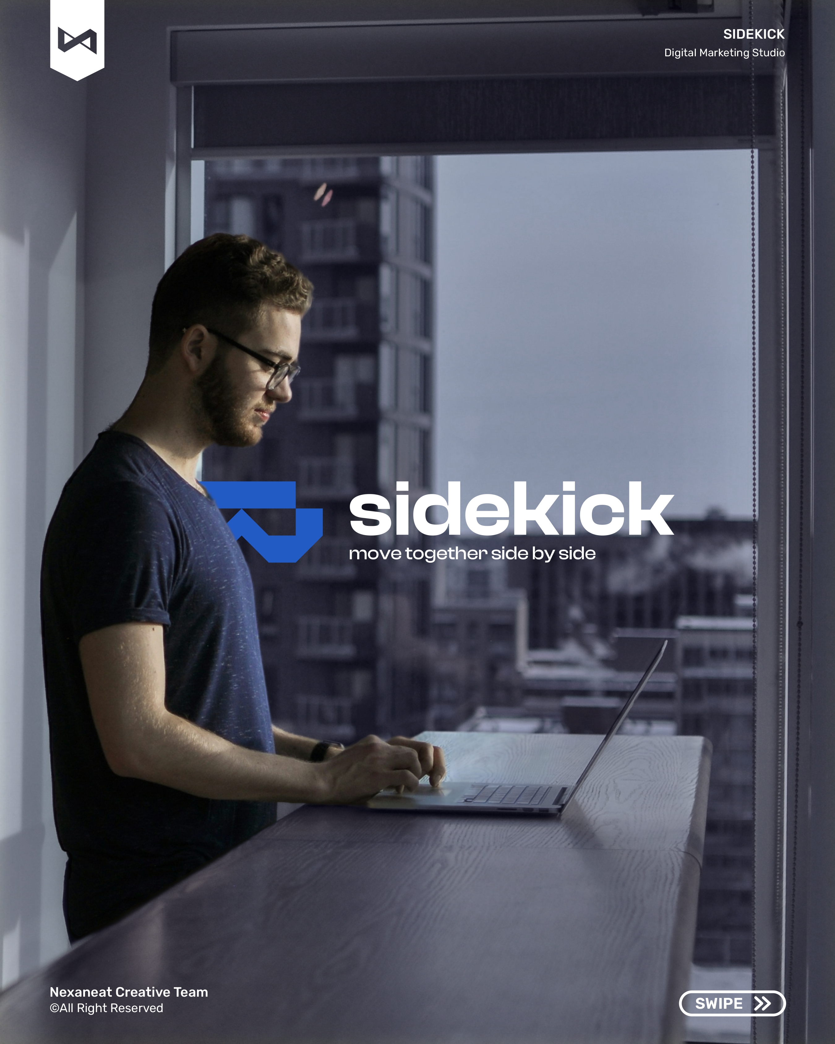
The monogram is a stacked-visor glyph — two stepped trapezoids derived from a 5×8 modular grid that riffs on aviator goggles, an esports headset, and an old-school arcade HUD all at once. Every angle in the mark is a 45° or 90° cut on that grid, so the form can be redrawn with a ruler by anyone in the studio without losing equity. That geometric discipline is doing two jobs at once: gestalt closure (the two shapes read as one face instead of two bars) and semiotic shorthand for "tool-user" — the goggles signal a pilot, a diver, a gamer, anyone who straps on gear to go further. Sidekick isn't the hero; Sidekick is the gear the hero wears.
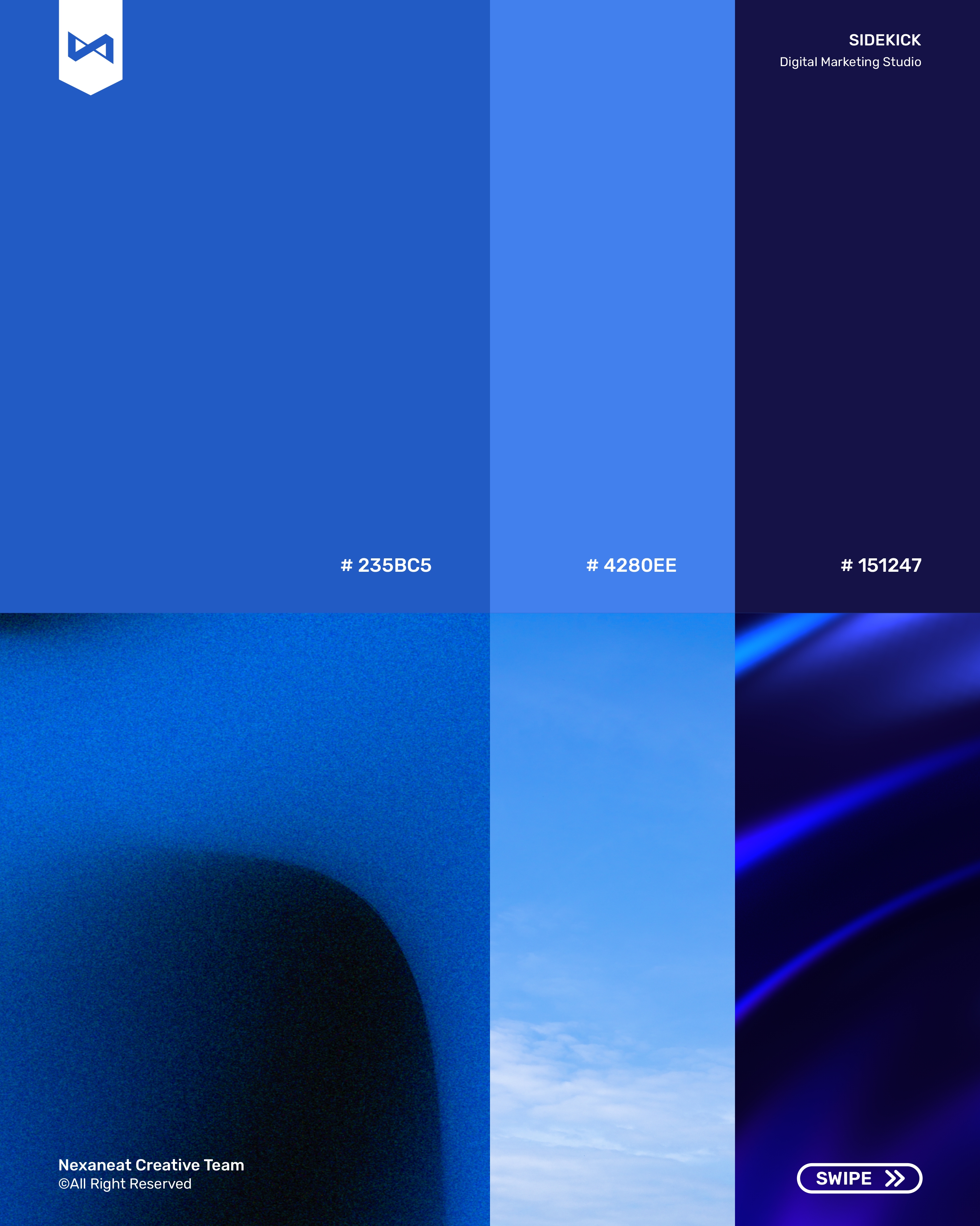
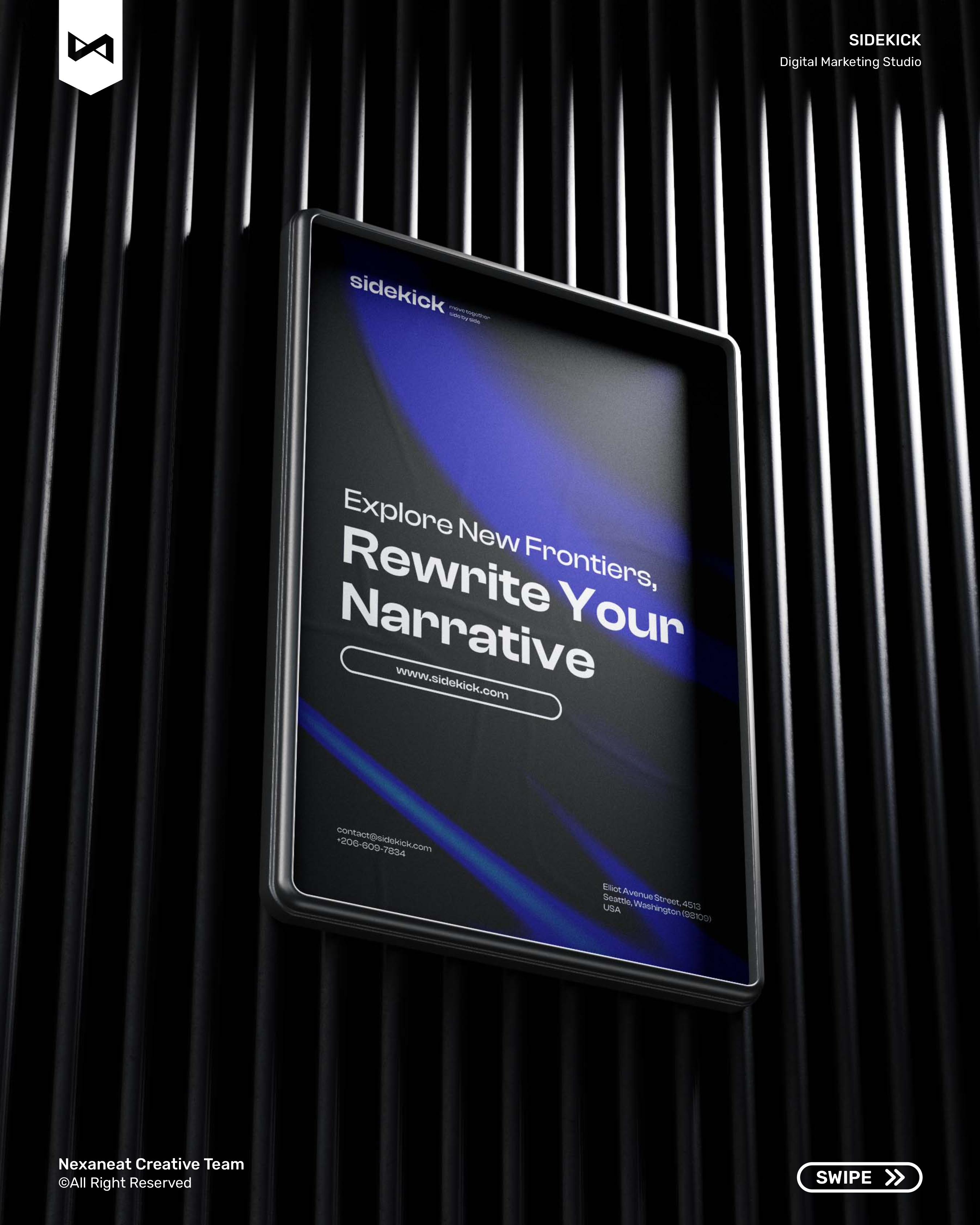
Digital marketing lives on a screen — so the palette is built for one. Midnight Navy #061033 sits at the bottom of the stack as the "operator cockpit" background; it reads as professional, engineered, not-another-SaaS-purple. On top of it, Sidekick Blue #0033D6 does the primary heavy lifting — a classic confidence-and-trust blue, the same hue band that UI research associates with reliability and precision. The brighter Electric Blue #2F78FF is reserved for CTAs and highlight moments, because it out-contrasts the base layer by over 4:1 — meaning a button literally glows against the navy. Sky #6FA8FF handles gradients and data-viz. White does the rest. No secondary accents, no warm tones, no escape hatches — the restraint is the point.
The display face is Space Grotesk — a technical sans with a narrow aperture and tightly-cut counters that reads as considered, engineered, slightly off-world. Paired with a Poppins UI stack for body copy and interface labels, the system achieves a deliberate serif-for-feeling / sans-for-facts split inverted: the display face is already the feeling (control, precision, altitude), so the body sans can do pure information work. The monogram's trapezoid angles reappear inside the Space Grotesk k and d — a gestalt rhyme between mark and word that ties the logotype to the system without a single extra flourish.
The lockup locks from a 24 px app icon to a 4 m trade-show banner. Electric Blue does the CTA, Midnight Navy does the cockpit, and the goggle mark stays sharp at every scale because it's drawn on a grid — not traced. The brand doesn't shout. It briefs you, then gets out of the way.
Agencies rebrand agencies all the time — so half the risk is ego, not craft. We ran tight weekly locks, kept the mark on a grid from day one, and finished with a voice-and-tone workshop so the copy sounds like Sidekick even when we're not in the room.
Pulled 30 competing agency sites — Berlin, London, Lisbon, New York. Finding: 78% defaulted to pastel gradients, soft serifs, and the word "impact". The open lane was technical, operator-voiced, night-mode.
Tested three directions: arrow-sidekick (chevron lockup), goggles-monogram (stacked visor), and bracket-system ([s]). Goggles won on scalability and the "gear for the hero" metaphor.
Palette locked, Space Grotesk + Poppins pair tested at 12 px UI and 240 pt display. Stationery, deck templates, invoice, lanyards and apparel laid out on one modular grid.
Guidelines doc, ten-slide Instagram launch, story kit, a website keyframe, packaging, and a voice-and-tone one-pager. Full handoff inside the fourth Friday.
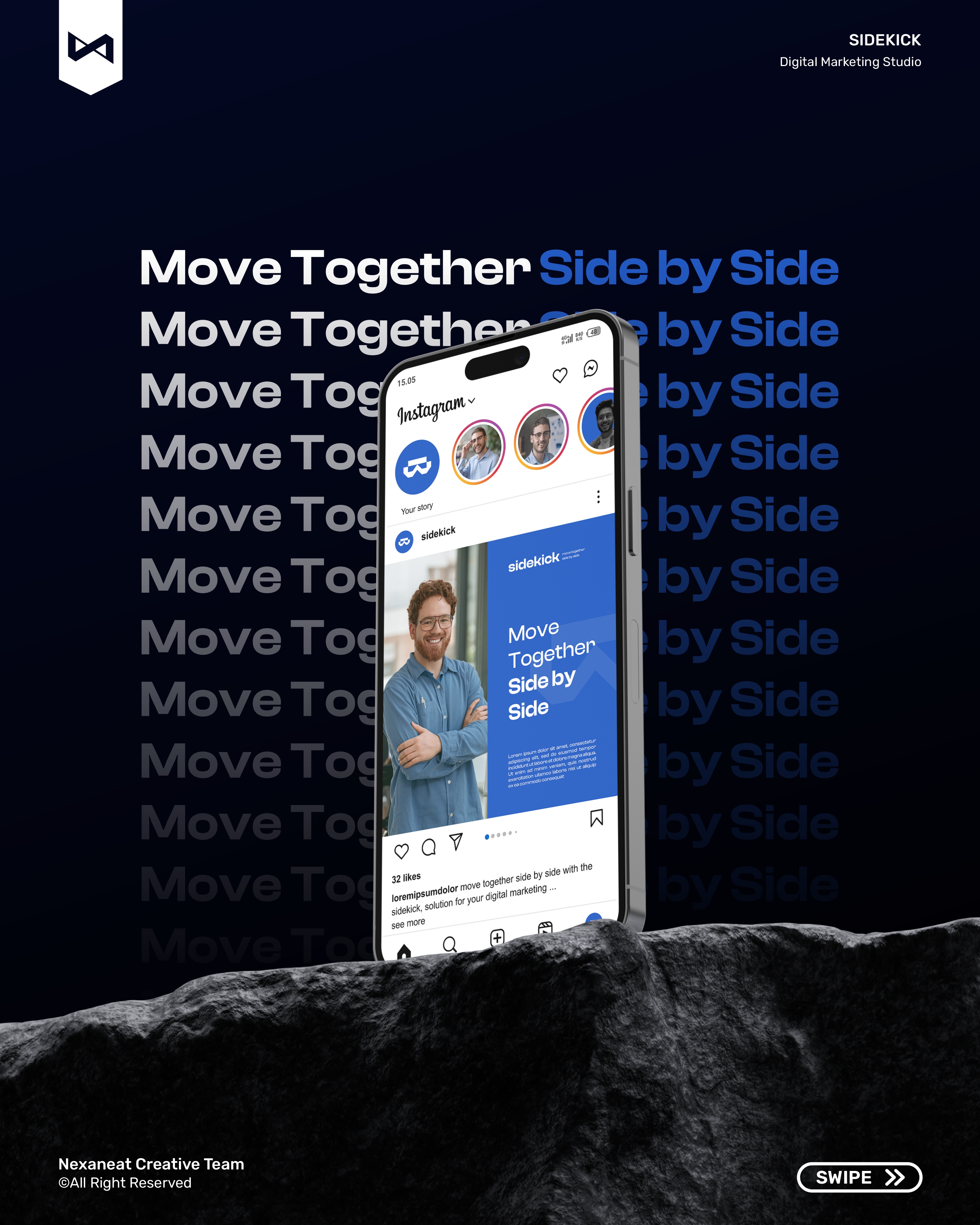
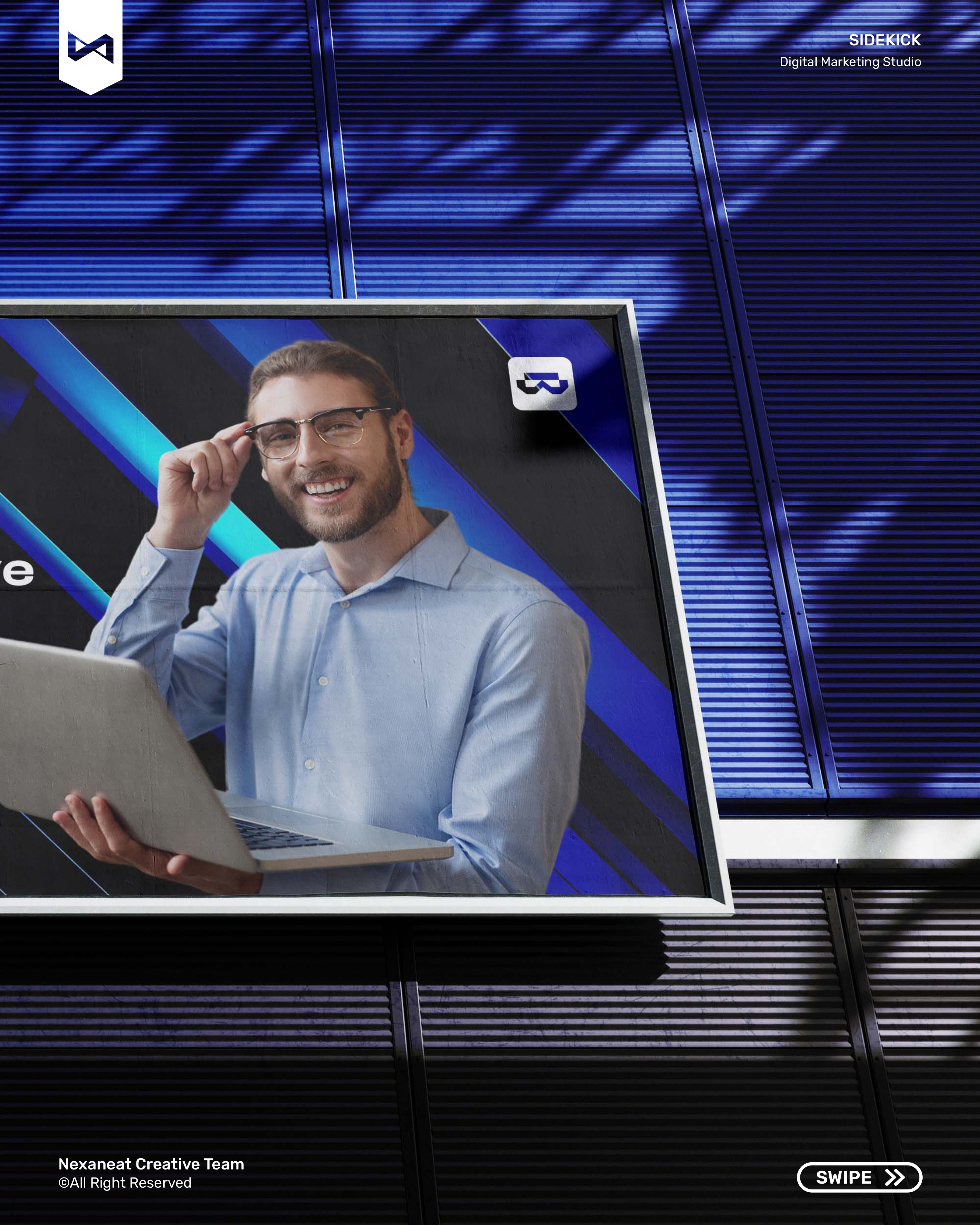
The launch piece is a ten-slide Instagram carousel that walks a reader from crafting stories to rewriting your narrative. Each frame shares the goggle mark as a corner bug and a thin vertical "cockpit line" down the gutter, so the posts read as one HUD — the agency, resolved in a thumb-length scroll.
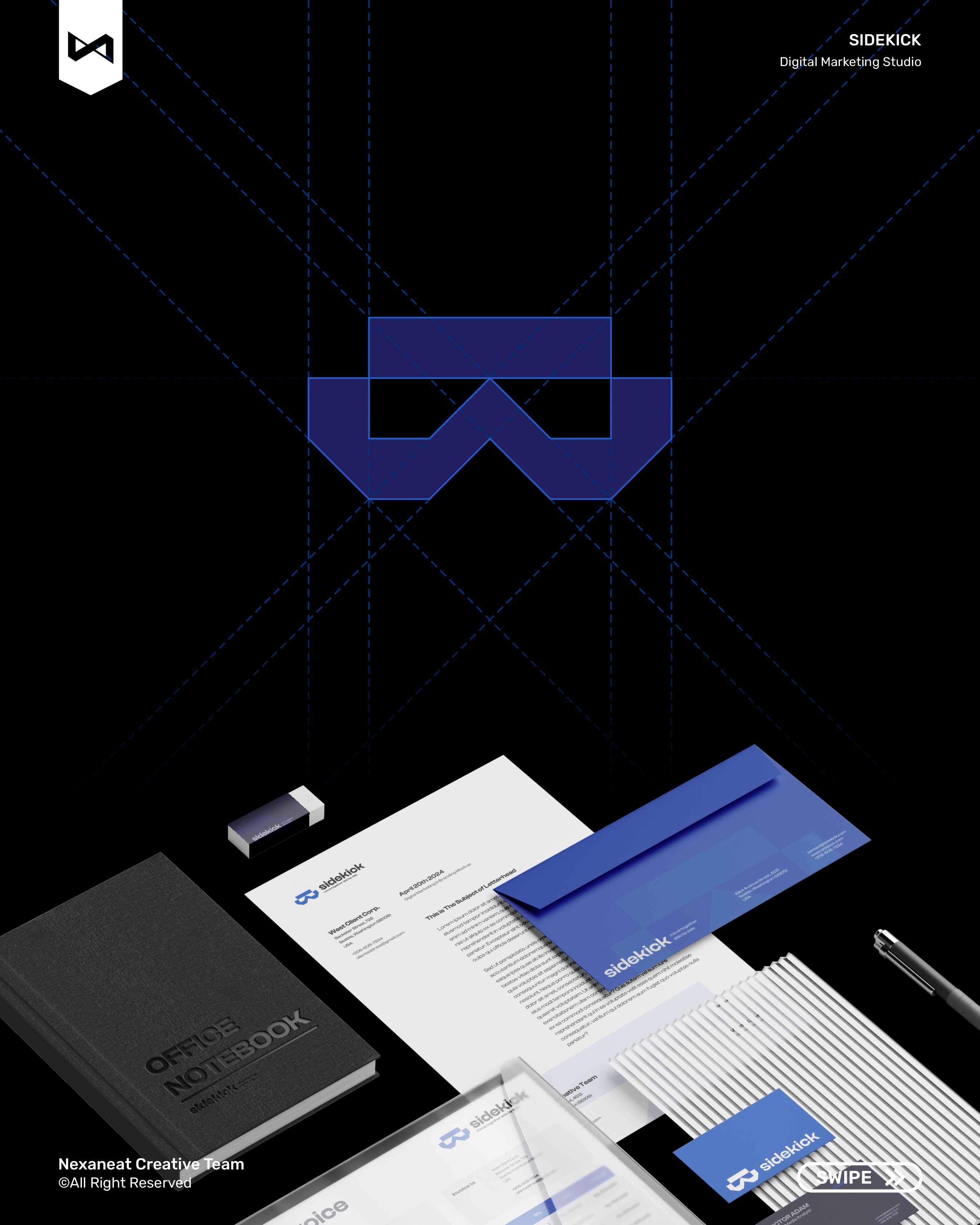
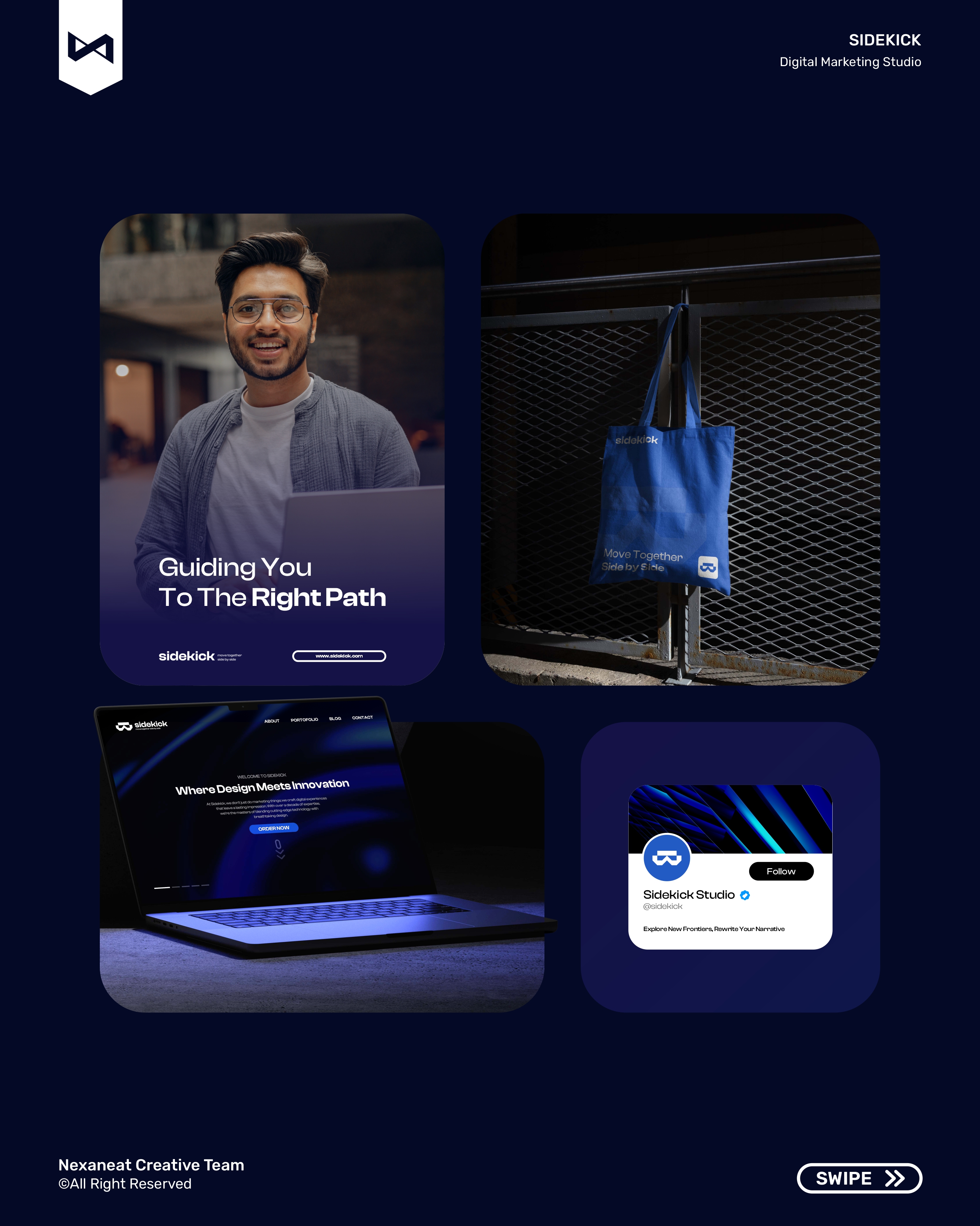
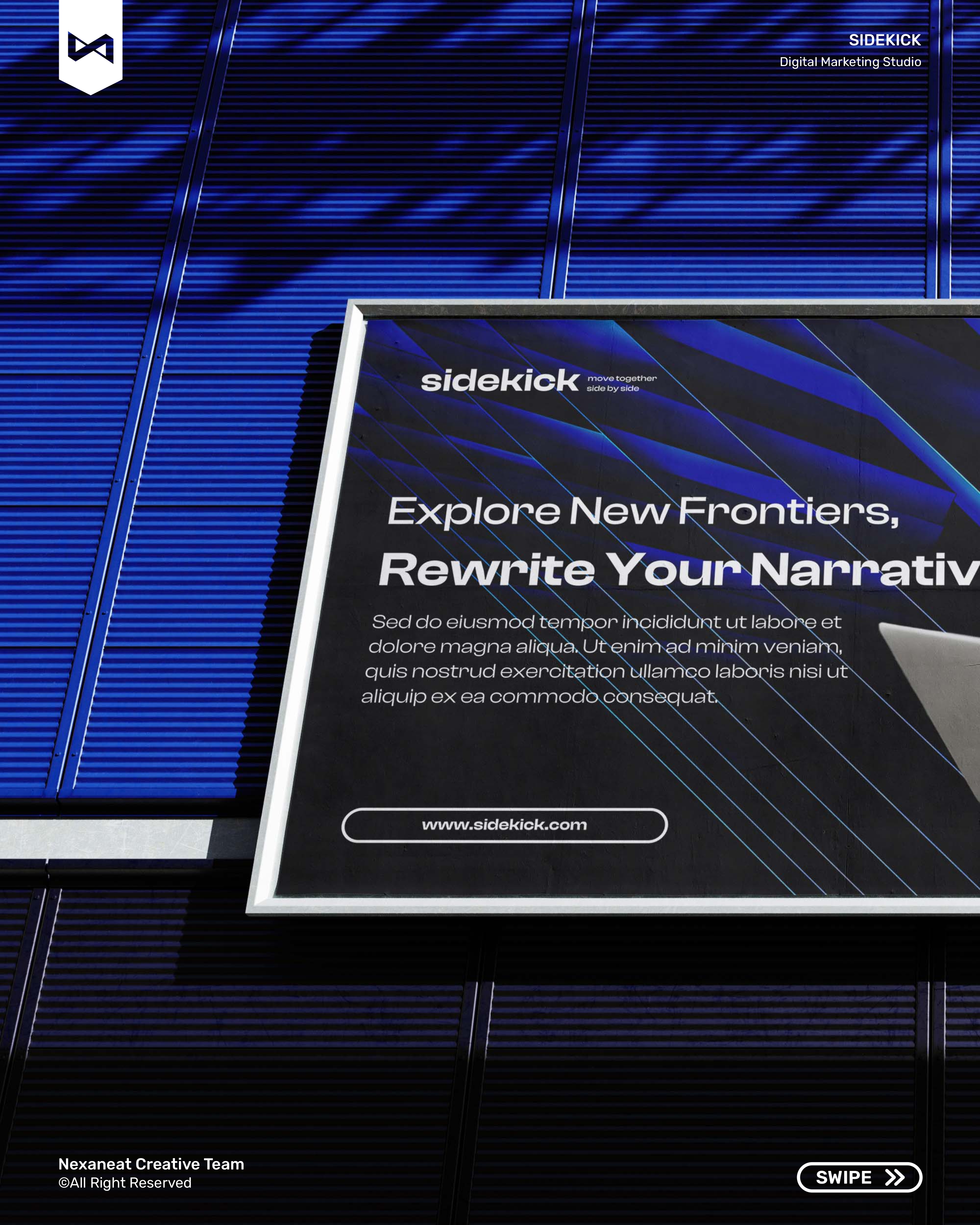
The same goggles-and-grid system walks from a paper invoice to a lit-glass office sign without losing equity. Every touchpoint below leans on the same modular grid, the same Midnight Navy base, the same Space Grotesk lockup — so the brand reads as one operator whether you meet it in a pitch deck, a trade-show booth, or the app icon on your second screen.
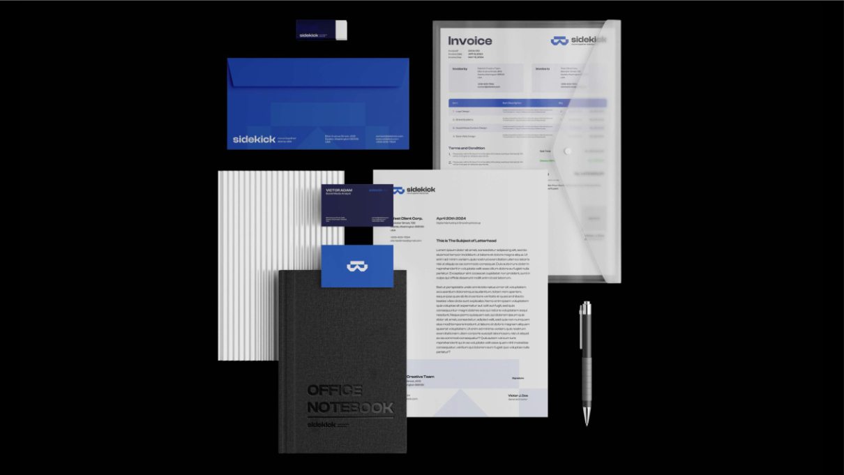 Stationery — one grid
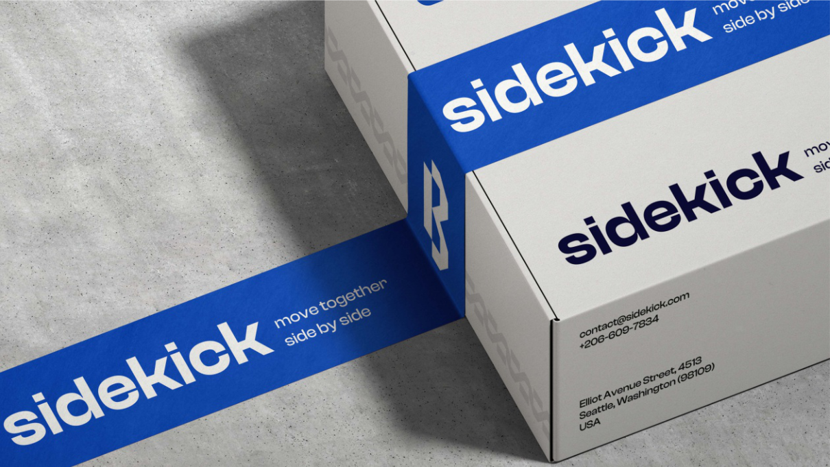 Packaging — parcel
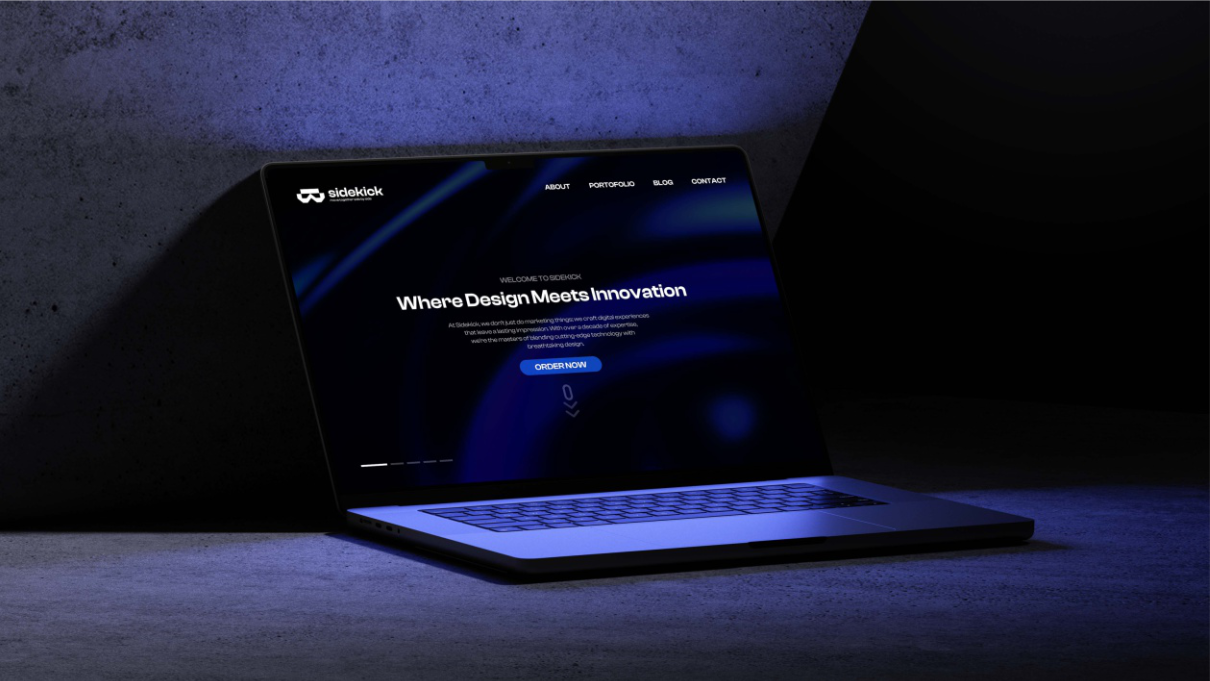 Web — dark cockpit
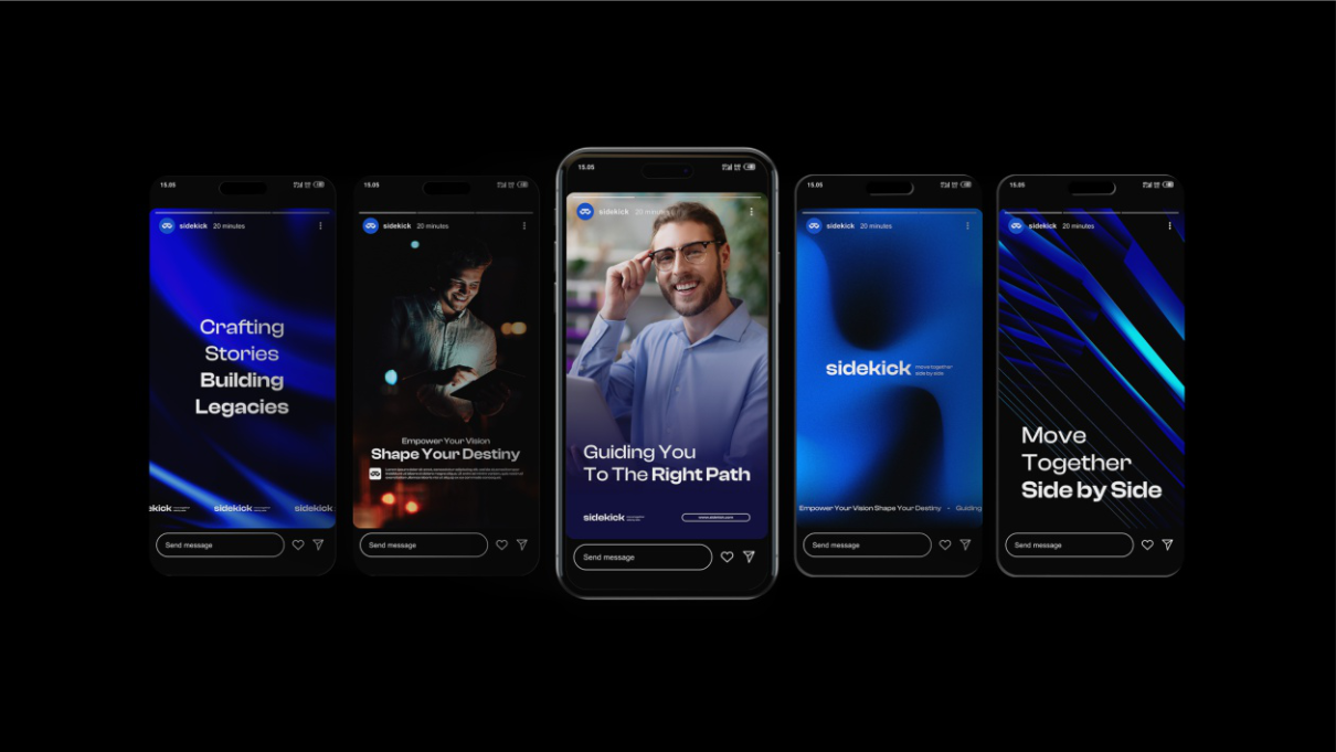 Stories — kit of five
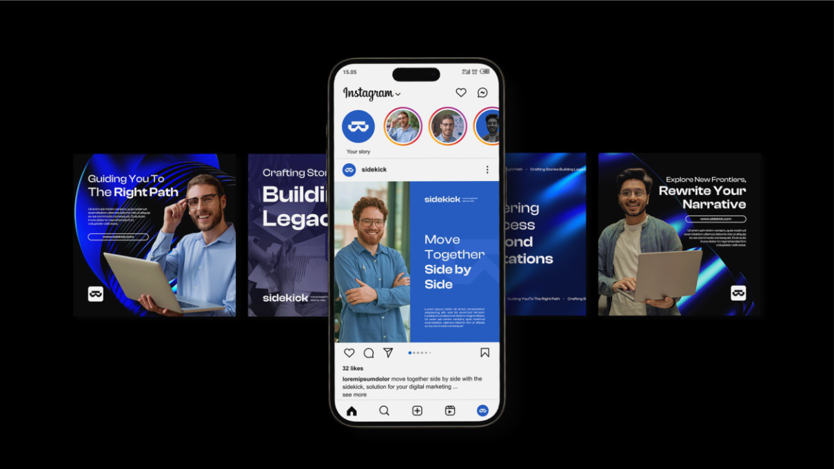 Social — feed grid
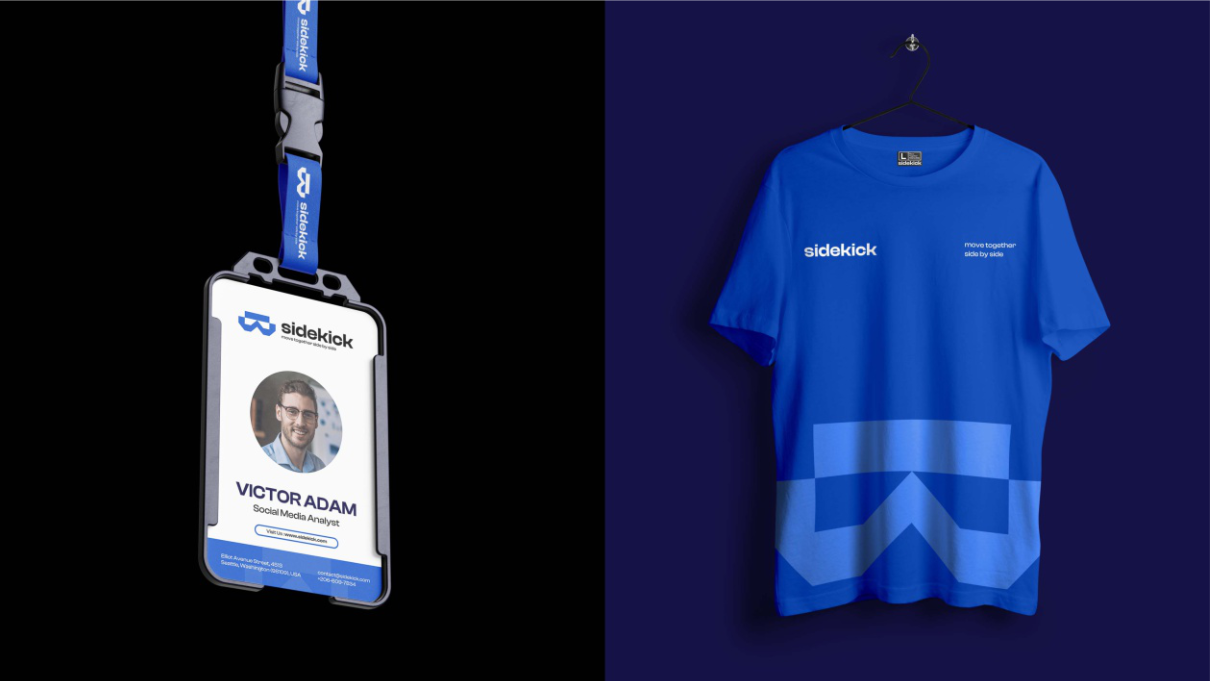 Apparel — team kit
Send a sentence about what you're building. Scope and timeline back in 48 hours.