A Netherlands-based cake and pastry shop wanted an identity that felt home-baked, not chain-baked — warm, hand-laid, and confidently old-fashioned in a category crowded with mint-green minimalism and tech-bakery clichés. We built a retro-serif wordmark around a single hand-drawn wheat sprig, locked it into a muted, oven-warm palette of Mummy Brown and Apricot Glaze, and ran the system from pastry boxes to bus-shelter posters so every touchpoint smelled the same.
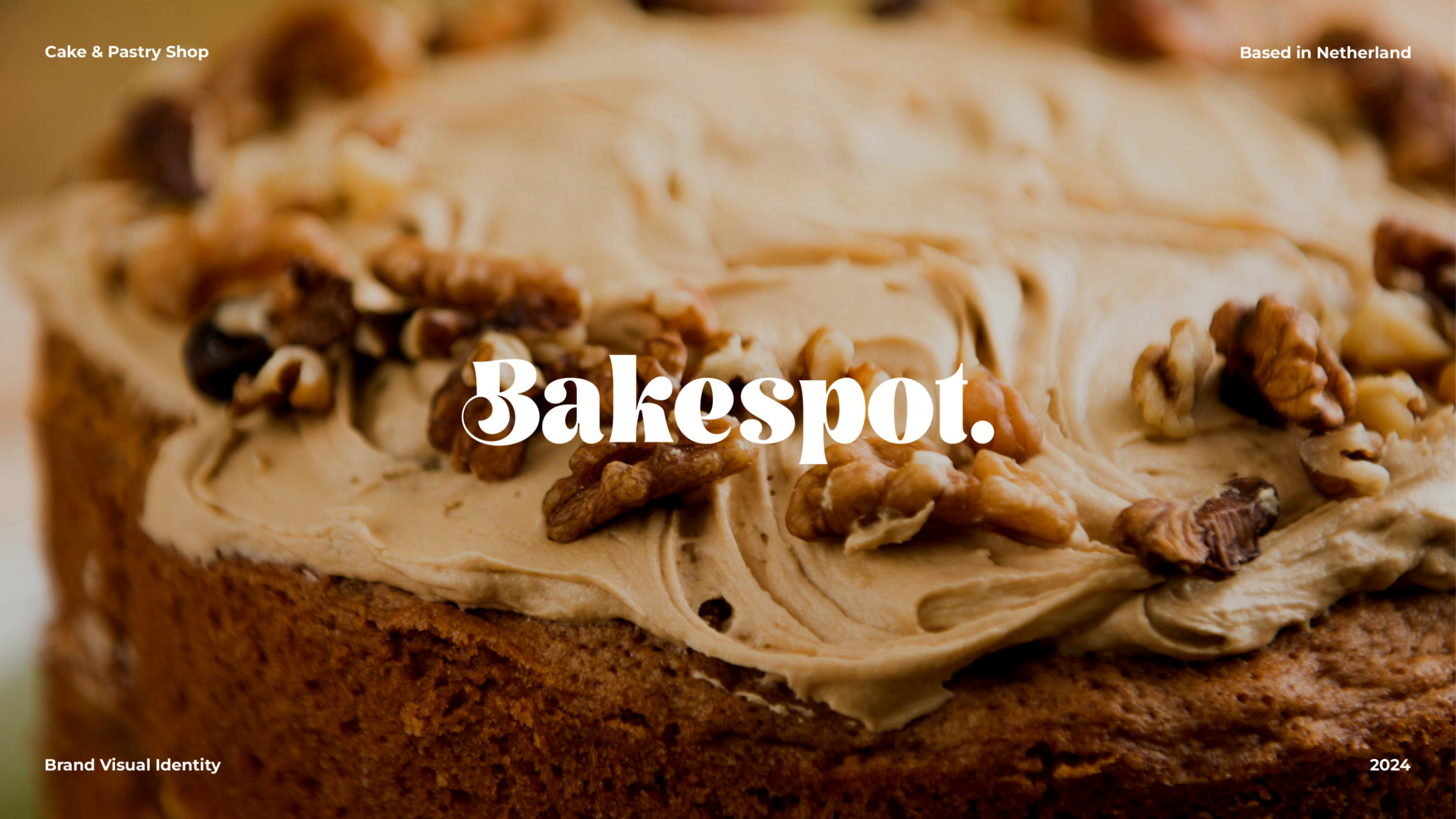
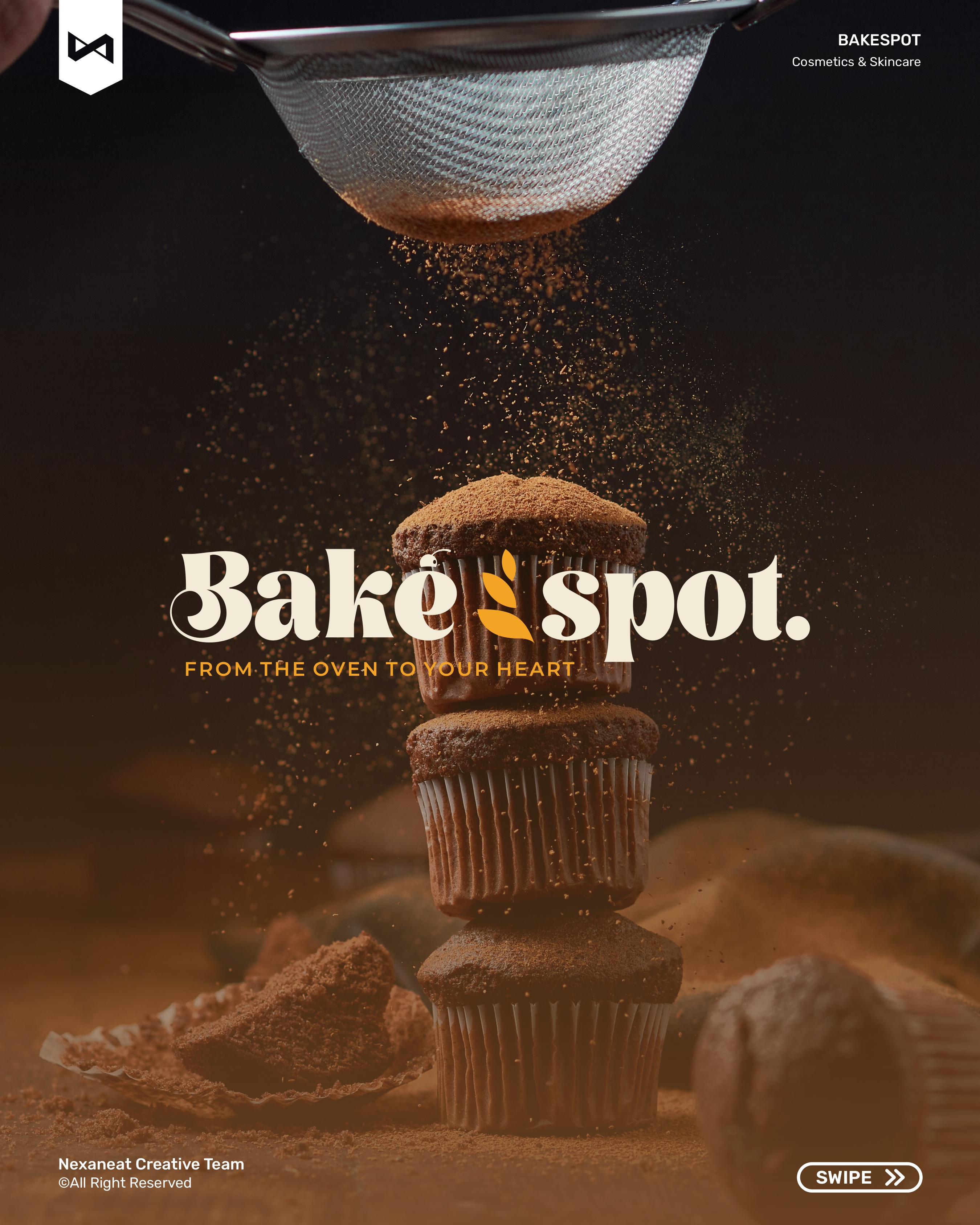
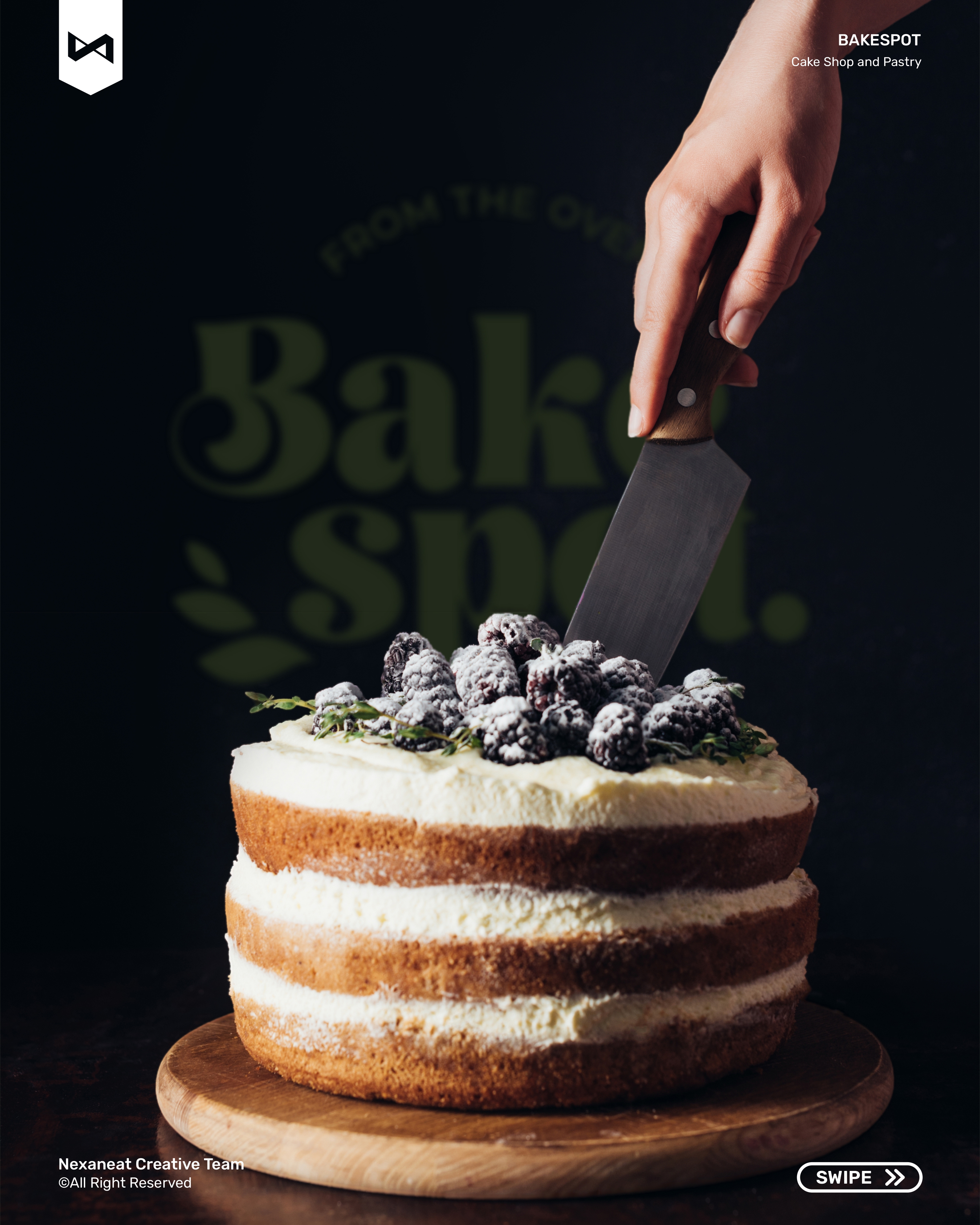
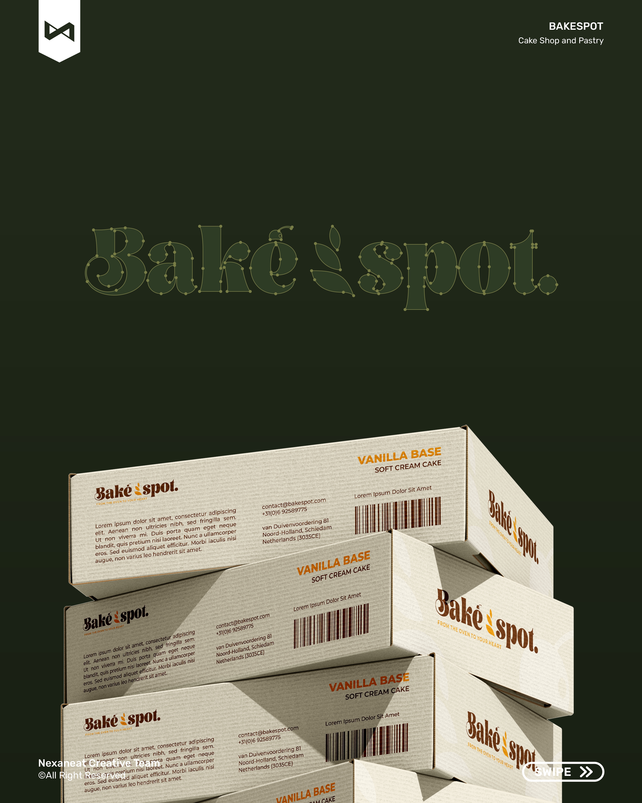
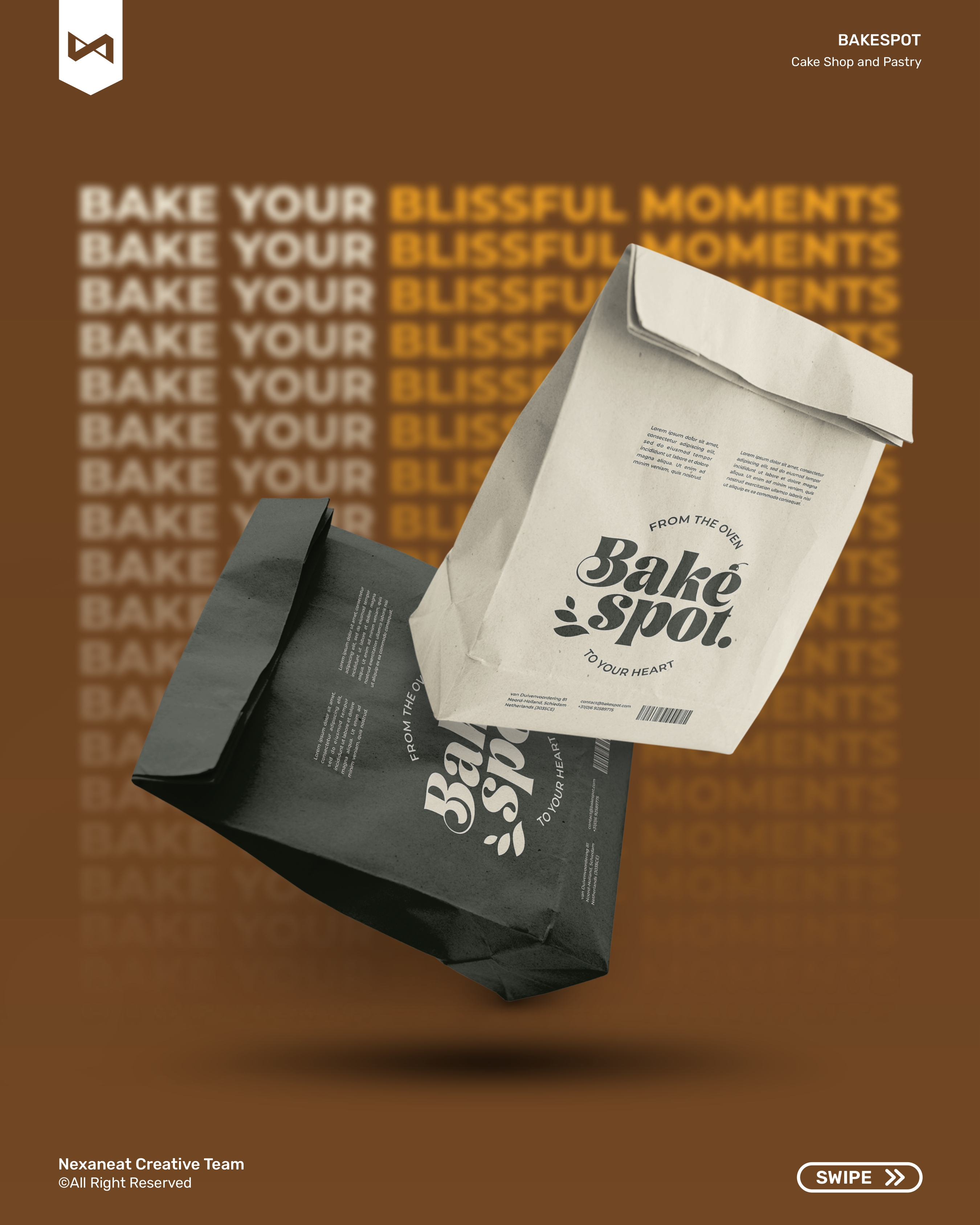
The logomark is a retro serif wordmark with swollen curls on the B and k — the kind of ball-terminal detail that reads as patisserie window, 1974 rather than cloud-kitchen, 2024. Between "Bake" and "spot" we tuck a tiny hand-drawn wheat sprig in Apricot Glaze: a single organic element sitting inside a geometric type rhythm — a textbook figure-ground break that forces the eye to pause exactly on the ingredient. Behind every lockup sits a full stop: Bakespot. — not a dash, not an arrow. The period is a closing gesture, the pastry on the plate. A secondary scalloped pie-crust seal (the wheat sprig inside a fluted circle) handles stamps, stickers, and every surface too small for the full wordmark.
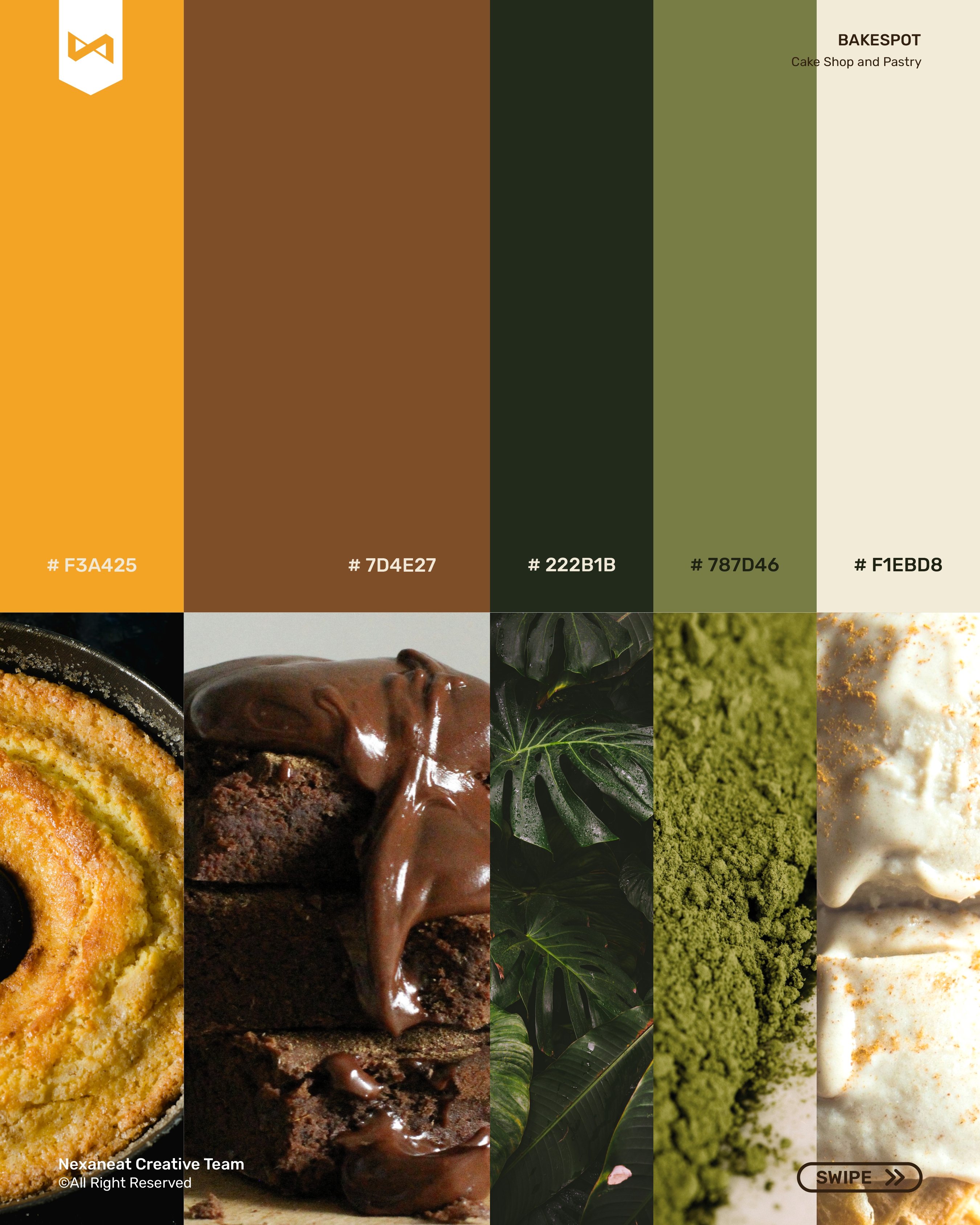
Every colour in the system is pulled from the oven itself. Mummy Brown #7D4E27 is the crust — the hero background, the one that triggers the Maillard cue a hungry brain recognises before it reads. Apricot Glaze #F3A425 is the finishing brush — used only on the wheat sprig, the underlines, the callouts, so the eye lands on flavour before it lands on copy. Mountain Range Green and Plant Green anchor the ingredient side — herbs, rosemary, pistachio — and give the editorial templates a second, calmer voice for the slow-bake story. Half Pearl Lusta is the plate: the off-white background that lets the brown breathe without the clinical chill of pure white.
The display face is DM Serif Display — a high-contrast serif whose swelled terminals and italic loop echo the same ball-curls as the Bakespot wordmark, so headlines feel cut from the same dough as the logo. For every working surface — menus, price tags, social captions, pack copy — we drop to Poppins, a geometric sans that stays legible at a pastry-label 6 pt and under the warm-white bakery lighting that tends to crush low-contrast type. The pairing leans on a classic serif-for-feeling, sans-for-facts split: the serif sells the craft; the sans sells the croissant before it goes cold.
The lockup has to survive a kraft pastry box, a misty window decal, and a 2 m tram-stop poster on a rainy Utrecht morning. DM Serif Display does the heart-work on the headline; Poppins carries the ingredient list, the price, the "closed Mondays" line. The brand reads the way the shop smells — warm, a little buttery, unmistakably hand-made.
A neighbourhood bakery doesn't need a decks-and-workshops marathon — it needs a pastry box that looks right on the counter by next week. We ran the project on weekly locks and closed with a physical box-and-bag fit test.
Walked through fourteen bakeries in Utrecht, Rotterdam and Amsterdam — photographed the signage, the boxes, the menu boards. Finding: 70% defaulted to mint-green, kraft-beige, or sans-serif minimalism. The open lane was warm, saturated, retro-serif.
Tested three directions: script-neon (cursive + glow), seed-stamp (wheat mark + sans), and retro-serif-plus-sprig. The last one won — it carried the craft without faking nostalgia.
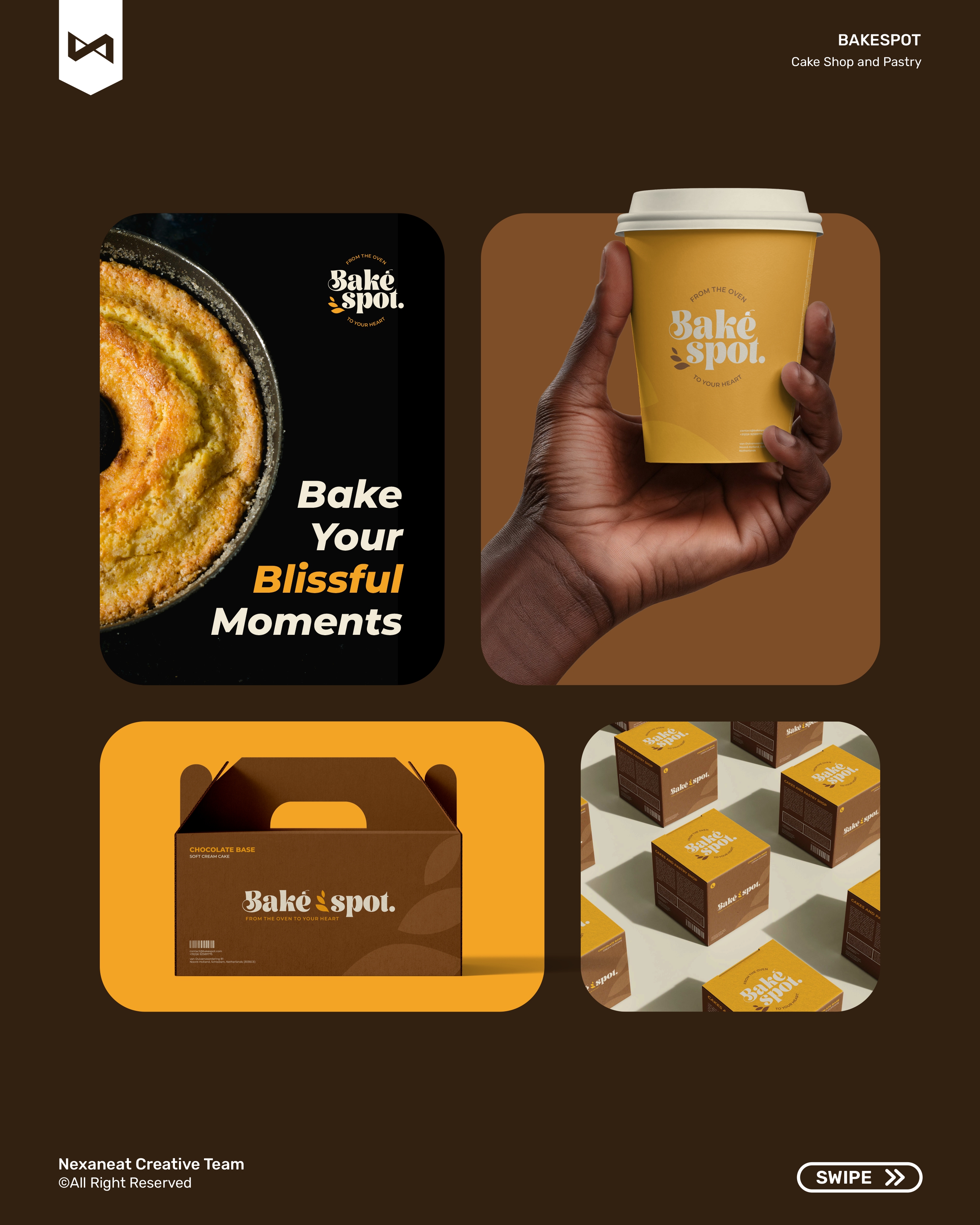
Pastry box, bread bag, cup, tote, and sticker — five pack formats on one grid. Brown kraft primary, cream accent, apricot seal, scallop cut where the box-flap folds.
Guidelines, five pack mechanicals, a ten-frame Instagram launch carousel, a story template, a five-poster OOH set, and merch. Full handoff inside the third Friday.
The launch piece is an Instagram carousel built as one scrolling bakery window — cover, tagline, bundt close-up, chocolate tart, cinnamon roll, bakery hands, sourdough, merch, poster wild-posting, sign-off, and a story-format teaser. Every frame shares the same apricot underline and pie-crust seal so the set reads as one argument — a bakery with a point of view, resolved in a thumb-length scroll.
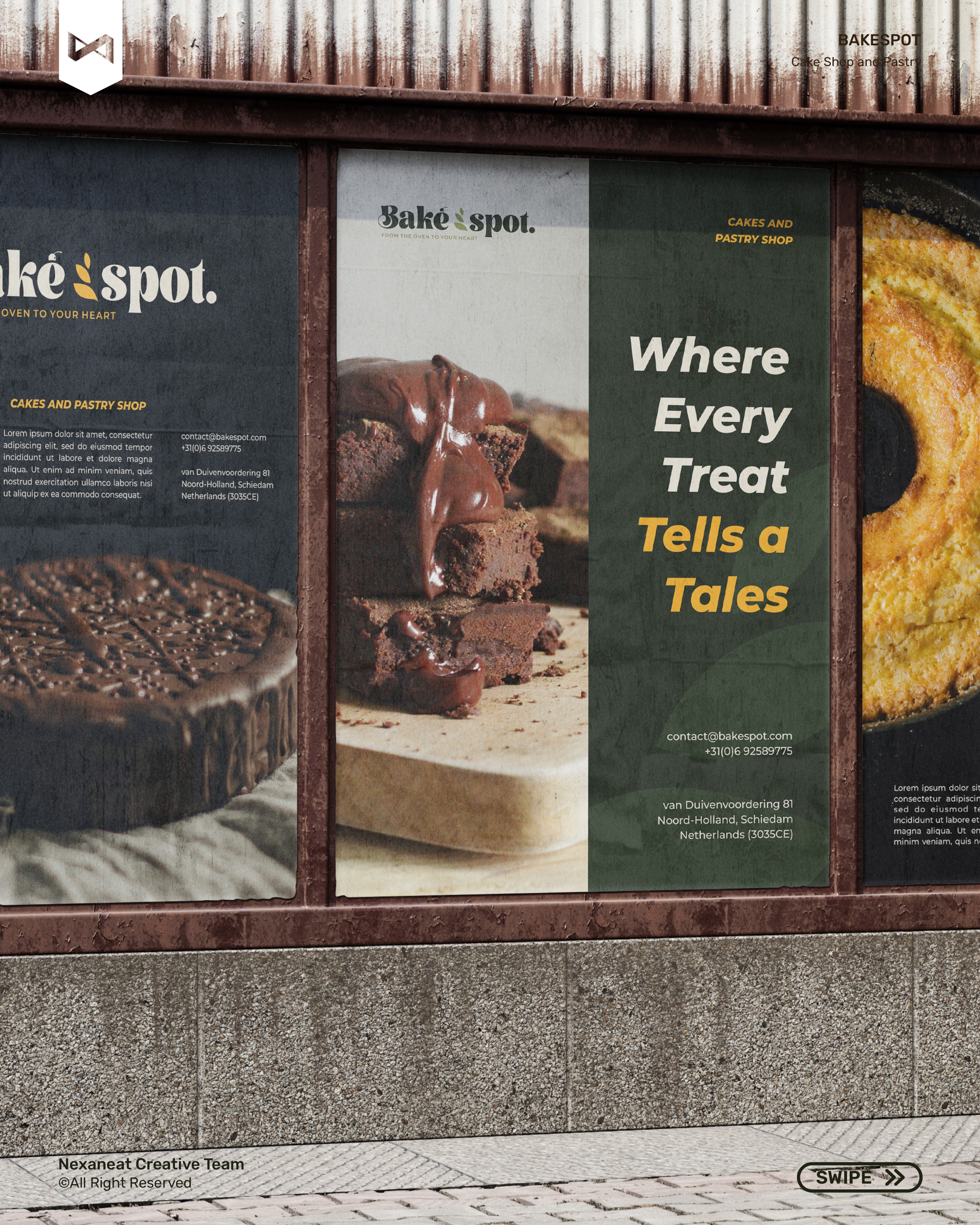
The same wordmark-and-wheat system walks from a kraft pastry box to a wild-posted tram-shelter triptych without losing equity. Each surface leans on the same retro serif, the same Mummy Brown base, the same apricot sprig — so the brand reads as one bakery whether you meet it at the counter, in a paper bag on the tram, or on a Friday-night billboard on the way home.
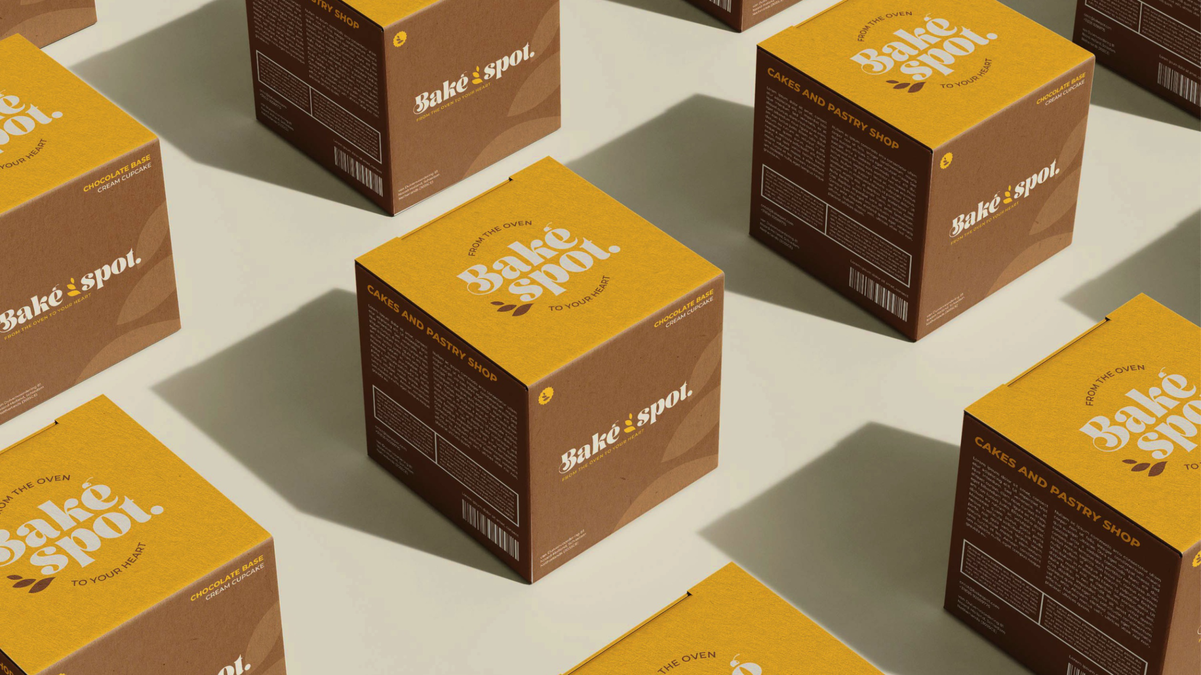 Pastry box — signature
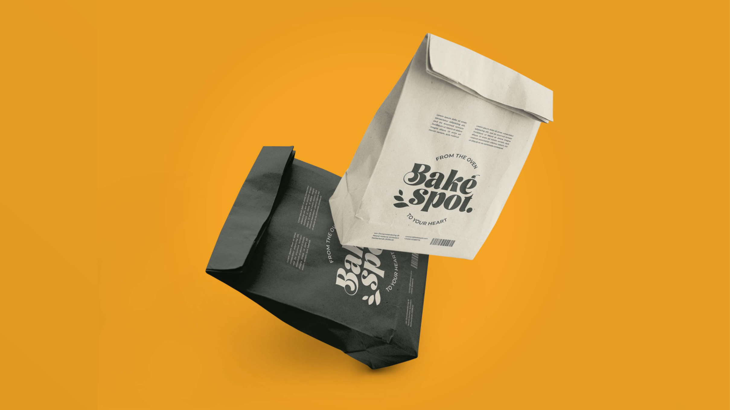 Bread bag — kraft & black
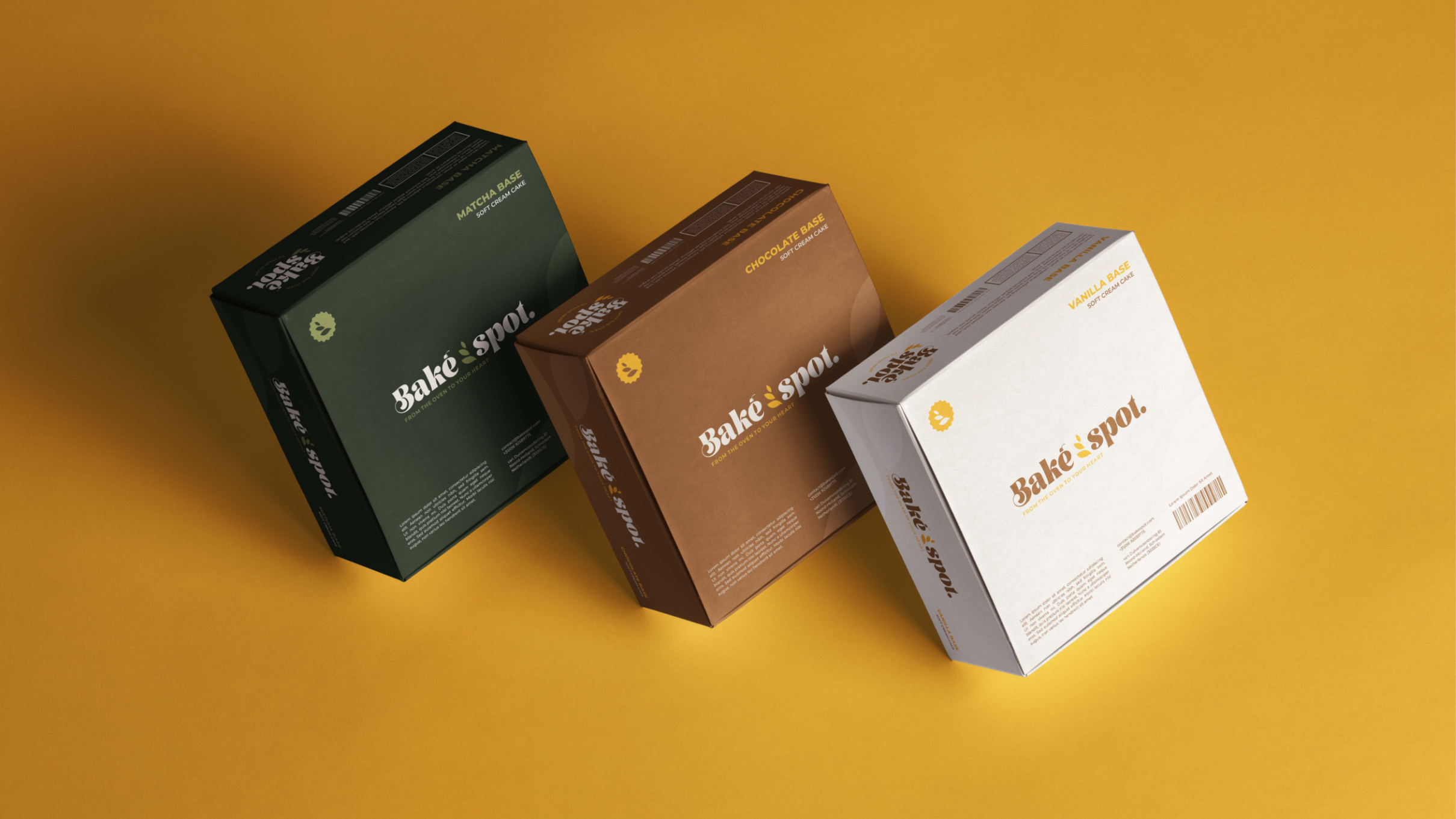 Retail — three colourways
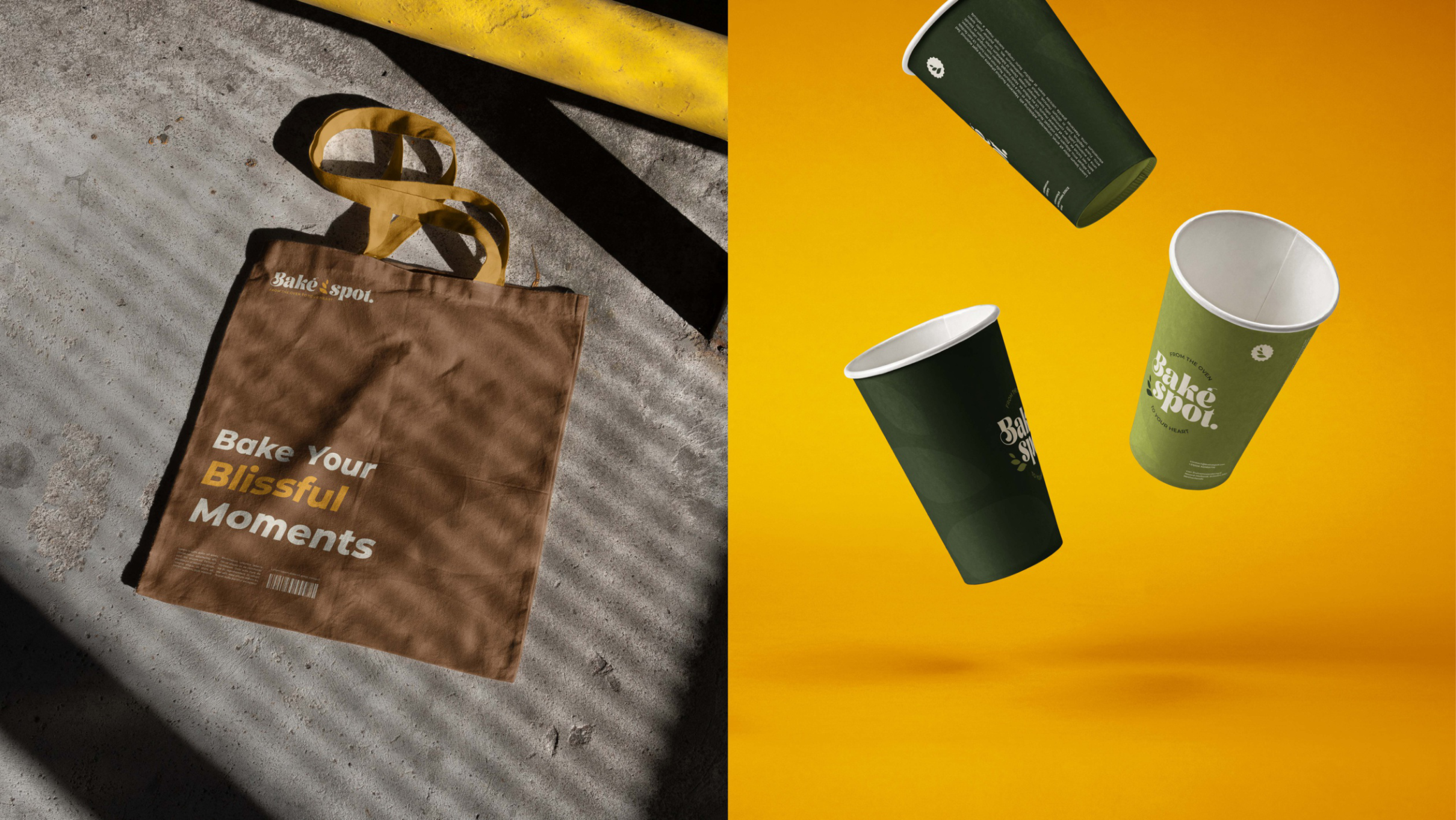 Tote & cups — takeaway
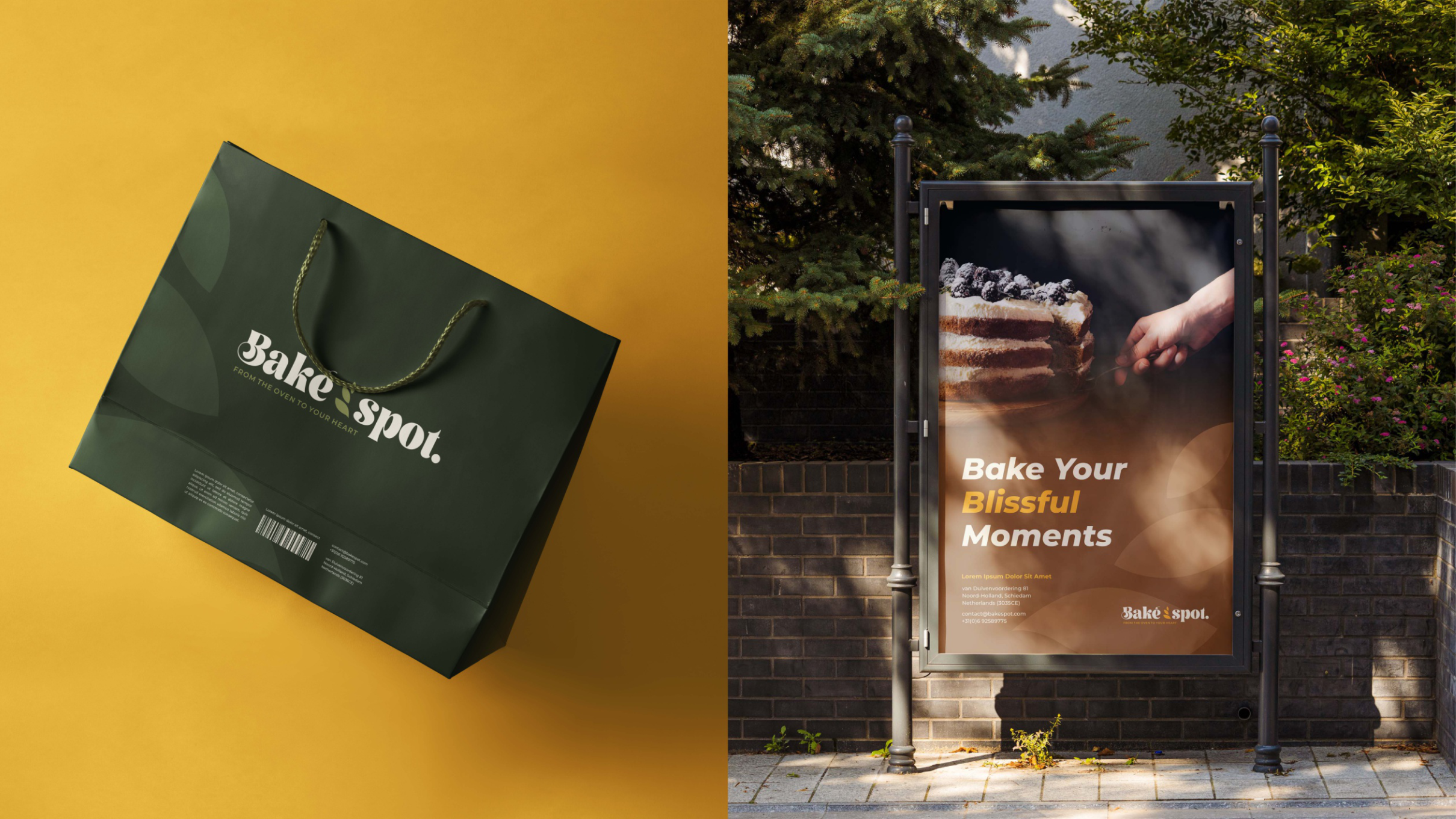 Shopping bag & poster
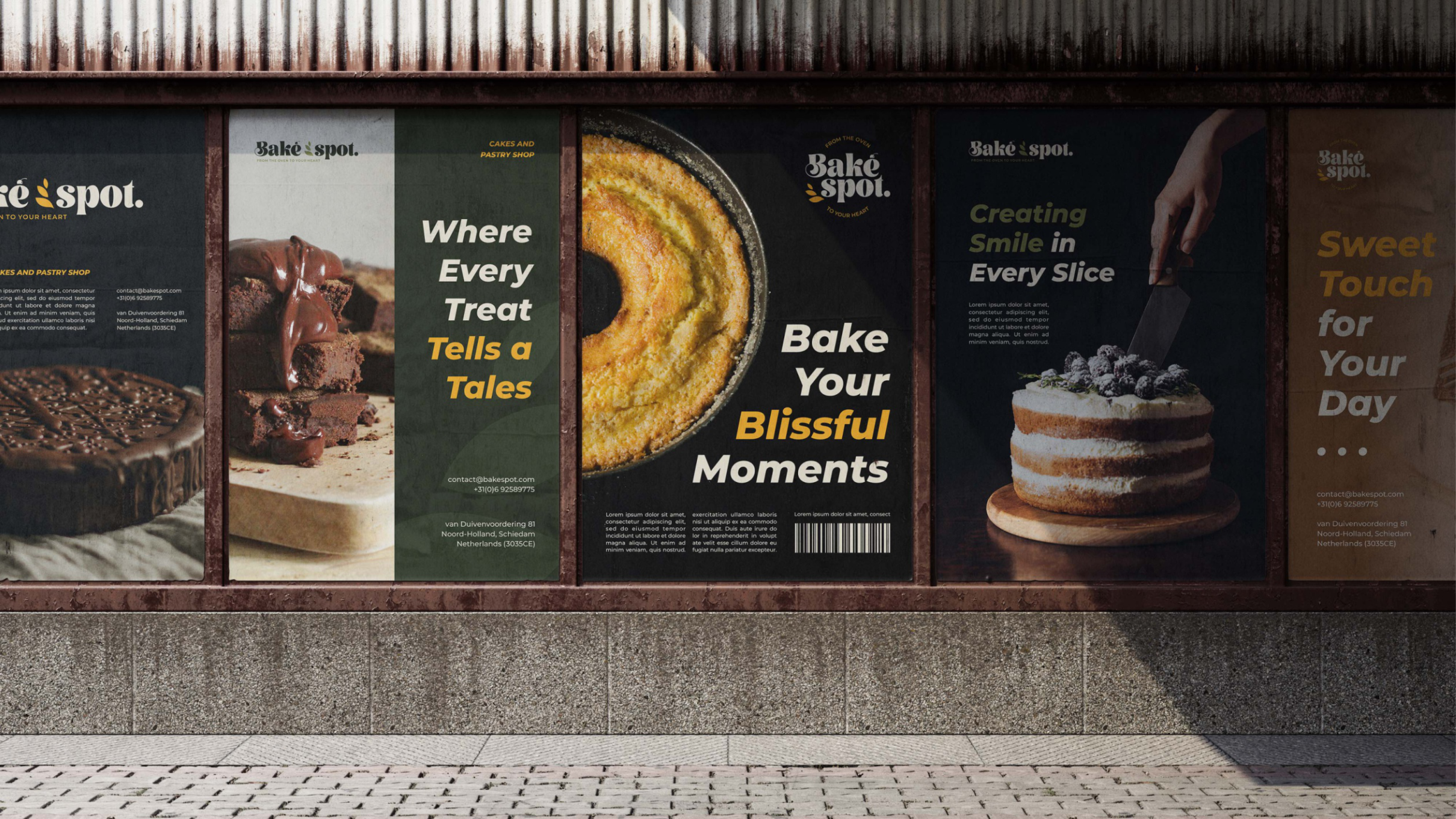 OOH — five-poster triptych
Send a sentence about what you're building. Scope and timeline back in 48 hours.